I’ve been telling myself that someday I’ll look back on my time in New York City with the fondness and nostalgia that living in a different location usually brings, and that I will wish that I had used my time here to the fullest. Therefore, I decided to do a very New York thing and took in a show yesterday. Granted, it was early Saturday morning, I was in a dilapidated Catholic grammar school gymnasium and surrounded by a crowd of middle-aged men ogling Ryan Howard rookies and game-used inserts. But I
had paid admission ($1), plus I ended up spending $30 for cards I didn’t know I wanted, and I had a pretty good time in the process.

I spent most of the morning talking with Mel, who described himself as more of a collector than a dealer. We agreed that there wasn’t much point in collecting new cards in terms of “making an investment” (his words), and his advice was that if you really wanted to make money, you shouldn’t purchase anything after 1969. And I had to agree with him on principle, but luckily I’m not at a point in my habit where I’m concerned with making an investment. I’m more concerned with owning the card, regardless of its condition. And when it comes to buying cards in not-so-great condition, well, Mel’s your man.

Like this killer card of Rod Carew sporting a wicked early-1980s headband. Let me tell you something, I always thought I had appreciated the headband, but after yesterday I now know that you can’t just wear a headband and automatically look like the Baumer from
Royal Tenenbaums. No, the headband is not something that can be idly mastered—practice is key. Plus, there are a few things that you must take into consideration before you even attempt to wear one. First, the thickness of the band. Second, the thickness of your hair. Third, the color of the band in relation to the color of your uniform. Based on these principles, it’s obvious that where Rod Carew succeeds with quiet aplomb, Sidney Wicks fails miserably. Carew’s fro-to-band ratio is well proportioned, while Wicks’ hair looks like an extension of the band. You can see Wicks’ discomfort in his eyes—he knows he isn’t practiced enough to be photographed.

Or these cards of Spider Lockhart and Chuck Muncie, who, by the way, is quickly becoming my favorite retired NFL player. All of his cards seem to picture him on the sidelines, sitting on the bench, or in various other places but never on the field. Plus he wears hornrims and has a scholarly mustache/goatee thing going. I almost expect him to teach college-level physics in the off-season. This Lockhart card from ’75 is great because it’s pre-universal Gatorade squeeze bottle. I bet he brought that plastic jug from home.

I got some other great cards too. Like this one of Kenesaw Landis from Fleer’s Baseball Greats series from 1961. And if you ever want to read a few stories about Landis that conflict with his hard-line legacy as Commissioner, read the first few chapters of Leo Durocher’s
Nices Guys Finish Last. Apparently he was a real softy when it came to players’ rights.

But perhaps the best card I got at the show was this Julius Erving Super Action card from the terribly underrated (and personal favorite) 1981-82 Topps basketball set. Not only is Erving skying high while he drives to the basket, but he’s doing so in the old Garden, with McHale and Bird looking on. It’s just an awesome shot, and one that’s got me thinking…

Now that baseball’s done for the year, I think I’ll start including some basketball-related stuff on the blog. Wouldn’t be bad, right? I mean, I’m not talking about a ton of World B. Free and Slick Watts references, but after listening to classic Tommy Heinsohn commentary during a playoff game against the Hawks about how overweight Ray Williams was (on the Larry Bird’s Greatest Hits dvd), I thought it might be nice to branch out a little bit. Try new things. Use this space to its fullest. That kind of thing.

 This is what baseball card collecting is all about: the paint has barely dried on the 2006 season and Topps has already announced their 2007 design. This used to be Donruss' job, coming out months before any other company awoke from hibernation. But now, because there's no Donruss, the pre-emptive strike responsibility falls squarely on the shoulders of Topps.
  Do you have any Panini World Cup sticker book stickers you don’t want? Do you feel generous and want to send them to me? Wait a minute…Is that wrong to ask? Am I being too pushy? I feel like I’ve committed some kind of horrible sin against you, gentle reader. Let me explain.
 knew that I was getting in deep. A box of 1000 stickers (100 packs of 5 stickers) was $50 on average, before shipping. Yikes. But then. Ah, but then. But then I took a walk through Elmhurst underneath the 7 train along Roosevelt Avenue (incorrectly called ‘Roosevelt Boulevard’ on a recent episode of Ugly Betty) and found a soccer jersey store that sold the stickers. So here I am, 27 years old, giddy that I found a place somewhat near where I live that sells packs of stickers for a child’s sticker album. Über-nerd took over and I cleaned the guy out.
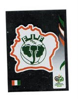
 It’s not every day that a major artist creates their own line of baseball cards, then has a hard time selling them. You’d think that with paintings going for record prices and comic books and graphic novels and the like selling for outrageous suggested retail prices right out of the gate, that something as cool and as original as a limited edition set of baseball cards would go quickly for big bucks. But that doesn’t seem to be the case.
 Here’s a heavyweight world wrestling championship match that unfortunately never took place: Tom Dempsey versus Kirk Gibson. It would’ve been a great premise—all season Kirk and Tom would’ve dressed identically and be known as Mirror Man. One would be in the ring and fight the heel, then when he got knocked momentarily unconscious (or marched victorious out of the hall) the other one would show up, sneer at the crowd and ruin the situation. Or something to that effect. Eventually their back-stabbing would finally catch up with them and they’d have to duke it out in a gigantic grudge match perfect for pay-per-view. Anyway, it would’ve been awesome, but it never happened—because Dempsey and Gibson are the same person.

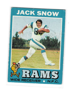 This is the funniest card I’ve seen in a long time. JT’s dad looks more like a comic version of Lurch from The Addams Family that he does a football player. Really, all he needs is a top hat, white gloves and a cane. I don’t know what makes this card: is it his splayed out legs? Or maybe his thick brown hair, parted just so…Or his crazy eyes and gigantic grin? Or maybe it's his shoulder pads way the hell up in his face? No, it definitely has to be his right hand, fingers out, like he’s cutting the air as swift as a sprint-ripped fart.
  Also, if you squint real hard, is that Ben from Wet Hot American Summer? Or maybe Coop? All I’m saying is, if you were a little kid in the Seventies and you had to choose a sleep-away camp, wouldn’t you choose the one with Jack Snow as your camp counselor?
  Especially because there was always a chance that other NFL stars might show up to earn some off-season beer money. Who wouldn’t want to learn how to swim with Billy Joe DuPree or trade campfire ghost stories with Bill Kilmer? Sounds like a helluva summer to me.
 Some photos are just too good to be true. Like Sam Mitchell in a hard hat resting a sledgehammer on his shoulder. Also, he’s decked out in an early-Nineties T-Wolves sweatshirt. I would bet that the Minnesota front office wanted this photo to scream ‘the T-Wolves care about the community.’ Instead it takes turns screaming ‘PR-firm photo-op’ and ‘alternate photo for 16-month calendar aimed at helping teenage boys decide if they’re homosexuals’, which actually would make a better calendar than ’12 Months of Jason Kidd’.
 I can’t afford packs of Topps’ new Allen & Ginter, I have no desire to complete the set and I don’t really understand Topps’ new policy of including non-baseball players in its base sets (like the supermodels in the 1952 Style basketball set). But that doesn’t mean I don’t like the cards. The design is fantastic: clean, smooth, no overbearing Topps logo on the front of the card, and best of all, it’s printed without gloss on quality card stock. Just a real nice-looking set.
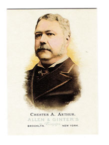
 Ruthe-fraud B. Hayes? I honestly don’t understand. I mean, there was plenty of room in the set. They could’ve left in the other late century presidents and not include a card of competitive eater Takeru Kobayashi, shown in deep concentration as he chokes down an unnumbered hot dog.
  Ah, who am I kidding? Cards of competitive eaters, spelling bee champs and supermodels sell cards. I guess if I wanted cards of important historical stuff I could buy old Flags of the World commons. At least I can afford them.
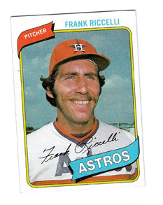 The title of this post says it all. It has to be just a coincidence that Riccelli strikes an uncanny similarity to Bogusky’s interpretation of ‘The King’.
 Like this killer card of Rod Carew sporting a wicked early-1980s headband. Let me tell you something, I always thought I had appreciated the headband, but after yesterday I now know that you can’t just wear a headband and automatically look like the Baumer from Royal Tenenbaums. No, the headband is not something that can be idly mastered—practice is key. Plus, there are a few things that you must take into consideration before you even attempt to wear one. First, the thickness of the band. Second, the thickness of your hair. Third, the color of the band in relation to the color of your uniform. Based on these principles, it’s obvious that where Rod Carew succeeds with quiet aplomb, Sidney Wicks fails miserably. Carew’s fro-to-band ratio is well proportioned, while Wicks’ hair looks like an extension of the band. You can see Wicks’ discomfort in his eyes—he knows he isn’t practiced enough to be photographed.
 I got some other great cards too. Like this one of Kenesaw Landis from Fleer’s Baseball Greats series from 1961. And if you ever want to read a few stories about Landis that conflict with his hard-line legacy as Commissioner, read the first few chapters of Leo Durocher’s Nices Guys Finish Last. Apparently he was a real softy when it came to players’ rights.
 But perhaps the best card I got at the show was this Julius Erving Super Action card from the terribly underrated (and personal favorite) 1981-82 Topps basketball set. Not only is Erving skying high while he drives to the basket, but he’s doing so in the old Garden, with McHale and Bird looking on. It’s just an awesome shot, and one that’s got me thinking…
 Now that baseball’s done for the year, I think I’ll start including some basketball-related stuff on the blog. Wouldn’t be bad, right? I mean, I’m not talking about a ton of World B. Free and Slick Watts references, but after listening to classic Tommy Heinsohn commentary during a playoff game against the Hawks about how overweight Ray Williams was (on the Larry Bird’s Greatest Hits dvd), I thought it might be nice to branch out a little bit. Try new things. Use this space to its fullest. That kind of thing.
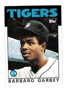 Were those doctors ever able to fix Barbaro’s leg? Sometimes I wonder what Sparky told the Tigers in 1984 that boosted them over the top…or was it something more? Because I’ve never thought it was a good idea for a man to enter himself in horse races (and then to be considered the favorite—he must have been doping!).
  I am a man of my favorites. That’s why it’s easy for me to appreciate the manager cards from 1981 Donruss: the stark simplicity of what is, in essence, a headshot or a blurry medium shot of an old man is rendered both wonderful and painfully boring. The other years when Donruss put out manager cards, the company thought it necessary to include them within the scope of ‘regular’ cards: posed shots in the dugout to simulate a game setting or else an actual in-game photo. But by doing so, the company stripped the managers subset of the very thing that made the
 original subset so appealing: the fact that these guys could actually pass for your grandfather, portrayed in ways not far removed from those in which you’d seen your grandfather photographed. Sure, you’re grandfather probably didn’t dress up in a Cleveland Indians uniform, but like Dave Garcia, he probably used a cane, and he did have an honest look about him (that is a cane that Garcia is resting his hands on, right?).
 unpleasant guy who makes your life unpleasant in some way, whether he’s a traffic cop, a boss or a high school principal. And really, all that’s missing from Dave Bristol’s forehead is ‘Dork’ spelled out in suntan lotion (much like Captain Harris’ misguided day in the sun from the immortal Police Academy 5: Mission Miami Beach). Seriously, where does Bristol’s Giants jersey end and his face begin?
 Overall, the uniform colors are great, the skin tones horrible, and many if not all of the managers are photographed up against some kind of wall. The only exception I can think of is Joe Amalfitano’s card where it looks as though he was photographed leaving the Cubs’ team bus on the highway to take a piss.
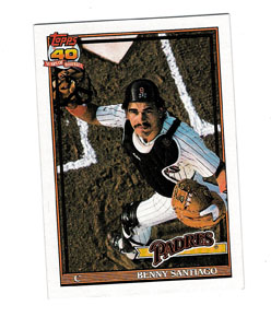 But for all this doom and gloom the changed atmosphere (one of increased competition for share of voice and for collector dollar) did wonders for the individual quality of the cards. Topps, not known for stellar photography, busted out some definitely cinematic poses for the 1991 base set. Take this one of Benny Santiago (and by the way, when did he go from ‘Benito’ to ‘Benny’?): not only is the lighting just right, but the photographer is definitely using a crane for the shot, in an effort to dramatize Santiago going after a pop foul, from the pov of the ball. Kind of weird, when you think about it, but definitely more dramatic than another shot of Santiago in the dugout picking his nose.
 As a third example, take a look at the Fernando Valenzuela card from the 1991 Upper Deck set (#175). It’s trademark Upper Deck, in that it features an awesome three-picture photo of the dynamic Valenzuela wind-up. The three-photo card was an original UD idea that was as much a brand signifier as it was a gimmick, and just by looking at it you knew what Upper Deck stood for as a card company: great quality, irreverent presentation. In essence, a premium brand that cared fuck-all about the other companies, because once collectors got a taste of the Upper Deck product, there wouldn’t be any more competition. It took the hobby a little while to come to this conclusion, but here we are. Industry insiders and historians will tell you that the success of Upper Deck can be laid on the shoulders of many decisions, from including autographed cards as inserts to leading off with the Griffey rookie as card #1 in 1989, but they’d be amiss if they didn’t mention that by using cinematic photography on nearly every card, and especially the three-photo card, customers moved past ‘collectors’ to ‘loyal following’ the moment they opened a pack.
 I’d like to inaugurate a new classification of card: Wallet Worthy. I’d been thinking about the demise of Tower Records and how with the impending death of compact discs comes the impending death of liner notes. And with the death of liner notes comes the death of the obscure reference. And this is something that must not come to pass. Tower Records also got me thinking about the idea of desert island discs: you know, the ten or so records you’d take with you if you were stranded on a desert isle. My idea was, could you do the same thing with cards? Could you really make a list of desert island cards and get away with it? I decided you could do it, but you’d have to change the situation and the name. Instead of the age-old question: If you were stranded on a desert island with only ten baseball cards, what would they be?, I came up with: If you were slowly getting drunk at an airport bar, what cards would you produce from the photofold in your wallet (you know, where photos of your wife, kid, grandparent, grandchildren are supposed to be) to brag about with anyone who’ll listen?
 notice all the stains, scratches and wear and tear on the front of the card? It’s like the card is begging you--begging--to be jammed into a wallet, unlike, say, Gaylord Perry’s #115 from 1982 Topps (unless, of course, you have a thing for older men. Perry looks like he’s either posing for a dust jacket photo or he’s secretly Spalding Gray’s older brother…by the way, how great would it have been if Gaylord Perry became a famous author after he retired? Or instead of ‘famous author’, if he became a mediocre harlequin romance novel writer? That would’ve been unbelievably funny, but still not wallet worthy.)
 Name me five long-lasting, successful knuckleball pitchers. I’ll even spot you three: Phil Niekro, Tim Wakefield and Hoyt Wilhelm. It’s hard, right? So then how do you think a guy like Wilhelm felt to have the Topps photographers ask for him to make the knuckleball pose almost every year? Isn’t that like giving away a trade secret? And what if this had fallen into the wrong hands? What if an obsessed hitter spent the off-season dissecting his grip and then showed up in April and blasted the hell out of the ball whenever they faced? I would say that Wilhelm’s considerable talent would’ve been severely compromised.

 Molitor looks so sad all by himself. And why is the photographer so far away from him? Did he want to prove that the young Brewer actually had legs? Also, this is one of the few posed cards I’ve seen where there are fans in the stands behind the posed player. I’m guessing that one of three things happened: a Topps rival bribed ballpark security to give the Donruss photographer a hard time, he was running late or Gorman Thomas demanded thirty-five shots be taken of him in various positions, pushing sad-sack Molitor’s time down to just thirty seconds before game time.
  I was not very cool in high school. To illustrate this claim, one spring break I spent 10 hours a day for three days straight learning how to juggle. I developed a respect for Michael Moschen, I made my own juggling balls out of balloons and sand and hoped that one day I could shop at Brian Dubé in New York. I started by learning a simple three-ball cascade, then moved to passing one over two, then over time taught myself a simple claw cascade, then Mill’s Mess, then claw Mill’s, then half-claw Mill’s, then half-claw Brook’s Barrage, then I moved on to creating my own patterns and now, almost twelve years later, I find I sometimes go three or four months without juggling and then can just start without thinking anything of it. It’s very much like riding a bicycle.
 This card is a sweepstakes card from a pack of 1990 Bowman. The text on back reads “Did you know…that the picture on the other side of this card is a reproduction of a painting of Jerome Walton that is part of a set of 11 paintings of superstar players by artist Craig Pursley? Do you know that this set of 11 artist-signed and numbered lithos has a value in excess of $440.00?”