
Sometimes I wonder about how much influence bloggers have on card companies—if any at all. If card bloggers focused every post for a month on old Sportflics sets, would the manufacturers find a way to include a bevy of lenticular cards in their sets next year? Logic says probably not... but what if the topic was cards of the 1980s? Would manufacturers find a way to include throwbacks in next year's sets?

But first let's talk about the front end of the checklist. The checklist includes an array of old and new stars mixed indiscriminately. Babe Ruth, Roberto Clemente, Ty Cobb, Mickey Mantle, Tom Seaver, Stephen Strasburg, Albert Pujols, a Yu Darvish rookie, yadda yadda yadda. I get it. The checklist itself isn't what intrigues me. What makes me sit up and take note is why Topps limited the design choices for the first 200 cards. Topps has scores of great designs scattered across its history, designs that go well together when mixed. But if you put the base set in pages, you'd have five and a half sheets of 1954, five and a half sheets of 1971, five and a half of 1980, and then five and a half of 1984. Not randomly dispersed; all in a row.
One of my theories is that Topps sees this product as a new-card collector's measured introduction to the back catalogue. When I was a little kid, I remember my oldest card was a 1978 Topps Doug Ault (before I started going to shows at the Watertown Mall). I don't know how I got it, but I cherished it. And it was one of the only cards I had that was made before 1986. Granted, new-card collectors in 2012 are inundated with classic designs: Allen & Ginter, Topps Heritage, Gypsy Queen, Topps Lineage...and dime and quarter boxes are full of "retro" cards made in the last 10 years. Old designs—or new designs with old-design tweaks—are everywhere. But that doesn't mean all collectors see them, especially those whose "local dealer" is a Walmart or Target only stocked with the latest Bowman Chrome or Topps Series 2. By dividing the base set into four equal 50-card quarters, the 1954, 1971, 1980, and 1984 designs are drummed into the collector's brain, elevating them to a higher design-worship plane.
Another of my theories is that these four designs are at different stations of worship within the Topps' company walls. There seems to be a definite official hierarchy of classic Topps designs. The no-brainer is that Topps values its 1952 design the highest, with 1954 and 1953 as a close second and third. After that it's anybody's guess. I'm basing this theory on a very unscientific method: totaling the number of times the company uses a given design in a retro-themed product, insert set, or individual card within a mixed-design set. This calculation deserves its own post, with a universe measured from 1991 to the present, but for now I'll stick to the instances I can think of off the top of my head. And by "retro" design, I mean those designs made for sets between 1951–1990.
1952: Reprint set (1983); 2001 Topps Heritage; 2006 Topps '52 Rookies; Mickey Mantle Hero Worship (various years)
1953: Topps Archives: The Ultimate 1953 Set (1991); 2002 Topps Heritage; Topps Gallery Heritage
1954: Topps Archives 1954 (1994); 2003 Topps Heritage; 2012 Topps Archives; a thinly veiled interpretation was used by Fleer for its Tradition set in 2000
Other years: Designs from 1955–1963 have been used for Topps Heritage products from 2004–2012; Topps' Big Baseball in 1988–1990, as well as 2001 Fleer Tradition, were homages to the 1956 design; Upper Deck used basic facsimiles of the 1963, 1965, and 1971 designs for its Vintage line from 2001–2003; Topps Archives, Topps All-Time Fan Favorites, and various eTopps and insert sets from across the last 15–20 years
From thinking about this theory over the last few days, my hypothesis is that 1964 is the least-used (and therefore least officially loved) of the classic Topps designs, with a bottom five of 1964, 1970, 1973, 1982, and 1989. Again, this is just a guess; a more formal tally would reveal totals. But if my hypothesis proves true, 2013 Topps Heritage will be very interesting.
But back to the base cards of 2012 Archives. Elevating these four designs begs the question: Do these designs deserve to be worshipped? I've written a lot already about the 1980 and 1984 designs (see here and here), and 1954 is in the Topps Pantheon of Great Design. But 1971? With the smushed sans serif and simple black borders?

1971 is a tough set to put together in any condition. From what I've seen, prices on individual cards are higher than the year before it and the year after it. I mean, how can you explain that Munson's second-year card from 1971 is worth more than his rookie from 1970? You can count examples of a second-year card out-valuing a rookie on one finger: 1952 Topps Mickey Mantle. 1971 was also the first year that action photos made their way onto individual player cards, not just World Series or historical highlight subsets. This was a fairly large improvement after years upon years of faces and posed sideline shots.
But is 1971 worthy? Or is it just that the design is so markedly different from any other vintage design that it warrants an inclusion? I'm not sure of the answer.
Now to the inserts. Stuck on the end of the base set checklist are 40 short-printed cards numbered from #201–240. These are cards of inactive stars, Hall of Famers, and fan favorites. Each player is featured on a vintage design from their respective playing days, with a different photo used from the one on their original, vintage card. (I believe this practice was first used by Topps in their All-Time Fan Favorites set from 2003/2004.)
Then there's a gold rainbow foil parallel of the base set, a reprint set stamped with a tiny gold "Topps Archives" stamp, a Classic Combos set, a 1982 In Action set, a 1977 Topps Cloth Sticker set, a 1969 Deckle Edge set, a 1968 3-D lenticular set, a 1967 giant-head peel-off-sticker set, and relic and auto cards. The relic cards use the 1956 design, and the autos are on mini, framed 1983 cards. There are also high-end autographs on original cards of retired stars like Frank Robinson, Sandy Koufax, Willie Mays, and Bob Gibson, to name a few, an autographed Yu Darvish rookie, and an autographed Bryce Harper card. There are also a couple buy-backs, a six-signature "book" card, a weird hand print of Uncle Fester, er, Cal Ripken Jr., totally bizarre cards autographed by the villains from The Karate Kid as box loaders, and Topps Vault items. Am I leaving anything out? Oh yes, cut signature cards by "entertainment stars of the 1980s," which I hope includes Harvey, the announcer from Double Dare, and Kurt Loder of MTV News. If there's a Kurt Loder autograph floating around out there, I might be tempted to buy a box. In fact, here's my wish list of "entertainment stars of the 1980s":
• Harvey the Double Dare announcer
• Kurt Loder of MTV News
• "Weird" Al Yankovic
• Maxx Headroom (I don't care that he's not real!)
• The Million Dollar Man and Virgil
• Manimal
• Daryl Hall and John Oates
• Robocop
• Scott Baio
• The Bundys from Married... With Children
(Not to be outdone, I pulled a Shawon Dunston autographed card in my pack. Sidebar: When I was a kid—actually, even now—I'm not sure how to pronouce "Shawon." I mean, I think it's pronounced like "Chone," which is to say, like "Sean." But sounding it out it's definitely "Shuh-wahn." Which is not exactly a bad thing. Better than "Chone," which I always mistakenly pronounce "Chone.")
A set's base set checklist has to be strong, and the base set card design has to be strong for me to even consider a set to be worth collecting. This installment of Topps Archives passes both tests, as we all knew it would. How can you argue with classic designs and a checklist that encompasses (many of) the best players of the 20th and 21st centuries? I also like that the checklist is manageable: at 200 cards—240 with all the SPs—you aren't inundated with multiple Nolan Ryan cards, or Mickey Mantles, or Barry Bondses. Hey, speaking of which, where is Barry Bonds? A lot of "fan favorites" aren't here, guys like Garry Templeton, Chet Lemon, Joe Carter, and Fred McGriff are just a few that come to mind. And as long as we're talking about the negatives of this set, the card stock is not great. The stock is closer to that awful Lineage set from last year than it is to the Archives set from 2001. Which is a shame, because while they finally got the fronts and backs right, they didn't go all out and print them on old-school cardboard. Was Topps scared that collectors were going to confuse these new cards with the originals? Hard to explain the rationale on this decision, but it hurts the set.
Grade: B+


 When, in the course of baseball card set ranking related events, a person comes upon the 1980 Topps set, what does that person think? Does this set resonate or does the person even care? I, for one, never realized how much I cared until I spent a little quality time with it and now I realize that this set is one of the most underrated of the decade. It lacks the splash of later-decade Topps sets as it has very few subsets, the All-Star denotation is on regular cards and rookies (for the most part) are not announced. But it makes up for this lack of pageantry with a strong checklist, including the desirable 2nd year Ozzie Smith and third years of Molitor, Trammell and Murray, plus great cards of hobby powerhouses Nolan Ryan, George Brett, Yount, Winfield and a cache of others like Reggie Jackson, Pete Rose and Bench, Fisk and Yaz. And how could we forget: this set features the rookie of, according to Bill James, the fourth greatest left fielder to ever live, Mr. Rickey ‘Refers to Himself as Rickey’ Henderson.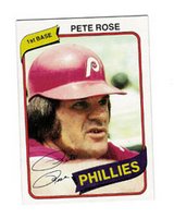
 I think that these last two points are huge. I started collecting right in the thick of things: there were already three card companies going strong, an upstart was encroaching on valuable space (Sportflics) and it would be less than three years before there would be 5 major players vying for my baseball card dollar. If I pined for a Bo Jackson card, I was pining for as many as six Bo Jackson cards, all of them with a legitimate claim to being his rookie. But with Rickey, there was only one set, so there’s only one rookie. And for there to be only one rookie of Rickey Henderson seems fitting, as he broke every mold the game had to offer. (And by the way, when Rickey finally gives up the ghost and officially retires from showing up newbies at Spring Training, he should call up former SuperSonic Michael Cage and they should join the WWE circuit as the tag team Steal Cage, and the WWE scriptwriters could pit them against other tag teams and then at Wrestlemania Cage could turn on Rickey and Rickey would enlist Dave Henderson (who would be a plant in the audience, much like Hasselhoff was at the American Idol finale) and Hendu would come in the ring and rip off his tear-away warm up pants to reveal yellow and green wrestling tights and stomper boots, and thus Steal Cage would be dead and the Flying Hendersons born. I don’t know what would happen to Michael Cage…maybe he could get Old Man Larry Nance off the couch to tag team as Achilles Knees…You know, you could put together a formidable pro-wrestling circuit made up entirely of former legitimate sports figures. Tree Rollins and Jon Koncak would be Ebony & Ivory, Dan Majerle and Darryl Dawkins would be ‘Thunder Brothers’ and Kurt Rambis could wrestle on his own as Oculoptopussy, cause Rambis wore glasses and because I personally hate the Lakers. In fact, I might pay around $10 to watch a battle royale featuring Hot Plate Williams, The Refrigerator Perry, Stanley Roberts, Don Baylor, Gabe Kapler, the Phillie Phanatic, Kevin Duckworth, Leon Lett and Rickey Henderson. I would bet Rickey would win that one, even if he was scripted to lose. He’s just that good.)
 It was a fun design element that added a personal touch to the cards, blurring the line between player and collector, like the player had held his card only moments before you got it in your pack. The fact that Topps didn’t use this feature on any design after 1982 (I can only think of the silver and gold signature cards in Upper Deck’s Collector’s Choice series and one or two of Leaf’s Studio sets in the mid-1990s that did) leads me to believe that autographed baseball cards sets are so ludicrously popular today because my generation didn’t know cards could feature facsimile autographs. Can you imagine a clunker like 1990 Topps with facsimile autographs? I would argue they’d be more desirable than the quick-fix mudroom insulation they’ve become.
 looking for a weird photo or a weird name or a player that’s especially hairy or ugly? Of course you have (maybe it was the reason you started collecting in the first place, to feel better about yourself). Usually any given set will be split 50/50 between weird and normal players, but if you take a look at the Atlanta Braves team, it’s like there was something in the water down there. Pull out their cards the next time you’re going through your box of 1980 Topps and you’ll see what I mean—it’s like a lineup for a less-intimidating version of The Dirty Dozen. No wonder they finished in the basement (even though Phil Niekro won 21 games, he lost 20. Now that’s some Hall of Fame pitching!).