 |
| Cardboard Fenway - #97. 2006 Topps Heritage Keith Foulke |

Showing posts with label 2006. Show all posts
Showing posts with label 2006. Show all posts
April 20, 2012
Cardboard Fenway: 2006 Topps Heritage Keith Foulke


Cardboard Fenway: 2006 Fleer Greats of the Game Dwight Evans
 |
| Cardboard Fenway - #44. 2006 Fleer Greats of the Game Dwight Evans |
September 19, 2007
Goudey Trade-away #21: Peralta for Teixeira

This trade comes in from Ryan in Fairborn, Ohio.
Giving: Jhonny Peralta, #119
Getting: Mark Teixeira, 2006 SPx
I've heard of people misspelling their own names on the SAT, but when, in the course of human events, has anyone ever had their name misspelled on their birth certificate? I can''t think of anyone (besides Jhonny Peralta).
September 13, 2007
Goudey Trade-away #9: Napoli for Crosby

This trade comes in from Andy in Akron, New York.
Giving: Bobby Crosby, #17 (red back)
Getting: Mike Napoli, 2006 Bowman
Mike's facsimile signature looks like 'Mihi Nupor.' This gets me thinking...has there ever been a sports injury suffered while signing an autograph? I know about Lionel Simmons and his Nintendo Thumb, but Auto Grip? Also, do you think ballplayers suffer from arthritis at an earlier age (ostensibly from all the signings, not the crippling wear and tear from playing a sport every day) than those of us who aren't in stellar athletic shape?
One last thing: Do you think that the Oakland A's management has it written into player contracts that they must grow some sort of facial hair? I wouldn't put it past them. I've never been to a game in Oakland, but from the hair worn by the players, I'd imagine the guys selling soda and peanuts in the stands all wear sherpa packs, use carved walking sticks and have birds living in their Rip Van Winkle beards.
If you want to get in on the fun and trade with me for a 2007 UD Goudey card, email me!
October 30, 2006
Appreciation: 2006 Topps Heritage #50 Scott Rolen
 To the reader who commented on the post about Topps’ 1972 In Action subset and the card companies’ recent betrayal of the traditional headshot/closeup for the greener pastures of action shots, this card’s for you. Not only would I not trade this awkward closeup of Rolen for an action shot, but I want to find out just what exactly was going on when this photo was taken.
My guess is one of three things:
1) The Topps photographer told a really bad joke
2) This is Scott Rolen’s Serious Face
3) Tony La Russa just told him he thought they should see other people and Scott Spiezio walked into the room in a towel at the exact same time (how awkward)
April 09, 2006
Card Critic: 2006 Topps Heritage
Any card collector can agree that there is really nothing more exciting than a big find when and where you least expect it. I remember a friend of mine was going through some stuff at a yard sale and came upon a few vintage rookies: Brooks Robinson, Frank Robinson, Roberto Clemente and Reggie Jackson, which he then purchased for a dollar each. That’s a gigantic score right where you least (or maybe most) expect it. I was totally jealous for years about that, even after I was given a box of old books and maps from a family friend and happened to find a perfect copy of the Ozzie Smith rookie (at least NM-MT, 60/40 on the front at the time).
Likewise, there’s nothing more disappointing than having high hopes for a set that doesn’t invoke excitement and could be, in fact, a real dud. 1991 Donruss comes to mind, as does 1991 Fleer…actually almost every set from 1991 fits into this category. That’s why it brings me great pains to say that the Topps Heritage set (with the 1957 design) is a real dud.
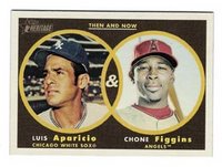 Now, don’t get me wrong. I’m not so one-sided in this opinion not to overlook the great Venn-diagram design they’ve got going with the Then & Now insert set. It’s a clean-looking card, upbeat in the way that the original cover of Kerouac’s On The Road is upbeat: kind of jazzy, kind of hip, kind of modern. But Then & Now is an insert set, and as a collector I’m not really buying packs to build the T&N set; it’s the base set that I have to be into.
Topps fails (and failed in the 2005 Heritage set as well) because they are not true enough to the original look of the set. They lucked out that for most of the 1954 set, real photos were used. That’s why the 2003 Heritage set is so utterly fantastic: even though the Heritage cards are smaller today than the original set, you get the impression that you could have opened a 5¢ pack in ’54 and found this card of Alfonso Soriano. The same can be said of the 1955/2004 sets: real photos were used, and truthfully, headshots are hard to screw up. But screw up they did in 2005 and now here in 2006. The 1956 set had a colored pencil look to the images: the cheeks are rosier and the backgrounds look like faithful artist renditions of their photographic counterparts. Its Heritage design counterpart doesn’t employ the same dramatic-line approach and thus loses its credibility. It’s almost like the cards are too clean. I’m also not a fan of denoting
  anywhere on a card that something is a trademark symbol of Major League Baseball. I get it, but it ruins the overall aesthetic of the card. I would even recommend that Topps removes its own logo from the front of the Heritage cards: die-hard collectors (whom I would guess makes up the core audience for these sets) can recognize the design by just one element of the design. For example, if you showed just the black box and white lettering of a card, any collector worth their salt can tell you it’s from the ’51 Bowman set. We don’t need to be reminded who makes the cards: the designs themselves are the cornerstones of the hobby. Maybe in twenty-two years when they come out with Heritage ’79 then Topps can put their logo on the card fronts and it will make sense.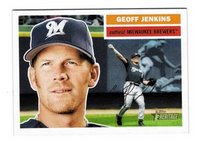
You’d think that because Topps chose to use real photos in 1957 (as well as move to the modern standard card size) then its Heritage homage would be a smashing success because there would be very little the designers could do to screw it up, right? Well, they manage to find a way.
In 1957 there were basically two front photos: the close-up (of which there are varying degrees) and the pose. In 57 Heritage, there are three basic fronts (from what I’ve seen): the close-up (of which there are varying degrees), the pose and the action shot. Why are there action shots? Frankly, what made the 57 Williams and Mantle cards so iconic (and boring and lousy photos) was that they were posed on the sidelines. Off the top of my head, I can’t think of one even posed action shot in the 1957 set. Therefore, to be true to the original design there should not be action shots anywhere in 57 Heritage. Topps has the option of using action shots in the insert sets, and in fact that would make a compelling insert set: the best action shots from the Sporting News from 1957 and 2005.
 Let’s look at two pairs of cards for comparison. Starting with the Camilo Pascual from the original 1957 set, the first thing you notice is that the colors are rich; his skin tone looks natural. Also, there is one point of light in the photo: off-frame to the right from the sun. In comparison, this Cliff Floyd from the 57 Heritage set looks like there are a few different sources of light: behind him, to the right of him, and a very strong flash from the photographer’s camera directly in front of him. Floyd looks washed-out (this is really my biggest critique of the 57 Heritage set: there seems to be an aversion to color at Topps HQ; every color from the 57 Heritage base set is washed out. It’s a goddamn shame, too, because with richer color this set would have more credibility in its homage to the original),
 and his face looks flattened. There’s no depth to the photo. I think the issue of depth could’ve been addressed better if the background was more dynamic. Is that a highway overpass behind Floyd? And who chose to photograph him on an overcast afternoon? One of the great things about the original set was the play between the rich tones of the photos, the colorful typeface for the name, team and position and the clean white border on the front. This dynamic is rendered useless on Floyd’s card (and a lot of others in the 57 Heritage set as well). I mean, does Topps want me to get a migraine from looking at this set? Cause I’m almost there.
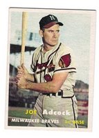 In the second comparison, let’s start with the Joe Adcock card from the original set. He looks like he just climbed out of a cigarette ad or at least down out the cab of his tractor-trailer. Now, maybe it’s just that he’s old when this photo was taken…wait a minute…it says on the back that he was born in ’27, so that means he was only 30 when this photo was taken! That’s crazy! He looks like he’s at least old enough to have weathered the Dust Bowl by barnstorming through the Rockies with other players with nicknames like ‘Crazy Legs’ and ‘Red’ in an old jalopy. Anyway, his jaw line is impressive, and his pose is dramatic. The background is recognizable as an actual ballpark, and the colors are deep, rich and warm. The lines are clean and there is no difficulty in telling where he ends and the background begins. Unfortunately, the same cannot be said of the Miguel Cabrera card from the 57 Heritage set.
And that’s another thing that really kills me about this set: there seems to be a fuzzy border separating the player from the background. What gives? Not only are the colors washed-out, the backgrounds almost the same value as the players and the action shots uncalled for, but who the hell made the decision for a weirdly fuzzy yellow border around the player? It makes the set look like an amateur assembled it in his basement. And if that amateur were me, I certainly would not have included that fuzzy border. I also would’ve unearthed an old camera and some old film and taken the photos so that they’d look like those of the original set.
On the backs, Topps has used a darker cardboard for the 57 Heritage set, cutting down on visibility. And because of the legalese fine print, the overall printed space on the back is smaller by at least 1/16th of an inch, which is a pretty big change when space is as limited as on the back of a baseball card.
Dear Topps, can’t you see how mad all of this makes me? You have all this money and the chance to make a great set that collectors will cherish for their whole lives and you don’t care enough to make it great! It’s one gigantic opportunity to waste, and that is just so disappointing.
Likewise, there’s nothing more disappointing than having high hopes for a set that doesn’t invoke excitement and could be, in fact, a real dud. 1991 Donruss comes to mind, as does 1991 Fleer…actually almost every set from 1991 fits into this category. That’s why it brings me great pains to say that the Topps Heritage set (with the 1957 design) is a real dud.
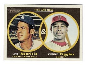 Now, don’t get me wrong. I’m not so one-sided in this opinion not to overlook the great Venn-diagram design they’ve got going with the Then & Now insert set. It’s a clean-looking card, upbeat in the way that the original cover of Kerouac’s On The Road is upbeat: kind of jazzy, kind of hip, kind of modern. But Then & Now is an insert set, and as a collector I’m not really buying packs to build the T&N set; it’s the base set that I have to be into.
Topps fails (and failed in the 2005 Heritage set as well) because they are not true enough to the original look of the set. They lucked out that for most of the 1954 set, real photos were used. That’s why the 2003 Heritage set is so utterly fantastic: even though the Heritage cards are smaller today than the original set, you get the impression that you could have opened a 5¢
 pack in ’54 and found this card of Alfonso Soriano. The same can be said of the 1955/2004 sets: real photos were used, and truthfully, headshots are hard to screw up. But screw up they did in 2005 and now here in 2006. The 1956 set had a colored pencil look to the images: the cheeks are rosier and the backgrounds look like faithful artist renditions of their photographic counterparts. Its Heritage design counterpart doesn’t employ the same dramatic-line approach and thus loses its credibility. It’s almost like the cards are too clean. I’m also not a fan of denoting
 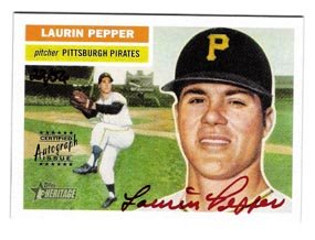 anywhere on a card that something is a trademark symbol of Major League Baseball. I get it, but it ruins the overall aesthetic of the card. I would even recommend that Topps removes its own logo from the front of the Heritage cards: die-hard collectors (whom I would guess makes up the core audience for these sets) can recognize the design by just one element of the design. For example, if you showed just the black box and white lettering of a card, any collector worth their salt can tell you it’s from the ’51 Bowman set. We don’t need to be reminded who makes the cards: the designs themselves are the cornerstones of the hobby. Maybe in twenty-two years when they come out with Heritage ’79 then Topps can put their logo on the card fronts and it will make sense.
You’d think that because Topps chose to use real photos in 1957 (as well as move to the modern standard card size) then its Heritage homage would be a smashing success because there would be very little the designers could do to screw it up, right? Well, they manage to find a way.
In 1957 there were basically two front photos: the close-up (of which there are varying degrees) and the pose. In 57 Heritage, there are three basic fronts (from what I’ve seen): the close-up (of which there are varying degrees), the pose and the action shot. Why are there action shots? Frankly, what made the 57 Williams and Mantle cards so iconic (and boring and lousy photos) was that they were posed on the sidelines. Off the top of my head, I can’t think of one even posed action shot in the 1957 set. Therefore, to be true to the original design there should not be action shots anywhere in 57 Heritage. Topps has the option of using action shots in the insert sets, and in fact that would make a compelling insert set: the best action shots from the Sporting News from 1957 and 2005.
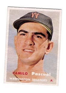 Let’s look at two pairs of cards for comparison. Starting with the Camilo Pascual from the original 1957 set, the first thing you notice is that the colors are rich; his skin tone looks natural. Also, there is one point of light in the photo: off-frame to the right from the sun. In comparison, this Cliff Floyd from the 57 Heritage set looks like there are a few different sources of light: behind him, to the right of him, and a very strong flash from the photographer’s camera directly in front of him. Floyd looks washed-out (this is really my biggest critique of the 57 Heritage set: there seems to be an aversion to color at Topps HQ; every color from the 57 Heritage base set is washed out. It’s a goddamn shame, too, because with richer color this set would have more credibility in its homage to the original),
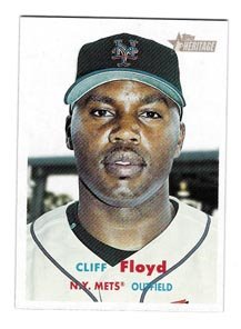 and his face looks flattened. There’s no depth to the photo. I think the issue of depth could’ve been addressed better if the background was more dynamic. Is that a highway overpass behind Floyd? And who chose to photograph him on an overcast afternoon? One of the great things about the original set was the play between the rich tones of the photos, the colorful typeface for the name, team and position and the clean white border on the front. This dynamic is rendered useless on Floyd’s card (and a lot of others in the 57 Heritage set as well). I mean, does Topps want me to get a migraine from looking at this set? Cause I’m almost there.
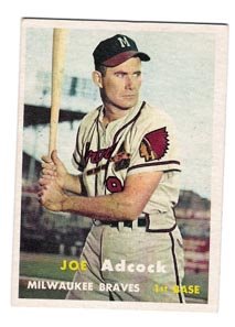 In the second comparison, let’s start with the Joe Adcock card from the original set. He looks like he just climbed out of a cigarette ad or at least down out the cab of his tractor-trailer. Now, maybe it’s just that he’s old when this photo was taken…wait a minute…it says on the back that he was born in ’27, so that means he was only 30 when this photo was taken! That’s crazy! He looks like he’s at least old enough to have weathered the Dust Bowl by barnstorming through the Rockies with other players with nicknames like ‘Crazy Legs’ and ‘Red’ in an old jalopy. Anyway, his jaw line is impressive, and his pose is dramatic. The background is recognizable as an actual ballpark, and the colors are deep, rich and warm. The lines are clean and there is no difficulty in telling where he ends and the background begins. Unfortunately, the same cannot be said of the Miguel Cabrera card from the 57 Heritage set.
 And that’s another thing that really kills me about this set: there seems to be a fuzzy border separating the player from the background. What gives? Not only are the colors washed-out, the backgrounds almost the same value as the players and the action shots uncalled for, but who the hell made the decision for a weirdly fuzzy
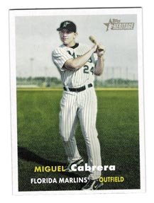 yellow border around the player? It makes the set look like an amateur assembled it in his basement. And if that amateur were me, I certainly would not have included that fuzzy border. I also would’ve unearthed an old camera and some old film and taken the photos so that they’d look like those of the original set.
 On the backs, Topps has used a darker cardboard for the 57 Heritage set, cutting down on visibility. And because of the legalese fine print, the overall printed space on the back is smaller by at least 1/16th of an inch, which is a pretty big change when space is as limited as on the back of a baseball card.
Dear Topps, can’t you see how mad all of this makes me? You have all this money and the chance to make a great set that collectors will cherish for their whole lives and you don’t care enough to make it great! It’s one gigantic opportunity to waste, and that is just so disappointing.
Subscribe to:
Posts (Atom)