Sometimes I wonder about how much influence bloggers have on card companies—if any at all. If card bloggers focused every post for a month on old Sportflics sets, would the manufacturers find a way to include a bevy of lenticular cards in their sets next year? Logic says probably not... but what if the topic was cards of the 1980s? Would manufacturers find a way to include throwbacks in next year's sets?

But first let's talk about the front end of the checklist. The checklist includes an array of old and new stars mixed indiscriminately. Babe Ruth, Roberto Clemente, Ty Cobb, Mickey Mantle, Tom Seaver, Stephen Strasburg, Albert Pujols, a Yu Darvish rookie, yadda yadda yadda. I get it. The checklist itself isn't what intrigues me. What makes me sit up and take note is why Topps limited the design choices for the first 200 cards. Topps has scores of great designs scattered across its history, designs that go well together when mixed. But if you put the base set in pages, you'd have five and a half sheets of 1954, five and a half sheets of 1971, five and a half of 1980, and then five and a half of 1984. Not randomly dispersed; all in a row.
One of my theories is that Topps sees this product as a new-card collector's measured introduction to the back catalogue. When I was a little kid, I remember my oldest card was a 1978 Topps Doug Ault (before I started going to shows at the Watertown Mall). I don't know how I got it, but I cherished it. And it was one of the only cards I had that was made before 1986. Granted, new-card collectors in 2012 are inundated with classic designs: Allen & Ginter, Topps Heritage, Gypsy Queen, Topps Lineage...and dime and quarter boxes are full of "retro" cards made in the last 10 years. Old designs—or new designs with old-design tweaks—are everywhere. But that doesn't mean all collectors see them, especially those whose "local dealer" is a Walmart or Target only stocked with the latest Bowman Chrome or Topps Series 2. By dividing the base set into four equal 50-card quarters, the 1954, 1971, 1980, and 1984 designs are drummed into the collector's brain, elevating them to a higher design-worship plane.
Another of my theories is that these four designs are at different stations of worship within the Topps' company walls. There seems to be a definite official hierarchy of classic Topps designs. The no-brainer is that Topps values its 1952 design the highest, with 1954 and 1953 as a close second and third. After that it's anybody's guess. I'm basing this theory on a very unscientific method: totaling the number of times the company uses a given design in a retro-themed product, insert set, or individual card within a mixed-design set. This calculation deserves its own post, with a universe measured from 1991 to the present, but for now I'll stick to the instances I can think of off the top of my head. And by "retro" design, I mean those designs made for sets between 1951–1990.
1952: Reprint set (1983); 2001 Topps Heritage; 2006 Topps '52 Rookies; Mickey Mantle Hero Worship (various years)
1953: Topps Archives: The Ultimate 1953 Set (1991); 2002 Topps Heritage; Topps Gallery Heritage
1954: Topps Archives 1954 (1994); 2003 Topps Heritage; 2012 Topps Archives; a thinly veiled interpretation was used by Fleer for its Tradition set in 2000
Other years: Designs from 1955–1963 have been used for Topps Heritage products from 2004–2012; Topps' Big Baseball in 1988–1990, as well as 2001 Fleer Tradition, were homages to the 1956 design; Upper Deck used basic facsimiles of the 1963, 1965, and 1971 designs for its Vintage line from 2001–2003; Topps Archives, Topps All-Time Fan Favorites, and various eTopps and insert sets from across the last 15–20 years
From thinking about this theory over the last few days, my hypothesis is that 1964 is the least-used (and therefore least officially loved) of the classic Topps designs, with a bottom five of 1964, 1970, 1973, 1982, and 1989. Again, this is just a guess; a more formal tally would reveal totals. But if my hypothesis proves true, 2013 Topps Heritage will be very interesting.
But back to the base cards of 2012 Archives. Elevating these four designs begs the question: Do these designs deserve to be worshipped? I've written a lot already about the 1980 and 1984 designs (see here and here), and 1954 is in the Topps Pantheon of Great Design. But 1971? With the smushed sans serif and simple black borders?

1971 is a tough set to put together in any condition. From what I've seen, prices on individual cards are higher than the year before it and the year after it. I mean, how can you explain that Munson's second-year card from 1971 is worth more than his rookie from 1970? You can count examples of a second-year card out-valuing a rookie on one finger: 1952 Topps Mickey Mantle. 1971 was also the first year that action photos made their way onto individual player cards, not just World Series or historical highlight subsets. This was a fairly large improvement after years upon years of faces and posed sideline shots.
But is 1971 worthy? Or is it just that the design is so markedly different from any other vintage design that it warrants an inclusion? I'm not sure of the answer.
Now to the inserts. Stuck on the end of the base set checklist are 40 short-printed cards numbered from #201–240. These are cards of inactive stars, Hall of Famers, and fan favorites. Each player is featured on a vintage design from their respective playing days, with a different photo used from the one on their original, vintage card. (I believe this practice was first used by Topps in their All-Time Fan Favorites set from 2003/2004.)
Then there's a gold rainbow foil parallel of the base set, a reprint set stamped with a tiny gold "Topps Archives" stamp, a Classic Combos set, a 1982 In Action set, a 1977 Topps Cloth Sticker set, a 1969 Deckle Edge set, a 1968 3-D lenticular set, a 1967 giant-head peel-off-sticker set, and relic and auto cards. The relic cards use the 1956 design, and the autos are on mini, framed 1983 cards. There are also high-end autographs on original cards of retired stars like Frank Robinson, Sandy Koufax, Willie Mays, and Bob Gibson, to name a few, an autographed Yu Darvish rookie, and an autographed Bryce Harper card. There are also a couple buy-backs, a six-signature "book" card, a weird hand print of Uncle Fester, er, Cal Ripken Jr., totally bizarre cards autographed by the villains from The Karate Kid as box loaders, and Topps Vault items. Am I leaving anything out? Oh yes, cut signature cards by "entertainment stars of the 1980s," which I hope includes Harvey, the announcer from Double Dare, and Kurt Loder of MTV News. If there's a Kurt Loder autograph floating around out there, I might be tempted to buy a box. In fact, here's my wish list of "entertainment stars of the 1980s":
• Harvey the Double Dare announcer
• Kurt Loder of MTV News
• "Weird" Al Yankovic
• Maxx Headroom (I don't care that he's not real!)
• The Million Dollar Man and Virgil
• Manimal
• Daryl Hall and John Oates
• Robocop
• Scott Baio
• The Bundys from Married... With Children
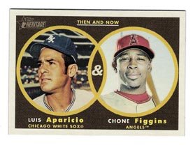
(Not to be outdone, I pulled a Shawon Dunston autographed card in my pack. Sidebar: When I was a kid—actually, even now—I'm not sure how to pronouce "Shawon." I mean, I think it's pronounced like "Chone," which is to say, like "Sean." But sounding it out it's definitely "Shuh-wahn." Which is not exactly a bad thing. Better than "Chone," which I always mistakenly pronounce "Chone.")
A set's base set checklist has to be strong, and the base set card design has to be strong for me to even consider a set to be worth collecting. This installment of Topps Archives passes both tests, as we all knew it would. How can you argue with classic designs and a checklist that encompasses (many of) the best players of the 20th and 21st centuries? I also like that the checklist is manageable: at 200 cards—240 with all the SPs—you aren't inundated with multiple Nolan Ryan cards, or Mickey Mantles, or Barry Bondses. Hey, speaking of which, where is Barry Bonds? A lot of "fan favorites" aren't here, guys like Garry Templeton, Chet Lemon, Joe Carter, and Fred McGriff are just a few that come to mind. And as long as we're talking about the negatives of this set, the card stock is not great. The stock is closer to that awful Lineage set from last year than it is to the Archives set from 2001. Which is a shame, because while they finally got the fronts and backs right, they didn't go all out and print them on old-school cardboard. Was Topps scared that collectors were going to confuse these new cards with the originals? Hard to explain the rationale on this decision, but it hurts the set.
Grade: B+


 There's a common misconception about baseball players: that those who toiled before Andy Messersmith's monumental free agency ruling did so simply out of 'love of the game.' That because they didn't make millions of dollars, the players were happier and the game was simpler and more innocent. This couldn't be farther from the truth. The fact of the matter is that men played this game not because they loved it but because their skill at it allowed them to escape going down the mines, or puddling steel, or being farmers, or anything else.
  Before I get into how much I like 1959 Topps (it’s by far the most brilliant Topps design of the early years, embracing jazz, beat, and a post-modernist pop culture sensibility within the staid, confines of baseball; plus it’s one of the few American card designs that was blatantly copied for a Japanese card set (1967 Kabaya Leaf, image shown from


 I’ve written about Upper Deck before at great length, but when they burst onto the scene in 1989, they got so many things right that the normal learning curve just didn’t apply. They led their sets with (and thus showcased) rookies. They included special cards, cards with fun, offbeat photography, artistic cards and holograms—lots of holograms. And they built on their success the very next year with randomly-inserted autographed cards, insert cards and more of what made their 1989 product great. Sure, they made a helluva lot more of the cards in 1990 and the set wasn’t career-defining, but it helped set the table for the company for the next few years. Their forward-thinking mentality helped them nearly corner the certified-autographed sports memorabilia racket and carried them into the 21st century. Round about this time, Donruss lost their license from Major League Baseball, Upper Deck bought up what was left of the Fleer imprint after the company went bankrupt and many of the other early-Nineties competitors fell by the wayside. Coming into 2007, the landscape is again sparsely populated, with only Topps and Upper Deck producing licensed sets. So far the two companies have released at least eight product lines between them, with many more on the way (there were 38 different product lines produced in 2006, not counting the scores of insert sets available as well).
  Then I found that Kmart sold ‘fat packs’ which are essentially rack packs, as you get 32 cards for $4.99. So I ended up buying 3 fat packs. I’m not entirely disappointed in my pulls, as I understand that you pay a premium for hobby boxes because you’re basically paying for the chance for the big insert pull, and that was really not what I was looking for.
 That’s really all there is to the front of the base card. Slap a Fleer logo on it and you’re done. And you know what? It’s not that bad. In fact, I kind of like it. The only bad thing about the base set is that there are no posed sideline or headshots—all cards feature action shots. As for the positives, let’s look at the design a little closer: they’ve chosen a dull coat gloss for the front and a matte finish for the back, the trademark Fleer clean white border is present, and the design is pretty straightforward. Topps’ 2007 offering—with its little boxes, silver foil stamp and facsimile autograph—is bells and whistles in comparison to Fleer. This base set is decidedly no-frills, which is very nice.
 The In The Zone cards are possibly the ugliest insert card of the year so far, and that’s including Topps’ Alex Rodriguez Home Run History set, which are hideous. The Year in Review cards should not be an insert set at all, but a subset in the base set. The card I got of Bobby Abreu isn’t that bad, but it looks like the designer didn’t know where to ghost-out Abreu’s photo and bring up the celestial calendar background. It ends up looking a little muddy, but a good idea for design. But perhaps the worst idea for an insert set is the parallel set, which is basically the base set without the white border. I’m going to call them Little Cards. I think they’re dumb. If Fleer wanted to put out a little set and have it be exactly like the regular set, why didn’t they also issue little packs and little blaster boxes? Then it would’ve at least been more collectible, a la the 1975 Topps Minis. Instead collectors are faced with the prospect of a parallel set with no redeeming value except that the cards are missing their border. Besides, what’s the point of paying a premium on a card if anyone with a pair of scissors can turn a regular card into a parallel? The Little Cards get the thumbs down.

 This set feels perfect for young collectors, as insert cards are being distributed almost as freely as cards from the base set (I pulled 17 insert and parallel cards out of a total of seven packs), players from the same team are checklisted next to each other, and there seems to be a healthy dose of rookie cards that are readily accessible within packs (the packs I bought said that they contained at least two rookie cards on average). Plus, how can you go wrong with a set that calls every team by its nickname except the Rockies, which it calls the ‘Colorado Rockies’? I mean, c’mon, how great is that?
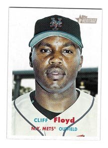
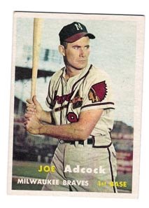
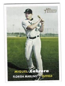
 How many more years can Topps do the Heritage line? You have to think they’ll do it as long as it makes them money, right? Or is it more of a question of design? I’d like to think it’s the latter, that at a certain point they’d stop (after the well of classic design runs dry). So how many more years? Well, they’re set for now, because this set is almost flawless, a huge improvement from last year’s Heritage ’57 (and I’ve always been a much bigger fan of the 1957 design than 1958). Topps had stellar design years in 1959, 1960 (to a certain degree), 1963, 1965, 1967, 1968, 1971, 1972, 1977, 1978…but Upper Deck compromised more than a few of those years with their own rip-off Vintage line, and do we really need or want Heritage ’78?
  This set—one of the strongest Heritage sets in years—represents Topps at the top of their design arc of the 1950s-1960s. Gone are the unneeded (and historically inaccurate) action poses. Instead: lots of close-ups and medium close-ups. Now I know beyond a doubt that not only does Jeff Weaver look exactly like Zach from Gilmore Girls, but he will probably fight you if you tell him. Gone is the washed-out photography that seriously marred last year’s Heritage ’57 set. Taking their places are strong colors: from the better-quality photography to the iconic solid color background; even the backs feel stronger than last year’s. The deep red may be a little hard to read in low light, but for some reason when I read them I get the strongest urge to learn how to chew tobacco. This is also odd, because I’ve always considered 1958’s design to be the most elemental Topps ever produced, almost to the flash-card degree. Like all great art, it’s all things to all people: elegant, abstract, simple, international, clean, crisp, modern, and yet I find it very pre-school (I think it would be fascinating to track down some of the old Topps designers and have them explain how they went from the almost no-design design of 1958 to the ultra modern, beatnik, jazz-record-and-advertising design of 1959. The two years couldn’t be more different. I almost expect the explanation to be that there was a change in art department leadership). Because today’s Topps designers didn’t muck around with the base card design (or any aspect thereof), it works.


 They should really do a design overhaul on this one, and while they’re at it, they should re-evaluate where they’re getting their images. This one of Kaline is obviously taken off his 1967 card. Not even the right decade! How dumb do they think we are?
  At least in the Mantle set’s defense, it commemorates his 1958 home run title and it’s printed on the same stock as the set, so it sort of fits. But the Rodriguez cards have nothing to do with anything, plus they are printed on thin glossy stock. They feel out of place in Heritage packs, like Topps got the target audience wrong. They’re as bad and feel as worthless as the Hobby Masters from last year’s Series 2 hobby packs.
  one thing holding me back from going for the master set (I’m 11 cards shy of the master Heritage ’54 set), and it’s this: in 1958, card #273 featured Hal Smith of the Cardinals. Smith, possibly to stem the tide of questions about who was who between the two Hal Smith’s, possibly because he was just having fun or was out of his mind, had his photo taken with his mask on. It’s one of the greatest cards ever. He’s even giving a sign, which to a little boy might look like he’s gesturing inappropriately. I don’t know, but I’m pretty sure he’s smiling, and it sure as hell is creepy. That’s why I’m crossing my fingers that there’s a card of Joe Mauer or Jason Varitek with their mask and pads on, hopefully giving an equally inappropriate-looking sign. Then I’ll know it’s okay to dive in head-first.
 I went out to the Babylon Sports Memorabilia Show on Saturday in Babylon, New York. And while I ended up with really great steals (more on those later), I spent my twenty bucks and made the rite the passage into spring—4 packs of Topps and 3 packs of Heritage. And I have to say that I’m both under- and overwhelmed. I guess the most accurate term is ‘whelmed’. I’m whelmed by 2007 Topps products (so far). Let’s get right to it.
 Take a look at the front and back of this Francisco Cordero card (my first card of the season). Besides the fact that his Rangers uniform is now magically a Brewers jersey a lá the Apple iPod Shuffle TV ads, and that he doesn’t seem to know how to spell his own name (‘Francico Cordero’ = signature), notice how on the back there’s that awkward black bar taking up the left fourth of the card. There’s Coco’s little block of a headshot. OK, now, that black bar provides enough room for a much larger photo, framed in an oblong rectangle, or maybe an artistic take on the team logo, or at least a series of blocky shots, like frames from a filmstrip or something. The way they’ve got it now, it’s just wasted space. Plus, it’s black, so unless Sharpie invents a white marker, kids aren’t going to use that back bar as an autograph panel.
  Daryle Ward In the 1987 set, Dion James was shown in his Yankees uniform but his team logo was Toronto. So, given Topps’ history of trying to stay on top of things, that one was understandable, even if his stats never reflected the change in teams. So explain to me how—or maybe why is the better question—did Topps think it would be a good idea to put Ward in a Cubs uniform, actually swinging a bat, supposedly in live game play? His stats don’t suggest he even played one game for the Cubs, and he played for two teams in 2006: the Nationals and the Braves…fun fact, Daryle Ward is from the same town in California as Weird Al Yankovic.
 Mike Redmond Man, that’s two back-up catchers. In one pack.
 Let me start by saying that I haven’t really collected basketball cards since 1993. I think my last major purchase of that era was a box of Upper Deck’s 93/94 Series I and I just wasn’t impressed enough to continue collecting the sport; Topps had just introduced Finest onto the scene and everything was headed towards the same mid-Nineties blah that engulfed baseball cards: too many sets, too many inserts, expensive packs, and one or two exciting rookies but mostly heaps of garbage.
  Topps seems to have had an inside man working for the NBA last year, because almost 95% of the base card photos feature a player skying for a rebound, slamming home a killer dunk, or in mid-flight somewhere around the basket. It’s obvious that Topps had access to a camera directly behind the backboard, though there are some other shots (Matt Harpring’s card comes to mind), where it wouldn’t surprise me if Ethan Hunt took the photos while suspended from a guy wire sixty feet above the court at the Delta Center.
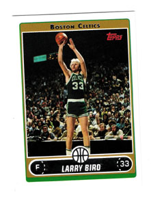
 Here’s another interesting thing about this set. Topps seems to need a father-figure/hero to worship. In baseball it’s Mickey Mantle. I don’t know who it is for football or hockey. For basketball it’s Larry Bird. This set features a great Larry Bird 'Missing Years' insert set where they take each year’s baseball design from 1982 to 1991 and give Bird a card. It’s a simple, winning idea, one that I hope they do for their hero worship player next year (it could work nicely for Magic or Dominique, who were both around for all of the 1980s). This insert set may actually be the sole reason for me to continue to buy packs of this set and may end up as my insert set of the year, regardless of sport. Plus, it's a nicer baseball/Bird tie-in insert idea than Bird's weird insert from the 1994 Ted Williams Baseball card set of Larry hunched over playing shortstop in what looks like either high school or college (or an early-Eighties Celtics charity softball game).