You've caught me in a lyrical mood tonight. Maybe it's the chilled autumn air of my walk home from work tonight. Or maybe it's that we're finally able to tuck away our political differences and focus on the season of giving.
And as far as giving is concerned, I've decided to give myself more time to write. About what, you ask? Why, those cardboard rectangles that so dominate my life. Yes, many years have passed since we thrived here together, but lo, the cardboard sea calls to me still.
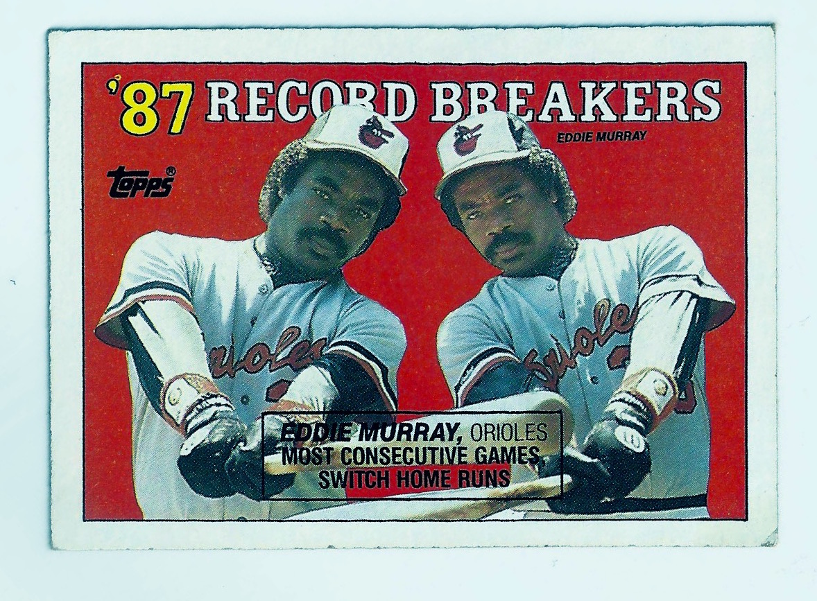
I saw a friend yesterday and he expressed interest in putting together a vintage set from childhood. Of course, he's not alone in this idea—like clockwork, you hit a certain age and find yourself on eBay, buying boxes of 1987 Fleer, or 1991 Topps Stadium Club, or whatever your Holy Grail set was when you were 8 years old.
The conversation got me thinking... Is that all there is? Endless pining over the card or set that got away? The one we couldn't afford on a $4-a-week allowance? Maybe so. But I've known and loved a lot of sets over the years, and, like some of you, never threw away my cards or had a parent who did. I've bought and sold sets, given away thousands upon thousands of cards to strangers and friends, and made lopsided trades just to empty my collection down to the barest of bones. (And I've documented most of it, over the years, on this blog.) So for me, the existential hole that only owning Will Clark's rookie card might
fill is not so very big. In fact, it may not be there at all. But to my friend, that hole is very real, and a couple Will Clark and Bo Jackson rookies would help fill it in quite nicely, thank you very much.
We talked about which set to collect. For him, it's the greatest hobby hits of the 1980s: 1983 Topps, 1984 Donruss, 1987 Fleer. For me, it was a bit more complicated: 1977 Topps, plus the cloth cards, the regional Burger King Yankees set and any additional O-Pee-Chee cards featuring players in different unis, photos, or teams. And I'd probably create my own customs once it was all said and done.
Talking out loud about collecting a new set got me excited, but it also got me thinking about what sort of collector I really am. My friend was excited by the idea of buying packs until he had completed a set that had eluded him as a kid. I was going on a more complicated, multi-step track: buying individual packs would probably be too cost-prohibitive. My route to a complete mini-mega-master set was going to be a series of eBay wins, Sportlots.com bulk purchases, and possibly a few cards picked up at a show or through my trading group.
I'm staring at that last sentence. Maybe to rekindle my love of collecting is just completing a set I can still buy in packs, or boxes. There are so few sets I'd want to collect from my childhood that I don't already have. I can count them on one hand: 1989 Topps, 1989 Score, 1985 Topps, 1994 Fleer. This friend and I have done Junk Wax Battles in the past, and those were a lot of fun. Maybe what I need is a true junk wax set... 1991 Fleer? The ugliest banana-yellow cards you've ever seen? Or all 10,000 cards from 1991 Score? If I'm going to do a junk wax set, it's got to have subsets, so that rules out 1990 Upper Deck and 1991 Fleer, despite the Pro Visions. Maybe 1990 Topps? I hated those cards as a kid, but 9 Nolan Ryans and a Greg Vaughn Future Stars card can't be wrong (plus all those recent Archives cards!)...

November 07, 2016
February 16, 2016
Help Me Choose My Next Set: 1990s Edition
There's really nothing like collecting a new—or new to you—set. I'm just putting the finishing touches on 1988 Topps baseball (only six cards to go!) and now I'm itching to start another. I've got it narrowed down to two possibilities: 1991 Topps Stadium Club baseball or 1992-93 Topps Stadium Club basketball.
I never collected either when I was a kid; both were too expensive. Fast forward 25 years and you can still find unopened wax for under $20 a box (what an investment that turned out to be!). Here are the pros and cons of each set...

1991 Topps Stadium Club baseball
As Topps's first foray into super premium design and materials, 1991's TSC had an undeniably great design on both front and back. It was also the first Topps baseball product to be released in more than one series in 18 years (last multi-series Topps baseball set was in 1973). There was a card of Nolan Ryan wearing a tux. For no good reason. (Collection idea: Guys in tuxedoes. There are a ton of cards depicting players in formal wear, for some reason most of them produced in 1991.) The backs featured an inset of that player's Topps rookie card. This was especially great when that player's rookie card was his 1991 Topps Stadium Club card. My 12-year-old self really loved the crap out of this ripple in the spacetime continuum. The photography is fantastic, and with full-bleed photos without borders, getting a miscut card is a really big deal (no borders mean miscuts are obvious; an excellent prospect for miscut collectors like me).
There are few drawbacks to this set. Foremost are the head-scratching data splits on the card back. Second, because the cards are basically just 25-year-old color photos, the cards stick together. Also, there are only 600 cards in the whole set, which means the last of the scrubs won't have cards. Also, there are few rookies (Bagwell, Luis Gonzalez) and no Chipper Jones.
1992-93 Topps Stadium Club basketball
I only purchased two packs on these when I was a kid, since packs were insanely expensive. Now you can buy a jumbo box of series two for $40. The photography is exquisite. The backs feature "rookie cards," which is self-defeating, since Topps did not create basketball cards from 1983 to 1991. Conversely, the actual rookies in series two are great, as the 1992 draft was hobby-defining for the 1990s: Shaq, Alonzo Mourning, Christian Laettner, Jimmy Jackson, Harold Miner, Walt Williams; even Latrell Sprewell. The checklist is robust at 400 total cards, which is especially deep for a pre-Toronto/Vancouver NBA expansion set.

And series two featured the ridiculous "Beam Team" insert, which was meant to highlight a laser-light extravaganza shown at halftimes of select NBA games and instead became the hottest insert of the early 1990s. Man, how I wanted those cards! And I don't think I ever even actually saw one in real life, just in Beckett.
The drawbacks are similar to those of the baseball set: clumped card stock, data points that make no sense to little kids, and the aforementioned non-rookie rookie cards.
So now I leave it up to you...
February 15, 2016
Happy Presidents' Day: 1967 Topps Who Am I?
Let's celebrate Presidents' Day with one of the weirdest little sets from the Topps sixties: 1967's Who Am I? Released as a 44-card set, the first of two incarnations of the set featured its subjects under a scratch-off layer, like a lottery scratch ticket. The subject's name is printed on the card below the scratch-off question layer. (The second incarnation was 42 cards and did not feature the scratch-off layer.)
I'm not sure how I found out about this set, but I love it and have been trying to finish the set for a long time (only recently did I finally complete it). The fright wigs, the buck teeth, the cigars and clown makeup, the Hippie clothing, the sunglasses—it's all too much to pass up.
Much like Topps's earlier nonsports sets featuring famous figures from history, many of its subjects are U.S. presidents (13, to be exact), not to mention three first ladies. It also sprinkles in a few famous baseball players, including Sandy Koufax, one year after his retirement. So now, for your scrolling pleasure, sit back and enjoy the garish costumed wonder that is 1967 Topps Who Am I?
 |
| 1967 Topps Who Am I? - #1 - George Washington |
 |
| 1967 Topps Who Am I? - #2 - Andrew Jackson |
 |
| 1967 Topps Who Am I? - #3 - James Monroe |
 |
| 1967 Topps Who Am I? - #4 - Joan of Arc |
 |
| 1967 Topps Who Am I? - #5 - Nero |
 |
| 1967 Topps Who Am I? - #6 - Franklin Delano Roosevelt |
 |
| 1967 Topps Who Am I? - #7 - King Henry VIII |
 |
| 1967 Topps Who Am I? - #8 - William Shakespeare |
 |
| 1967 Topps Who Am I? - #9 - Clara Barton |
 |
| 1967 Topps Who Am I? - #10 - Napoleon Bonaparte |
 |
| 1967 Topps Who Am I? - #11 - Harry Truman |
 |
| 1967 Topps Who Am I? - #12 - Babe Ruth |
 |
| 1967 Topps Who Am I? - #13 - Thomas Jefferson |
 |
| 1967 Topps Who Am I? - #14 - Dollie Madison |
 |
| 1967 Topps Who Am I? - #15 - Julius Caesar |
 |
| 1967 Topps Who Am I? - #16 - Robert Louis Stevenson |
 |
| 1967 Topps Who Am I? - #17 - Woodrow Wilson |
 |
| 1967 Topps Who Am I? - #18 - Stonewall Jackson |
 |
| 1967 Topps Who Am I? - #19 - Charles De Gaulle |
 |
| 1967 Topps Who Am I? - #20 - John Quincy Adams |
 |
| 1967 Topps Who Am I? - #21 - Christopher Columbus |
 |
| 1967 Topps Who Am I? - #22 - Mickey Mantle |
 |
| 1967 Topps Who Am I? - #23 - Albert Einstein |
 |
| 1967 Topps Who Am I? - #24 - Benjamin Franklin |
 |
| 1967 Topps Who Am I? - #25 - Abraham Lincoln |
 |
| 1967 Topps Who Am I? - #26 - Leif Ericsson |
 |
| 1967 Topps Who Am I? - #27 - Admiral Richard Byrd |
 |
| 1967 Topps Who Am I? - #28 - Capt. Kidd |
 |
| 1967 Topps Who Am I? - #29 - Thomas Edison |
 |
| 1967 Topps Who Am I? - #30 - Ulysses S. Grant |
 |
| 1967 Topps Who Am I? - #31 - Queen Elizabeth II |
 |
| 1967 Topps Who Am I? - #32 - Alexander Graham Bell |
 |
| 1967 Topps Who Am I? - #33 - Willie Mays |
 |
| 1967 Topps Who Am I? - #34 - Teddy Roosevelt |
 |
| 1967 Topps Who Am I? - #35 - Genghis Khan |
 |
| 1967 Topps Who Am I? - #36 - Daniel Boone |
 |
| 1967 Topps Who Am I? - #37 - Winston Churchill |
 |
| 1967 Topps Who Am I? - #38 - Paul Revere |
 |
| 1967 Topps Who Am I? - #39 - Florence Nightengale |
 |
| 1967 Topps Who Am I? - #40 - Dwight D. Eisenhower |
 |
| 1967 Topps Who Am I? - #41 - Sandy Koufax |
 |
| 1967 Topps Who Am I? - #42 - Jacqueline Kennedy |
 |
| 1967 Topps Who Am I? - #43 - Lady Bird Johnson |
 |
| 1967 Topps Who Am I? - #44 - Lyndon B. Johnson |
February 11, 2016
Cards Without Borders: 2016 Topps

This is the first design for the flagship Topps set (not their other brands) in the company's 65-year history that doesn't feature some kind of border. Think about that for a minute. The design malaise of the white-bordered years (2008–2014) seems like a distant memory. Even last year's casual homage to the 25th anniversary of 1990 Topps seems quaint. Borders? That's so 2015!
Full-bleed photography is old hat for a lot of card brands, most notably Topps's own Stadium Club imprint (the brand debuted in 1991 with a bright, shiny, never-done-before design feature: full-bleed Kodak photography). But Stadium Club has always been seen as more of a premium than the eponymous brand.
Obviously, it's a dramatic shift for Topps. But it's also a natural next step, as the company had to find a way to marry the designs of its base tactile and digital products (Topps Bunt). It could make more Bunt designs look like traditional baseball cards. Or it could make its baseball cards look more like video game cover art. They went with the latter.
And you know what? There's absolutely nothing wrong with that decision. Though the photography looks heavily processed, the cards are attractive. Incorporating the stock-in-trade faux watercolor look Topps has long employed in its Allen & Ginter designs doesn't hurt, either. The glossy stock doesn't feel cheap, and the photos are a nice mix of in-game action shots and paused-action close-ups.
Even some of the inserts breathe with their own life: besides the trip-down-memory-lane retread (Berger's Best), the Stadium Club–esque "Perspectives" and position players as pitchers (Pressed Into Service) are fun ideas. The celebrities insert isn't bad (First Pitch), and the Cubs insert is okay, even though its subjects skew more toward the present-day roster than I would have liked (100 Years of Wrigley Field). These are all insert sets I would collect, though the Wrigley Field set gets me thinking: Why didn't they do something like this for Fenway Park's 100th anniversary in 2012? The only insert set that had me yawning was the one-two lineup punch of "Back 2 Back." The world doesn't need any more insert cards celebrating Ryan Braun.
Even some of the inserts breathe with their own life: besides the trip-down-memory-lane retread (Berger's Best), the Stadium Club–esque "Perspectives" and position players as pitchers (Pressed Into Service) are fun ideas. The celebrities insert isn't bad (First Pitch), and the Cubs insert is okay, even though its subjects skew more toward the present-day roster than I would have liked (100 Years of Wrigley Field). These are all insert sets I would collect, though the Wrigley Field set gets me thinking: Why didn't they do something like this for Fenway Park's 100th anniversary in 2012? The only insert set that had me yawning was the one-two lineup punch of "Back 2 Back." The world doesn't need any more insert cards celebrating Ryan Braun.

And don't get me started about parallels. On the whole, I think they're a waste of time, especially if they don't add anything to the design. In the packs I opened, I got a few rainbow foil parallels (not serial-numbered), a few "gold" parallels (numbered out of 2016), and an acetate "clear" parallel of Mark Melancon (numbered out of 10). The clear acetate parallel is a fun idea, and reminds me of a throwback from the mid-1990s. The other parallels, however, are not fun and remind me only that it would've been nice to receive a different card in my pack. I especially don't understand the logic of non-serial-numbered parallels. I think it would be much more enticing if the rainbow-foil cards were numbered out of 1,000,000 or whatever their print run happened to be. (Of course, the next logical step in this serial-numbering madness is for every single card to be serial-numbered. Oh, how I long for a Jered Weaver numbered 1,110,054 / 200,650,755! Every single stinkin' card would be unique...)
By elevating the look and feel of the base cards of the flagship set, Topps has done something that all 21st-century companies try to achieve: they've unified their brands. This is different from past years where all that separated Opening Day, flagship, and Topps Chrome was a logo and card stock. Base digital and tactile offerings look and feel similar, and low-end and higher-end tactile offerings incorporate similar, if not the same, design characteristics. For Topps, there's the hope that this diminishes attrition; not just losing customers to other card manufacturers, but to the company's real competition: video games, smartphones, and whatever else steals the attention and dollars of collectors.
Heavily Photoshopped cards without borders is just the beginning. Maybe the next step for the company will be an augmented reality app where you use the backgrounds of tactile cards to find "hidden" virtual packs of Topps Bunt cards in the real world. And so it may seem like a small thing, but I bet you that we won't see the return of a white—or any other color, tint, or hue—border anytime soon.
Heavily Photoshopped cards without borders is just the beginning. Maybe the next step for the company will be an augmented reality app where you use the backgrounds of tactile cards to find "hidden" virtual packs of Topps Bunt cards in the real world. And so it may seem like a small thing, but I bet you that we won't see the return of a white—or any other color, tint, or hue—border anytime soon.
February 02, 2016
The History of The Baseball Card Blog

Ten years seems like a good time for a recap. Here goes nothing.
The Baseball Card Blog was born in January 2006. My friends and I had been kicking around the idea of blogging about sports cards since summer 2005, but we only started posting after I bought a scanner. Even though we didn't know how long we wanted to write, or really what we wanted to write about, blogging seemed like a fun idea.
I remember being amazed that a Google search only returned one sports card blog (Stale Gum) in its results, and that its writer, Chris Harris, hadn't posted in years. Here was a gigantic, generation-defining hobby with zero presence on the Internet.
After I signed up for a Blogger account (pre-Google acquisition), my friends Rob and Josh helped me set up a template, as well as a commenting interface. I knew that the audience was out there, waiting for something like our blog, but I was not at all convinced that there would be enough traffic to warrant comments.
After posting a few entries, I started emailing other writers to get them to link to me. Guys like Aaron Gleeman and Jay Jaffe were supportive and general sports blogs helped spread the word too. Pretty soon, the blog was receiving almost 20 visitors a week. When I wasn't writing, I was watching traffic come in on my third-party traffic counter. Visitors from all over the country, staying on the site for more than five minutes at a time. It was awesome.
As January turned into February, I knew that I enjoyed blogging, and decided that I could write about pretty much anything I wanted. So I wrote some outlandish stuff with a lot of cursing, highlighted fantastic cards, cards of players with bushy facial hair, funny names and expressions, and generally lived it up for my own enjoyment. Then I emailed Bill Simmons.
 I first met Simmons in 1992, at the draft of my dad's fantasy basketball league. My dad has been in that league every year since, and Bill's ascension to noted sportswriter and media star has been a point of pride for many years. (If you want a good time, read Bill's draft diary from 1998 or so; I'm the "Fresh Fish" team. It's still out there on the Internet somewhere.)
I had emailed him for advice on how to approach writing. He was a prolific writer, and I thought a few nuggets of his wisdom would at least point me in the right direction. I also assumed that he was so busy that I'd never hear from him. Wrong. Tucked into one of his ESPN.com Page 2 links posts was a little sidebar about The Baseball Card Blog.
It was like someone turned on a faucet. Within minutes I had more readers than I had in the entire month of January. By the end of the week, the blog had more than 35,000 visitors. It was crazy. I knew that I would have to write more than a couple times a week, or the traffic would disappear. So I decided to blog and rank every major set produced in the 1980s. And tell more people about it. Jamie Mottram at Yahoo!, Will Leitch at Deadspin, and other sites (including something called "Whatevs") all linked, and in June Entertainment Weekly included The Baseball Card Blog on its "100 Websites to Bookmark Now" list. (I had been so excited that I showed the mention to my boss at the small arts marketing firm where I worked. She asked what kind of reward I got from this and I remember telling her that this was the reward.)
There were other media mentions, and more traffic, and I got to do an interview with a Chicago newspaper. I also met with one of the marketing directors at Topps. I remember going into the meeting thinking I could convince him to hire me as the official Topps blogger, then coming out defeated and angry at myself. Visiting the Topps HQ was really, really cool, and I was plied with free cards on my way out. All this attention was nice, but the best part was that I was no longer the only person actively blogging about sports cards and sports card collecting. Other blogs started popping up, and now, ten years later, there are hundreds and hundreds of blogs and social media sites and other new media platforms on which to read and talk about sports cards; it's great.
 Two thousand six turned into 2007, and I started to tire of posting so often. And although I loved fielding questions and hearing from fellow collectors, I was also sick of the hate mail, the passive-aggressive missives from other writers, the pleadings of others who needed me to write more often, and the stalkers. (There was at least one guy who would message me every single time I checked my email account; it was super creepy and it went on for months.)
To combat the doldrums, I helped launch a group blog (A Pack A Day) with many, many authors. I also did a short, unpaid stint with Beckett.com (pre-redesign) but the combination of work, blogging, and the endless, angry hate mail I received from Beckett.com readers really turned me off. (I remember getting one email from a Beckett reader who called me "As bad as Michael Vick"—then under investigation for dog fighting—because I didn't think the Canada box-loader insert in Allen & Ginter was that great.) So by the time 2008 rolled around, I was pretty much done with writing about sports cards.
By spring 2008 I had quit my job in NYC and moved back to Boston. I holed up in my bedroom at my parents' house and used my Quark XPress expertise to write and lay out The Baseball Card Book (never published, though I'm convinced it will be a best seller whenever it ends up being released).
In the summer of 2008, I completely, deliberately alienated the bulk of the blog's readers by adding a PayPal donation button to the blog, then actively encouraging people to give me money. It was a gross misstep, and I became a pariah in the now-robust sports blogging community, with an aggressive rival at the front of the pitchfork-toting procession, beating the drum to admonish me. He was right, I deserved it. It was a great way to disappear from blogging.
But then I started to get into custom cards. And after a few months away from blogging, I found I liked working with PhotoShop to create the cards I wished existed. I took a brief excerpt from A. Bartlett Giamatti's Green Fields of the Mind and threaded the text over a few Red Sox cards. It was fun. As a follow-up, I decided to adapt Casey at the Bat in the same style. It was also the perfect "last post" I had been looking for. It went up in December 2008. I was proud of it and promoted the hell out of it. Traffic had been steady at about 400 visitors a day since summer 2006, and with the promotion and links from more prominent sites like WSJ.com, FOX Sports, etc., traffic remained steady for all of 2009 without me typing a single entry.
I had entertained the idea of selling the blog in 2009, but because I never successfully monetized the site, the offer I got was embarrassingly low. And by January 2010 I was itching to write again. The year passed with many posts but not much fanfare. When 2011 arrived, I decided that The Baseball Card Blog would be a group blog. I invited Mike Kenny and Travis Peterson to join up and was ecstatic when they agreed to participate. Both are without parallel in their respective domains: Mike is insanely funny and Travis is probably one of the best custom card artists practicing today. I left Mike to do his own thing, but with Travis I collaborated on a few projects, including custom parody cards of Saturday Night Live cast members through the decades. As validation of our collective work, the blog was lauded as a Blog of Note by the folks at Blogger and Google in April 2011.
The years rolled on. Family life and jobs took precedent and frequent posts from Travis and Mike became occasional posts from Travis and Mike. I kept going down the rabbit hole with more and more custom cards, and then it all just petered out. The Baseball Card Blog welcomed its 1,000,000th visitor and I stopped counting quickly afterwards. Facebook became more important, and I started posting exclusively to the FB page I created for the blog. I made custom sets of additional traded players in the style of 1976 Topps Traded. I made custom 1978 Topps Traded cards. And custom 1965 Topps All-Stars (which were a featured design in Topps Bunt, which I still find hilarious: Topps cribbing a design that I created as a "fix" to their original).
I'm not sure where The Baseball Card Blog goes from here. I'm not going to sell it, but I'm also not interested in posting frequently enough to warrant steady traffic or even relevance anymore. And that's cool with me. That said, a lot of people deserve thanks for keeping this blog alive. People like Josh Mueller, Adam Dorn, Mike Kenny, Travis Peterson, Matt Sienkiewicz, Chris Harris, David Campbell, JayBee Anama, Mario Alejandro, Scott Crawford, Rich Mueller, Mike Smeth, Ryan Cracknell, Blake Meyer, Bill Simmons, Mark Sapir, Dan Hitt, Josh Wilker, Aaron Gleeman, Will Leitch, Jamie Mottram; the list goes on and on. But most importantly, the person who deserves the most thanks is you, dear reader. Thank you for spending your time reading my inane musings about our shared obsession. It hasn't been overlooked.
Subscribe to:
Posts (Atom)