First, a little background to give this set a sense of history in terms of design, checklist and overall make up. This set was the last to do a dual-league all-star by position subset (until the mid-Nineties), the last to feature the landscape orientation on regular base cards (until 1991 or 1992, I can never remember which) and it was the set that showed Topps how to properly perform hero worship on a still-active player (Hank Aaron), so successful in fact, that it emulated it to near-perfection twelve years later with Pete Rose in 1986.

1974 is a classic example of ‘the strongly designed set’, or a set where the main graphical element is present on every card. In ’74’s case, it’s the streamlined pennant (stolen and reconfigured from the classic design of 1965) on nearly every card. Those goddamn pennants…they’re ugly as hell, and you sure do get sick of them after about 20 cards, but you have to hand it to those Topps designers, because six years later in 1980 they take the same tired pennants, skew them 45 degrees and somehow make everything seem pleasing and fresh.

The ’74 backs were hard to read, set in a dark green, and, despite their misgivings, managed to establish their own place in history: they laid the groundwork for 1982’s not-quite-as-hard-but-still-hard-to-read dark green backs.
Finally, the checklist: You got a second-year Schmidt in there, plus early career Fisk, Munson, Reggie, and all the other great early Seventies stars from the A’s, Reds and everywhere in between, plus a few nice subsets. As I mentioned before, the dual-league All-Star cards are cool, and that subset wasn’t done again—by Topps or anyone else—until Topps brought it back in 1993.
Aaron was rightly worshipped with his own subset, and really this is his set (and it’s too bad, too, that Hank couldn’t have accomplished his homer heroics in the Summer of ’74, so that Topps could’ve put out a commemorative card in the late-

series Traded series and then put out a special hero-worship subset in the 1975 set. That would’ve catapulted 1975 into the top ten sets ever made. Can you imagine? Cards 653-659 could’ve been ‘Hank Aaron Years’ cards, with card #660—his penultimate regular card, with maybe a photo of him at his car lot down in Atlanta, or smoking a cigar at home plate, or pushing away shaggy Braves fans as he rounded third, or, wait for it, a photo of him as a young call up for the Boston Braves in ’53? How about that?), which is just too bad, because there are a number of signs that this set is the quintessential one-step-away-from-greatness set, the ‘Biding Our Time’ set, the ‘Wait Til Next Year’ set…really, besides the Hank Aaron cards and the Winfield rookie, this set is a load of garbage.

Let me back that wild claim up with some rockhard facts. Not too many subsets, and these Seventies sets almost live or die on their subset inventiveness. 1972 had a late-series ‘Traded’ subset, 1975 had the MVPs through the years, 1977 had ‘Big League Brothers’ featuring the shell-shocked Reuschels. 1976 had the All-Time Team. 1972 had ‘In Action’ and a few ‘Boyhood Photos of the Stars’. 1973 had some more Boyhood Photos, including one of Catfish Hunter clutching a farm animal. What did 1974 have besides the Aaron Hero-Worship to open the set? World Series cards, dual-league leaders, All-Stars and a team variation. I guess you have to also count the Traded series as a subset for this set, but since I’ve already counted it separately, let’s forget it. Also, forget the team variation as a legitimate subset. So that leaves us with three subsets that were by this time pretty tired. OK, next.

Landscaped base cards. You may think that that would be a good thing, and in theory I’d agree with you—1960 is one my favorite designs. But the photography is especially bad in this set, and it’s a doubly bad sin, since most of the cards are action shots...out of control, out of focus action shots. Topps did a courageous thing three years earlier with the 1971 set: they moved out of the dugout and off the sidelines and incorporated action shots onto base cards. Then, in 1972 they introduced ‘In Action’ and corralled the action shot into a more manageable subset. 1973 was dominated by headshots and posed action sideline shots with actual action shots tossed in to make a strong mix. The photo quality suggested a special color front-page newspaper photo, or a spread in
Sport. Then between 1973 and 1974 it’s like the Topps photo and art departments had a collective nervous breakdown, hit the bottle and just gave up. Really, if it had been me, I would’ve quit after producing the masterful
Yellow Submarine,
Electric Company 1972 set and not even had to stoop to producing the whitebread IBM punchcard 1973 design. If it were up to me, I would’ve commissioned Andy Warhol to do his take on the 1949 Leaf design, and then after shelling out three-quarters of the year’s budget, he’d probably just show me the same design, I’d call it Brilliant!, and we’d go from there. I’d start hanging out at The Factory, get kicked out for being a grown man and always talking about baseball cards while not being high, then start my own hip inner circle drop-in-hang-out-print-fume-inhalation-room place on the other side of Union Square and call in The Sweatshop. It would be totally

awesome and big shots like Elliott Gould, Tom Seaver and Karen Black would come by, like, all the time, and the difference between my place and The Factory would be that instead of sitting around and trying to act all cool in front of each other, we’d sit around and make shit. Hell, we’d sit at long tables and make shit for
hours, well, the celebrities would sit, and make stuff, like pot holders and fake designer handbags and leather boots, and I’d sit in my air conditioned office and talk with suppliers on the phone and then come out periodically to make sure that everybody was having a good time. And if they weren’t—and I’m talking big shots here, like Bud Harrelson and Clyde Frazier, Harvey Keitel and Henry Kissinger—well, then I’d launch into a long-winded speech on why Gus Triandos was completely undeserving of a 2nd Tier number in the meritocracy of the Topps checklisting universe of the 1960s…and they'd snap right back to work, because I happen to feel strongly about that and can go on about it for a long time (and really nobody wants that)...
Anyway, the photography (action, sideline, all and every kind) wasn’t very good in the 1974 set and I think there was something wrong with the color.
Finally, 1974’s rookie class is one of the weakest of the decade, if not the weakest. It hurt the make up of the set that Topps didn’t do team rookie cards in ’74. Instead there are a handful of by-position major-league rookies at the end of the set and base cards for the rest of the set. If some of them happened to be rookies (like Dave Winfield and Dave Parker), well, that’s cool, but still. I would rate the rookie class of the 1974 just below that of 1976, and even 1976 was pretty weak.
Here’s how the rookies of 1974 stack up against those from the rest of the decade.
Worthwhile 1974 RookiesDave Winfield
Dave Parker
Bill Madlock
Frank Tanana
Ken Griffey
Frank White
Manny Trillo
Brian Downing
Bake McBride
Bucky Dent
Gorman Thomas
Gene Garber
Steve Rogers
Randy Jones
Bill Campbell

Granted, fifteen’s not a bad number. Hell, there are more rookies than that in the set, but you know, no offense, but you have to draw the line at Elias Sosa and Dick Ruthven. Anyway, if you really wanted to be strict about calling rookies ‘worthwhile’, you’d probably have to trim that list at least in half. Now let’s look at it again:
Worthwhile 1974 RookiesDave Winfield (HOF)
Dave Parker
Bill Madlock
Frank Tanana
Ken Griffey
Frank White
Manny Trillo
Not so great anymore, huh? Just one HOFer, and I don’t know if Parker will ever get there even after a thousand years on the Veterans Committee ballot, assuming he’s on there. Anyway, the point is, this is one heck of a weak rookie class…though you know, the more I think about the Seventies, the more I’m realizing that those years were really hit or miss in terms of rookie classes. I bet that if we go set by set from 1970 to 1979 about half would have a Worthwhile Rookie Checklist about as long as 1974 and the other half maybe a little longer. I’m going to guess that 1972, 1975 and 1978 will have the longest lists, 1973 and 1979 will have the shortest, and 1974 and 1976 will still be tied for the weakest.
Worthwhile 1970 RookiesBill Buckner
Bill Lee
Vida Blue
Gene Tenace
Jerry Reuss
Thurman Munson
Darrell Evans
Reggie Cleveland
Worthwhile 1971 RookiesGeorge Foster
Dave Concepcion
Bert Blyleven
Ken Singleton
Ted Simmons
Dusty Baker
Don Baylor
Steve Garvey
Worthwhile 1972 RookiesCarlton Fisk (HOF)
Cecil Cooper
Darrell Porter
J.R. Richard
Chris Chambliss
Richie Zisk
Steve Stone
Rick Dempsey
Ron Cey
Ben Ogilvie
Worthwhile 1973 RookiesMike Schmidt (HOF)
Dwight Evans
Rich Gossage
Buddy Bell
Jorge Orta (Mexican HOF)
Dave Lopes
Bob Boone
Worthwhile 1974 RookiesSee aboveWorthwhile 1975 RookiesGeorge Brett (HOF)
Robin Yount (HOF)
Jim Rice
Fred Lynn
Gary Carter (HOF)
Keith Hernandez
Rick Burleson
Worthwhile 1976 RookiesDennis Eckersley (HOF)
Mike Flanagan
Ron Guidry
Willie Randolph
Chet Lemon
Jerry Remy
Worthwhile 1977 RookiesBruce Sutter (HOF)
Dale Murphy
Andre Dawson
Garry Templeton
Mark Fidrych
Tony Armas
Dennis Martinez
Jack Clark
Len Barker
Worthwhile 1978 RookiesEddie Murray (HOF)
Paul Molitor (HOF)
Alan Trammell
Jack Morris
Lou Whitaker
Lance Parrish
Willie Hernandez
Warren Cromartie (big in Japan)
Worthwhile 1979 RookiesOzzie Smith (HOF)
Pedro Guerrero
Lonnie Smith
Dwayne Murphy
Bob Welch
Willie Wilson
Bob Horner (wanted to be big in Japan)

Well, I was wrong. I would have to say that 1975 and dark horse 1971 are tied for strongest rookie class, though 1977 is by far my favorite. Any set boasting rookies of Barker, Templeton and The Bird—all three of which I can probably purchase for under a dollar combined—is a friend of mine. But anyway, you see what I mean about the Seventies: these sets don’t have more than one or two worthwhile rookies each, which is a shame. Especially in the case of 1974, since there aren’t many other reasons to collect it.


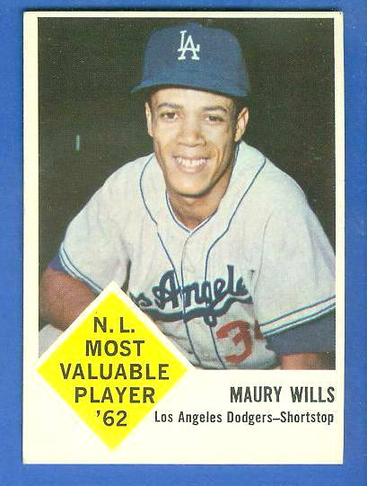


 The checklist is highlighted by Reggie Jackson's rookie card (#260) and Rollie Fingers' rookie (#597). The set also features an interesting error/variation series of cards with player last names in white instead of yellow (the most notable variation is Mickey Mantle (#500), in his last active card with Topps).

 Here’s another analogy (and I’ve been thinking about this one for a lot longer): If you study Topps’ baseball sets from 1969 to 1971, there’s a lot going on there; I’d say it’s one of the company’s most turbulent periods, right up there with 1953-56 and 1980-82. Okay, now look at the plot of the film Midnight Cowboy. Here’s a quick recap: Schlesinger’s 1969 masterpiece centers on Joe Buck (Jon Voight), a young Texan who moves to New York City to ‘make it’, only to wind up a male prostitute, befriending the homeless Ratso Rizzo (Dustin Hoffman), living with him in an abandoned building and learning a string of horribly depressing life lessons before accompanying Ratso on a trip to Florida (only to have Ratso die en route). It’s a classic and those who haven’t seen it should go out and rent it immediately.
  Hero-Worship. The closest they get is splitting it up between Willie Mays, Hank Aaron, Roberto Clemente and Harmon Killebrew, but if you ask me, Topps’ heart was never really in it with Killebrew and it kind of seemed like they were always half-assing it with Clemente. In Topps’ eyes, if anybody really deserved it in the early Seventies it was Mays (he’s #600 in 1970 and 1971), though Aaron supplanted him at the same speed he overtook Ruth.


 Like with anything else, it’s easy to make a ton of mistakes, to perform so badly that you limp to the finish line. It’s easier still to quit before you make the finish line, to simply turn around and walk away, leaving a half-assed job behind you. It’s much harder, though, to compete to win and not win, and not only not win, but be bad enough to be very close to the bottom and still not be the worst. And that’s where 1970 Topps will always find itself.
 1974 is a classic example of ‘the strongly designed set’, or a set where the main graphical element is present on every card. In ’74’s case, it’s the streamlined pennant (stolen and reconfigured from the classic design of 1965) on nearly every card. Those goddamn pennants…they’re ugly as hell, and you sure do get sick of them after about 20 cards, but you have to hand it to those Topps designers, because six years later in 1980 they take the same tired pennants, skew them 45 degrees and somehow make everything seem pleasing and fresh.
 series Traded series and then put out a special hero-worship subset in the 1975 set. That would’ve catapulted 1975 into the top ten sets ever made. Can you imagine? Cards 653-659 could’ve been ‘Hank Aaron Years’ cards, with card #660—his penultimate regular card, with maybe a photo of him at his car lot down in Atlanta, or smoking a cigar at home plate, or pushing away shaggy Braves fans as he rounded third, or, wait for it, a photo of him as a young call up for the Boston Braves in ’53? How about that?), which is just too bad, because there are a number of signs that this set is the quintessential one-step-away-from-greatness set, the ‘Biding Our Time’ set, the ‘Wait Til Next Year’ set…really, besides the Hank Aaron cards and the Winfield rookie, this set is a load of garbage.
 Let me back that wild claim up with some rockhard facts. Not too many subsets, and these Seventies sets almost live or die on their subset inventiveness. 1972 had a late-series ‘Traded’ subset, 1975 had the MVPs through the years, 1977 had ‘Big League Brothers’ featuring the shell-shocked Reuschels. 1976 had the All-Time Team. 1972 had ‘In Action’ and a few ‘Boyhood Photos of the Stars’. 1973 had some more Boyhood Photos, including one of Catfish Hunter clutching a farm animal. What did 1974 have besides the Aaron Hero-Worship to open the set? World Series cards, dual-league leaders, All-Stars and a team variation. I guess you have to also count the Traded series as a subset for this set, but since I’ve already counted it separately, let’s forget it. Also, forget the team variation as a legitimate subset. So that leaves us with three subsets that were by this time pretty tired. OK, next.
 awesome and big shots like Elliott Gould, Tom Seaver and Karen Black would come by, like, all the time, and the difference between my place and The Factory would be that instead of sitting around and trying to act all cool in front of each other, we’d sit around and make shit. Hell, we’d sit at long tables and make shit for hours, well, the celebrities would sit, and make stuff, like pot holders and fake designer handbags and leather boots, and I’d sit in my air conditioned office and talk with suppliers on the phone and then come out periodically to make sure that everybody was having a good time. And if they weren’t—and I’m talking big shots here, like Bud Harrelson and Clyde Frazier, Harvey Keitel and Henry Kissinger—well, then I’d launch into a long-winded speech on why Gus Triandos was completely undeserving of a 2nd Tier number in the meritocracy of the Topps checklisting universe of the 1960s…and they'd snap right back to work, because I happen to feel strongly about that and can go on about it for a long time (and really nobody wants that)...
 Well, I was wrong. I would have to say that 1975 and dark horse 1971 are tied for strongest rookie class, though 1977 is by far my favorite. Any set boasting rookies of Barker, Templeton and The Bird—all three of which I can probably purchase for under a dollar combined—is a friend of mine. But anyway, you see what I mean about the Seventies: these sets don’t have more than one or two worthwhile rookies each, which is a shame. Especially in the case of 1974, since there aren’t many other reasons to collect it.
 If I let my romantic tendencies get the best of me, this set would be in the top twenty. The limited vocabulary newspaper headlines on the back, the unbelievably bad airbrushing on the front, plus the original torn-from-the-headlines look on the front of the card—it all combines for a breathtaking card, a venerable feat of design that accurately captures an era of gap-toothed ballplayers with big glasses, bad unis and even worse hair.
 It was brief, but it did happen, and Topps had not one but two opportunities to show him in an Orioles uniform. Instead, there’s a ridiculous gap. What Topps should have been doing was extending production time until late June, keeping the presses out in Pennsylvania open at least a little while in the summer, and then releasing a true Traded series in late September. That way they would have players in the series who’d been traded anywhere from just before the season began to up to two months into the season. Sure, it’s a tall order to fill, but they owned their own press, so even if you factor in all the other jobs over the course of the year, from the other sports to non-sports to regionals to other small sets, I’m sure there was a couple days when they could’ve found the time.
 I don’t know what it is about MLB 2006: The Show, but I’m beyond addicted to it. And while almost every other part of my life has suffered because of it, one facet hasn’t.

 In a brilliant move, Leaf sold these—in the same wrapper—with marbles. It’s a miracle any of these cards survived even the first trip from the factory to the drugstore. Packaging aside, this is a neat little set, with overly candid black and white photos probably taken by a high school yearbook photographer on his lunchbreak. I’m serious—if one of the players included in this set ever ended up on the lam, post offices around the country could just tack that player’s card from this set to their wall. This set is an open textbook on the art of proper mug shot photography.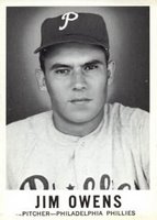

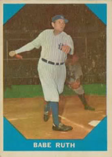 If you're not familiar with this set, Fleer put out a flurry of small competitor sets to Topps in the late 1950s and early 1960s in baseball, football and basketball (actually, basketball is a special case, as sets from this time period are few and far between: Bowman put out a set in 1948, Topps put out a set for the 1957-58 season, and then Fleer came out with a set for 1961-62. So to call them competitors in this particular sport is not exactly accurate. But Topps and Fleer were competitors in baseball, so let's not discuss basketball, if that's okay).

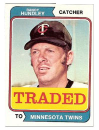 I'm not trying to say that this is the worst set--in the grand scheme of cards this set (series? subset of regular set? its own set?) is rather important. But 'grand scheme' symbolic strength and actual, measurable set strength are two very different things. This set is ugly. And ugliness matters. So does checklist strength. Despite a checklist of 40 cards (relatively big for a late-season subset), there are only seven big names: Marichal, Santo, Felipe Alou, Lou Piniella, Mike Marshall, Reggie Cleveland and Willie Davis. Then there's Nelson Briles, Tommie Agee, Steve Stone and Lindy McDaniel (of 'Lindy Shows Larry' fame). After that you're scraping the commons barrel (actually, you're scraping the commons barrel nowadays from Mike Marshall on, but for the sake of argument, let's forget that all but two or three of these cards can be had for less than a dime). Anyway, that line-up may have looked impressive as a launching checklist for Topps in 1974, but it translates to a success rate of just 28% for the set (success rate = # of good cards / total # of cards in set). Even when we factor in the coolness factor of getting a Traded card in your pack, well, it's still not that great. I can think of only one reason why Topps expanded the neat little Traded subset from 1972 into its own series: to sell more cards at the end of the summer, a time when kids have moved on to football cards, hockey cards, sniffing glue or whatever it is little kids do at the end of summers.