
 If you haven’t read Bill Veeck’s fantastic memoir Veeck—As in Wreck, I recommend it highly. Before I read it a few years ago, I knew vaguely of Eddie Gaedel, of the night of a thousand exploding disco albums and Veeck's legacy in Middle West baseball. But after reading it, you learn to appreciate the man not so much for his stunts, but for his ability to get fans in the ballpark to see the White Sox. Perhaps one of his better-known inventions was the Chicago White Sox uniform of the late 1970s, definitely one-of-a-kind (though a more accurate description is ‘hideous’). And while it’s not one of the game’s brightest moments, it’s an historical checkpoint I keep coming back to. More specifically: the wide lapels (and not so much the garish (and short-lived) shorts). Today, the game is used to the v-neck, button-down jersey, and yet it was founded on a wide-lapeled shirt a player had to lace up in the front. So while you almost half-expect Goose Gossage to pull a large peace medallion from between the lapels of his leisure-suit-cum-White-Sox-uniform, you also have to respect the homage (if however slight and unintentional) that Seventies fashion wrought.
 And as a sidebar, the best part of this card is not the guys sitting cross-legged on the ground like they’re at summer camp, or even the special guest star pennant for a dazed and confused Bob Lemon, but the second trainer in from the left, third row back. This jersey was ugly, no doubt about it. But it was especially no good if you weren’t wearing an undershirt. This guy looks like he should work at a gas station.
 To the reader who commented on the post about Topps’ 1972 In Action subset and the card companies’ recent betrayal of the traditional headshot/closeup for the greener pastures of action shots, this card’s for you. Not only would I not trade this awkward closeup of Rolen for an action shot, but I want to find out just what exactly was going on when this photo was taken.
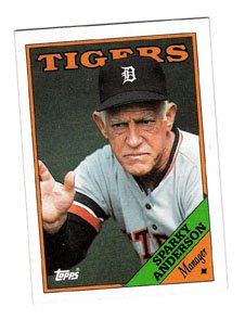 It’s a toss up: either Sparky’s putting the shift on for a pull hitter or he’s lifting Luke’s X-wing out of the swamp on Dagobah. Also, it’s obvious that he’s holding a cane in his other hand and boiling a pot of soup over a can of sterno on the dugout steps, right?
 1988 was an especially good year if you happen to like awkward headshots and closeups. More than a handful of guys got traded at the end of 1987 and were rewarded with lousy airbrush jobs. And then there's the case of Jay Baller, who pulled a Warren Brusstar on the unsuspecting Topps photographer, unleashing a lensful of splotchy chest hair, dotted with perhaps the earliest white-guy bling known to man. What is that a pendant of, exactly, a Lincoln-Mercury symbol? Was he bragging about his new Town Car paid for with Tribune money? I can't figure it out. Luckily, I won't have to--this is going to my friend Steve for his birthday as a magnet.
 I remember when I got this set. I was just a little kid and I don’t think I’d ever been to a Rite Aid in my life (and before I moved to New York City, the only place I’d ever heard mention of the drugstore chain was on these cards). I can’t rightly say that today I’m a better man after shopping at a Rite Aid, but I don’t think it’s entirely unfair to say that if I had to name a Team MVP of my local Rite Aid, it would definitely be Alan Trammell.
  I never once understood the appeal of tiny little Fleer cards. Was it that they were small? I remember in 1991 (and 1992, I think) Topps put out a set called Topps Micro that was simply the regular set shrunk down to a ½ or ¼ of the regular card size. When you get cards down that small you can’t do very much with them: the text on the back, including the stats, was too small to read, the photos were smaller, and the cards had an overall cheap feeling. And seeing as how Topps Micro came only as a complete set, it made collecting them kind of a moot point.

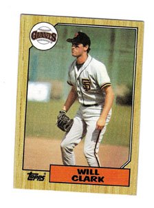 I always thought it was relatively easy to spot a rookie card. Take Will Clark’s 1987 Topps card. It’s obvious it’s his rookie because it looks like they told him to go take a few grounders during Spring Training as Roger Craig quietly loaded the Giants onto the team bus and they hightailed it outta there. Clark looks pissed cause Craig and Leonard and the rest of the team sprung a good one on him. But there were other ways you could tell as well. For instance, Clark was a fresh face in 1987, and if you were poor and couldn’t afford the 1986 Topps Traded set (like me), then you knew just by looking at the photo and the name that he was a new, hot-shit rookie, like Dan Plesac, Mike Greenwell, Barry Larkin and all the rest of the unmarked rookies from that glorious set.
 Vlad looks like he’s cruisin’ for a bruisin’. Either that or Jody came back a changed man after shooting Flag. Seriously, who green-lit this card? Guerrero looks deranged, and that low brick wall isn’t helping matters any. Did he just climb out of a public fountain? Or let loose on a steeplechase? Why isn’t he holding a bat, a glove, a ball or any base-ball-playing equipment? This is one of the most unflattering photos I’ve ever seen on a card, and this is how Topps wants to commemorate the reigning AL MVP? By making him look like he just staggered out of Shaun of the Dead?
  A while back I encouraged every- and anyone to send in their take on an 'average' 1960s Topps design to go with my checklist for the 'average' set. You may remember that our friend Dave from Vermont sent in a design a few weeks back; it was posted with the final, downloadable pdf checklist.
  There have been quite a few major leaguers throughout history whose facial characteristics were Muppet-esque. Ken Phelps and his Inspector Gadget-like disguise mustache perhaps the most recent example. But if we dig a little deeper back we come across Joe Rudi, who definitely moonlighted as a backup saxophonist in the Electric Mayhem.
 There are a couple of things to appreciate about this card. First, the 1996 Upper Deck base card design. It rocks: a nice, crisp copper leaf complementing full, richly colored photos (seriously one of the best Upper Deck sets in terms of photo quality from the Nineties), a simple back with another large photo and a clean team logo; just a real nice-looking card design (the Tribute cards were especially classy as well).
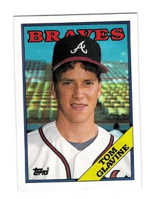 When was the last time you saw Tom Glavine smile? For me, it was on his 1988 Topps card, coincidentally his rookie, using a photo of him where he can’t be more than 17 years old. It’s almost like it was taken on his birthday and he got to dress up as a major leaguer and get his photo taken in front of a Sears Photo Studio back-lit backdrop.
  While Topps was busy screwing up team names, airbrushing the hell out of caps and uniforms and generally messing around, its Canadian counterpart was all about practicality. When a player was traded right before the cards went to press and the company didn’t have enough time to get in a new photo, it printed a card with a quick little explanation on the front, like Beard’s card here, along the lines of “Now with Mariners”. Simple, to the point. No embarrassing airbrush involved.
 I’ve talked about cards where various items of a player’s wardrobe on a card have been airbrushed, from Rollie Fingers’ Padres cap to Dave Kingman’s hair, but this is the first time I’ve ever come across an airbrushed card of a manager. And it’s a severely airbrushed card at that. I’ve been examining this card for a long time now (maybe a couple of days), and it really looks as though his entire face is a painting. For instance, look at his neck and his nose: the shadows are too smooth, too well-groomed, like they were created from an artist’s palette.
  This is one of my all-time favorite Topps sets. Ever. This is right up there with 1954, 1965, 1971 and 1986, and it’s certainly within the top 5 on my Best Set of the Early 1990s list. Plain and simple it’s the cartoons, and the idea that the cartoon artwork isn’t affiliated with Warner Brothers. I always found the Upper Deck Comic Ball cards unnerving, like an extension of Cool World starring Jim Abbott and Reggie Jackson. Yikes.

 Topps Kids had no inserts, the base set was a manageable 132 cards and packs cost 35¢. And you got a stick of gum. I don’t remember if the gum came in its own wrapper (like new Heritage) or was just recycled from old 1983 Michigan test wax. It doesn’t matter. This was a helluva set that apparently nobody cared enough about to keep it going after one issue.
 My collecting started when my older sister bought me a box of 1986 Topps as a Christmas present. As I noted in my Best Set of the 1980s Countdown a few months back, 1986 Topps is by far my favorite set, most likely because it was my first set. The large lettering, the square design, the cheap red dye back, all elements make me yearn for footie pyjamas and the raw emotion of crying myself to sleep after watching Buckner let the little roller scoot between his legs…
 Lately I’ve been rethinking my whole card-collecting strategy I employed as a kid. I bought packs, built hand-collated sets, bought factory sets and bought older cards in lousy condition. All in all I put together a pretty decent collection. I still buy cards here and there, but I’m definitely not as serious as I used to be. I’m only realizing now what I missed all these years: I wasted a ton of money. Wait, I already knew that. What I mean is, I wasted a ton of money buying cards that were not of Pascual Perez. If only I had limited my card collection to cards of Pascual Perez (and maybe his brother Melido), then I would have the perfect collection.
 (Speaking of, it they ever made a Broadway version of Back to the Future, I could totally see Pascual Perez in the Crispin Glover/George McFly role. Couldn’t you? Melido Perez would be Marty, Ken Kaiser could play Biff, Tony LaRussa would be Doc Brown and Lea Thompson could reprise as Lorraine (I bet she’s not doing anything). And then, when the show’s a monster hit, we could get Ramon and Pedro Martinez to do the roles of George and Marty in the touring company, with Lou Piniella as Doc. Man, I should be writing these down…)
 Despite it’s best intentions, this subset featured some of the most boring action shots ever taken. This one of Barton is classic Topps for all the wrong reasons: there’s more action on the sidelines than there is on the field.
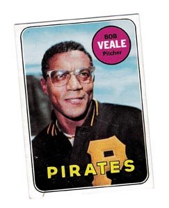 I have to admit, up until a few days ago I couldn’t tell you who Veale was. But just one look at his card from the ’69 set made me realize that he’s my new favorite player and perhaps my favorite Pittsburgh-related sports hero ever (narrowly beating out the fish that saved it and most of the non-numbers-running Crawfords). Why Bob Veale?
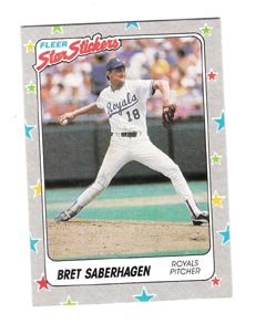 Did you know anybody who ever peeled their Star Stickers off and put them on their school binders or folders or Trapper Keepers? Me neither. Actually, I didn’t know anybody else who had even heard of Star Stickers. It’s just as well; they faded out of my collecting habit as fast as they faded in.
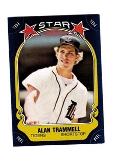
 Something tells me that Fernando wasn’t very happy about getting traded from the Pirates to the Royals. Who could blame him? This card is fun, because unlike the other Traded cards in the 1974 set, it really looks like the Topps photographer was the one who broke the news to the player that he better pack his bags. And Gonzalez is just so goddamn emotive in his facial expression. Is he sad? Angry? Overjoyed? Constipated? I honestly don’t know.
  I’ve always liked Thome. I mean, really, how can you not? He’s like a late-Nineties version of Matt Williams (another favorite). And I’ve really never liked Upper Deck. They had a string of four good years (1992 to 1995), and have otherwise been marred by ridiculous hi-jinks photos, pitchers batting and guys sitting around doing everything except playing baseball. That’s why I’m torn about this card.
  The next time I saw a card of him, I think he was beached on the Phillies bench. Anyways, Upper Deck wasted a great opportunity for a killer action shot. Also, and here’s the real stumper: whom is he pictured with on the back? And why do the two of them look so, so, related? And where are they, exactly? For a moment I thought it was Yankee Stadium, simply because it’s the last place the Indians and Rangers could be squaring off, though it would fit into the bizarro baseball card world where every card must feature at least one photo taken there.
 There a number of things that I know I’ll never have enough disposable income to afford. Right near the top of the list are old baseball cards. Now, I’m a big fan of buying older cards in lousy condition and then loving them as if they were mint, but if I was going to buy a 1934 Goudey card of even someone so minor as Babe Herman, I’d want it in pretty damn good condition. Call me a snob, I don’t care.
 the real, first original print, it’s not as good and doesn’t deserve a place amongst other cards. I don’t really agree with this argument, because I happen to like the idea of reprints, and Dover reprints are really pretty good.
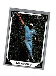 Martinez’ gaffe is going to go for extra bases. It’s a cool photo, don’t get me wrong, but how pissed would you be if you were Dave Martinez and you found out that the card they were using of you was of you making an error? And it’s right up at the front of the set, which means more people are going to probably see it, right? And it was a photo taken during a game back in Wrigley, where he played as a member of the Cubs from 1986 to 1988, when he was traded to the Expos. I’d say that would be kind of embarrassing for Mr. Martinez. And yet, wouldn’t you know it, also incredibly symbolic for the Leaf set for the year.
 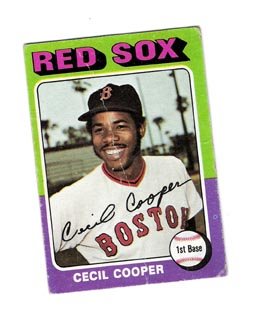 To this day I find it amazing that Cooper couldn’t find a way to fit in Boston. Instead, the Red Sox ran him out of town to Milwaukee where he went on to lead the league in hitting and put up great numbers for a long and productive career. That said, this card is the penultimate card from 1975 Topps. If you could only own one card from this set, this would be the one I’d recommend. Here’s why.
 There are a number of great things about these cards, and foodie cards in general. Unlike the Dan-Dee and Red Heart cards that mimicked the 1954 Topps set, foodie cards throughout the ages, from the Post and Kelloggs cards of the Sixties and Seventies to the Kraft, Ralston/Purina, Drake’s Cakes and others of the Eighties and Nineties have all had to dream up their own designs.
 Two other fun things about the Home Plate Heroes series: because they were issued on the packaging, you had to cut them out yourself (or have your Mom or Dad or older sibling do it for you). I kind of had a twitch as a kid and bad vision with no depth perception, as well as no coordination—my Wally Joyner
 card can attest to all of this. The other great thing about this set is that while the Player’s Union licensed it, Major League Baseball did not. So John Tudor and Kent Hrbek were on the Red Team, while Joyner, Brett and Gwynn were on the Bluish/Black Team. It’s a wonder any other team could compete against these two powerhouses.

 Back in the Eighties, it seemed like everybody and their brother had a beard (except for Pascual and Melido Perez, but more on them some other time). Today, I can name famously bearded ballplayers on one finger: Johnny Damon, and now even he’s been famously de-bearded. So that’s why it’s refreshing to see Matt Morris give the clean-shaven world the old f-you on his 2006 Topps Heritage card. What makes it even better is it’s his first card as a San Francisco Giant, so it’s almost like he signed the new contract over the winter, then grew a beard and started life fresh in a new city (I know he had a beard before he became a Giant, but go with me on this one). The only thing he’s missing in this photo is a pair of sunglasses.
  So imagine my surprise at opening dollar grab bags at the local shows at the Watertown Mall and finding multiple cards of the Toledo Mud Hens, not just another minor league team, but one of the oldest in the country, one of the oldest in the history of organized baseball. Sure this one is of Larry Cox, and it’s not worth a penny, but it’s a minor league card! In a set that included major league cards! Do you know how cool that was to a little kid? I still think that’s awesome today.