
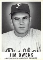
 In a brilliant move, Leaf sold these—in the same wrapper—with marbles. It’s a miracle any of these cards survived even the first trip from the factory to the drugstore. Packaging aside, this is a neat little set, with overly candid black and white photos probably taken by a high school yearbook photographer on his lunchbreak. I’m serious—if one of the players included in this set ever ended up on the lam, post offices around the country could just tack that player’s card from this set to their wall. This set is an open textbook on the art of proper mug shot photography.
 It’s as if Leaf was a decrepit scientist in a faraway castle tower, surrounded by stacks upon teetering stacks of media guides, flipping through each one until deciding upon the 144 ugliest ballplayers in the majors. What other possible explanation is there for the inclusion of this particular group of players? Were they all on the same prison bus? It’s amazing that Don Mossi and Wally Moon weren’t invited to this dance.
Of course, the photography is what makes this set memorable. Because it sure as hell ain’t the checklist. The checklist is weak, and understandably so. You don’t just go up against Topps and get away with it so easily. Leaf was lucky to get Brooks Robinson and Duke Snider, Orlando Cepeda, Curt Flood, Jim Bunning and the ten or so second and third-tier guys. And at 144 that translates into a pretty decent success rate (it’s just the quality of the success rate that is questionable).
So, despite the fun fotos (which almost look like they could’ve been early Polaroids), this set finds itself way the hell down at #45 for a number of reasons. First, as I mentioned, despite the heroics associated with the act of going up against the Topps monopoly, the checklist suffers from lack of star power.
Second, the design stinks. It was an obvious rip-off/update of the classic 1949 design (one of the best-looking sets ever, post-war or pre-, and one of the most universal in its design (look at Japanese cards through the Twentieth Century and you’ll see what I mean)), but it lacks the necessary oomph to make it work. Say what you will about thin black lettering and kitchen linoleum white backgrounds, but when you combine those with creepy, In-Cold-Blood-mugshot photography, the design really doesn’t do it. Then again, I might be alone in this opinion. Wasn’t there a gigantic tribute set in the Seventies made by Renata Gallasso in a sort of homage to this design? I think there was. But if memory serves me correct, they didn’t use stark, straight-on headshots. If I remember correctly, there were a lot of posed action shots.

Lastly, this set didn’t exactly inspire collectors, entice players to sign with Leaf for 1961 and beyond or intimidate Topps to buy them out. It was the only baseball set Leaf put out in the Sixties, and the last baseball set they’d put out until 1985, when Leaf was re-introduced as the Canadian Donruss imprint. Still, it’s a fun little set…as long as your idea of fun includes Steve Korcheck.
No comments:
Post a Comment