Here’s to You, Warren Brusstar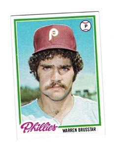
What is life’s greatest puzzle? Of course it’s one of those things that depends on who you ask. A teenage boy may tell you it’s removing a bra with one hand. Wesley Snipes may tell you it’s figuring out who found out he wasn’t paying taxes. But if you wanted to make a general list—and who doesn’t like making lists?—I would bet that the construction of the pyramids, the hanging gardens of Babylon and the Celtics’ lack of draft-day prowess in 1993 when they took Eric Montross over Eddie Jones would be on there. If the list was more extensive, you could even find a place for Warren Brusstar’s sloppy chest hair shave on his card from '78, the unexplained flameouts of Kevin Maas, Troy Neel and/or the incredibly brief flash that was Vaughn Eshelman. But I would guess that figuring out an average Topps checklist for an entire decade would probably
not make the list, though it is definitely deserving (it’s a lot harder than it looks).
New Numbers: #1 - 300#1 Clemente/T. Davis/Rose (NL Batting Leaders)
#2 Oliva/Runnels/Yastzremski (AL Batting Leaders)
#3 Aaron/Mays/McCovey (NL HR Leaders)
#4 Killebrew/Maris/Yastzremski (AL HR Leaders)
#5 Aaron/Cepeda/McCovey (NL RBI Leaders)
#6 Killebrew/Maris/F. Robinson (AL RBI Leaders)
#7 Koufax/Marichal/Spahn (NL Pitching Leaders)
#8 Ford/McClain/J. Perry (AL Pitching Leaders)
#9 Gibson/Koufax/P. Niekro (NL ERA Leaders)
#10 Chance/Peters/Tiant (AL ERA Leaders)
#11 Drysdale/Jenkins/Koufax (NL SO Leaders)
#12 Lonborg/McDowell/Pascual (AL SO Leaders)
#15 Robin Roberts,
Orioles (change from Phillies)
#16 Willie Kirkland, Indians
#17 Johnny Callison, Phillies
#19 Zoilo Versalles, Twins
#23 Mike Ryan, Red Sox
#25 Roy Sievers, White Sox
#27 Checklist 1
#33 Jackie Brandt, Orioles
#36 Bobby Wine, Phillies
#42 Chuck Schilling, Red Sox
#51 Pete Richert, Orioles
#55 Max Alvis, Indians
#60 Willie Horton, Tigers
#63 Gary Geiger, Red Sox
#68 Don Demeter, Phillies
#75 Milt Pappas, Reds
#76 Earl Wilson, Red Sox
#81 Sam Bowens, Orioles
#88 Frank Funk, Indians
#89 Boog Powell, Orioles
#93 Larry Jackson, Phillies
#101 Dallas Green, Phillies
#112 Steve Barber, Orioles
#114 Dick Donovan, Indians
#121 JC Martin, White Sox
#123 Don McMahon, Indians
#124 John Boozer, Phillies
#126-135 Babe Ruth Special
#138 Art Mahaffrey, Phillies
#140 Tony Conigliaro, Red Sox
#141 Tommy McCraw, White Sox
#143 Dave McNally, Orioles
#146 Checklist 2
#158 Wes Covington, Phillies
#162 Reggie Smith, Red Sox
#170 Del Crandall, Braves
#177 Bubba Phillips, Indians
#191 Clay Darlymple, Phillies
#196 Dick Hall, Orioles
#201 Larry Brown, Phillies
#203 Russ Snyder, Orioles
#211 Woodie Fryman, Phillies
#212 Dave Morehead, Red Sox
#220 Billy Pierce, Giants
#221 Cookie Rojas, Phillies
#230-239 World Series Special
(a card for each year)#245 Frank Malzone, Red Sox
#252 White Sox Rookies (Mike Hershberger/Carlos May)
#256 Woodie Held, Indians
#259 Juan Pizarro, White Sox
#265 Jim Bunning, Phillies
#270 Jim Gentile, Orioles
#272 Phillies Rookies (Ray Culp/Rick Wise)
#277 Checklist 3
#280 Dick Stuart, Red Sox
#283 Johnny Briggs, Phillies
#290 Jim Kaat, Twins
#296 Tony Taylor, Phillies
#298 Rico Petrocelli, Red Sox
So I’m only reporting number assignments between 1 and 300 (for now), because it’s just too many to list at once. Also, I hope it’s not too painfully obvious that I only worked on the Orioles, Red Sox, Phillies, White Sox and Indians and a few bigger names. I’ll list new numbers from 300 to 598 later this week.
 Grizzly Guillermo
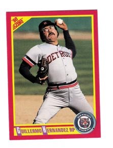
One of my glowing achievements in high school was that not only did I not take any honors-level classes, but I also failed Spanish and subsequently dropped learning the language. So it only follows that it took me until just this past weekend to learn that ‘William’ in Spanish is ‘Guillermo’. Thus, ‘Guillermo Hernandez’ is in fact the very same ‘Willie Hernandez’ who won the Cy Young and the MVP and had the teddy-bear
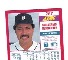
haircut (look at his headshot and squint, you’ll see what I mean about those tufts skirting out from under his cap). I know, I know, I’m an idiot. Hey, do you think that maybe he moved to the wilds of Puerto Rico after retiring and let his hair grow out, then groomed it out to look more like two well-proportioned bear ears off his head, let the hair grow over his real ears and down past his shoulders and even beyond, down past his elbows, grew his fingernails real, real long and plastered his hair to look like fur, then filed down his incisors, gained a lot of weight and lived off the land? Maybe, if he had kids, they could sell tickets to drunk spring-breakers to watch him kill a fish with his hands and teeth while he waded through a brook. And then, after a late lunch of raw fish, Guillermo could try to teach the guava spider and the coqui frog to intimidate the other animals with a good brushback pitch.
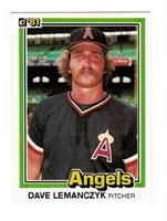 File Under: Muppet
Dave Lemanczyk, you are a Muppet, perhaps even the basis for the great
Fraggle Rock character Red. Tim McCarver, you a tired old Muppet, one with plenty of fleshy foam in the face. This is really one of the most unflattering photos ever taken. If I were Tim McCarver, I'd make sure Joe Morgan or some other rival jealous tv commentator doesn't get their hands on this; it has the potential to fuel the fire
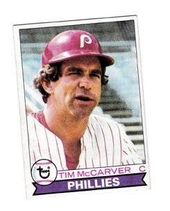
of a drunken, on-air rant. Or better yet, this card should be kept on file at every network news department, just in case McCarver ever gets busted for something, like if he were in town for a Dodger game and got caught on a security camera committing petty shoplifting on Rodeo Drive. If that ever were to happen and someone printed t-shirts coming to his support, I may be forced to buy one (but only as long as the graphic artist agrees to use the headshot from this hideous card).
 Hair, Glorious Hair!
OK, a long time ago, before you were born, I said that there should be a Sports Hair Hall of Fame. It wasn’t fully fleshed out back then, only that Oscar Gamble, Garry Maddox and Al Hrabosky would be among the inaugural class of inductees. Well, I have another prize example to induct.
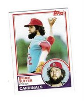
I’d like to welcome Bruce Sutter’s beard. Sutter’s Beard had a distinguished career, saving a fat face from a paper bag in the late Seventies, being the model for a perfect phone receiver shelf for adult men in need of hands-free talking and, of course, lulling opposing late-inning hitters with its gentle but deadly wheat-in-the-breeze undulation. Quite possibly the only major-league hair worthy of its own endorsement deal. How about:
It’s never too late for Pomade! Oh! Those Crazy Base-Ball Players! They Think They’re Soooo Great!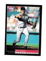
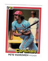
Canseco’s latest jump to pitcher wasn’t the first time he made a dumb move on the mound. He's made others, like the one captured here, from 1993. Also, Pete Vuckovich grips his bat like a little girl. Or perhaps, like a bendy toy (you know, one of those rubber toys with the really long arms and legs). It’s like Red Schoendienst told him it would be really good for him to get in the groove by sleeping with his bat the night before and all his muscles were still asleep when they took this photo. How much you want to bet that the respective Score and Donruss photographers got some kind of slap on the back from their bosses while their bosses grinned with their top teeth exposed and shook their heads in disbelief? I think there’s a pretty good chance.
 The Fantastic Card of the Day
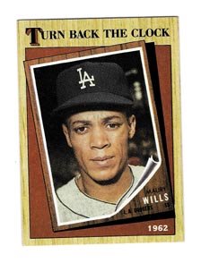
Maury Wills was a bona fide All-Star who could end up in the Hall of Fame. (Repeat this after you read the next few sentences). OK, so here’s why this is the Fantastic Card of the Day: this 1962 Topps card of him, featured on this Turn Back the Clock card from 1987, this one of him on the Dodgers, with the woodgrained background
 was never made
. Wills was one of the very few players that Topps didn’t sign to a contract, because they didn’t think he’d make it to the majors. How messed up is that? Today they give nearly every draft pick a card. But not that Maury Wills; I just don’t think he’ll make it to the majors.

 There are a few reasons I love this card: 1) it’s cheap, 2) it’s his first card in a West Coast uniform and 3), he’s obviously not as spry as he once was (but he’s trying very hard to look it). It’s Morgan’s face fat (and gut fat) that give it away, but he’s not helped by the pose. If anything, they should’ve had him at the plate, or barring that, sitting in the dugout or something that doesn’t call
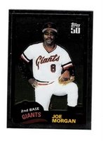 attention to the fact that he was nearly 40 years old when they took this photo. Also, another reason I love this card is because Topps thought it was worthy enough to be included in one of its Chrome sets. It’s like preserving Fat Elvis over Skinny Elvis.


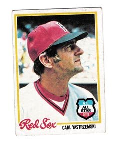 Despite the putrid design, 1990 was smack in the middle of an unprecedented run of eleven years where Topps gave the all-stars their own subset. From 1977 to 1981 a badge or a banner was placed on a player’s regular card. This had two effects: 1) there were more checklist numbers available for more players (more rookies, more role players, more bench warmers, other subsets, etc.) and 2) it created something we could call ‘All Stars Without Borders’ in that you’d have all-stars all across the checklist of the set. While I’d personally vote for an All-Star subset over banners on players’ regular cards in the ASWB tradition, the idea of spreading them over the course of the checklist is a neat idea. Of the ASWB years, 1978 is a personal favorite. The all-star badge is a perfect complement to the scripty border design, like a gas station logo complements the scripted thread nickname on the left breast of a gas station attendant’s jumpsuit. They just go together well. Plus, by looking at this one card of Carl Yastzremski, you can tell that the whole set lays out well. It’s one of the most aesthetically-pleasing sets of both the 1970s and the ASWB sets.
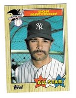 Going back to the All-Star subset run from 1982 to 1992, and not counting 1993, when all-stars went back to how they were in 1973 and 1974 (by position, with both leagues on one card), there are a few years I’d like to mention. First, besides 1990, there are only two years that don’t follow the design of the regular cards. Both work, but to varying degrees. The first is 1987. The regular ’87 card featured the name in a colored box along the bottom of the card. On the all-star card, the name is smeared across a banner along the top. The bottom features three stars (red, white and blue) with the bright yellow words ‘All Star’ spread out across. Not unpleasing in the least, and the photos are a mixture of close-ups and medium shots, including the classic ‘Dave Parker in a Warm-Up Jacket’ and ‘Mike Schmidt Leaning on
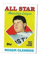
 a Bat’, not to mention Don Mattingly sporting a pre-NASCAR NASCAR mustache. The second year to deviate between regular and all-star card design was 1988. ’88 differed from ’87 in that 1988 featured headshots only, like this one of Tim Raines. The designers also did a funny thing with the Clemens card: they took a shot of him slouched on the bench and separated him from the background. 1988 and 1989 were the only two years during the 1980s when Topps put the all-stars on an abstract background. Every other year they were rooted in the context of their own photograph. 1988 is an especially good year for all-star design (in my opinion).
  Although Topps abandoned The Sporting News and/or Sport Magazine sponsorships of the all-stars nearly twenty years earlier, for 1988 they harked back even further and created a step-brother design to the hallmark 1958 all-star design. In this example, Eddie Mathews’ massive head takes up most of the card, but behind him is an abstract blue background (American League all-stars had a red background) with little yellow stars. “’58 All Star Selection” is across the top in very cool, calm 1950s modern design (Topps was always a mirror of the forefront of design), and the player’s name and position is across the bottom. In 1988, there
 really wasn’t any major, respectable design movement to speak of (from what I remember, anyway), so Topps had to look from within to find card design harmony. They found it by stealing from 1958. They got rid of the stars (which they’d bring back, to a certain degree, in 1989), but they kept the color scheme of red, yellow and blue. These elements make for a welcome return to the abstract, and certainly a great complement to the stellar, thin-bordered photography of the regular player cards in the set. One of the best all-star designs of the decade.
 Quickly, a few other favorites. 1993’s Topps Finest was a set that I only have two cards from because they were just so goddamned cool and thus, so goddamned expensive. That said, the all-star subset is great. The great thing about this first Finest set is that the cards look like they were made by pressing beer cans into a mold and then coloring them with dyes. This Eckersley is one of my favorite cards of the decade. (Which reminds me of a list I’d like to put together one of these days…)
 The Topps rack pack glossy all-star was always one of my favorite card subsets and really the only reason to spend the extra fifty cents for the rack pack (besides the extra cards). Just imagine my delight upon opening my 1986 Topps rack pack and scoring this Carlton Fisk glossy all-star, complete with him jawing out no one in particular. I still feel chills on my arm just looking at it. No wait, somebody left the window open.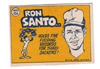
 When I first started this exercise, I asked that anyone interested send me their take on what the average Topps set would look like. I honestly thought that I wouldn't get any response, thinking that even though baseball card design has influenced design and art since the inception of the form, not too many people had the time (or the desire, really) to try their hand at it. Thankfully, I was wrong.
 If you don’t want to buy a 3-ring binder and some pages, then you’re a cheapskate and your loved ones probably don’t expect much from you on their birthdays or around the holidays. That said, boxes in a closet aren’t all bad. There are specially-designed cardboard boxes that can store 300, 600, 800 or more cards like a vending box. They don’t cost very much, and they’re good for stacking (especially for those of us with collections that populate well over 150,000). Of course, if you don’t want to splurge on the 2 bucks it costs for a sportscard box, there’s always the prospect of a shoebox, or if you don’t have the cash for kicks, there’s the recipe box standby. Here’s how that works: see where your mother/wife/girlfriend/boyfriend/friend/coworker/neighbor keeps their little flip-open box of recipes. I bet it’s somewhere in the kitchen. Now, when they’re not looking, steal the box, dump out all the recipes and keep your prized cards in there. I would recommend slipping a rubber band around the stack of recipes (perhaps even the very same rubber band that kept all your cards together) and hiding the recipe box somewhere in your room. Then, methodically swipe hard, uncooked macaroni elbows from the kitchen (and a bottle of glue), and garishly adorn the recipe box with said items. When it’s completely covered (and unrecognizable…see where I’m going with this?), take it out of its secret hiding spot and use it to proudly showcase your cards. When your friends ask why you’re showing them your baseball cards in a ridiculous macaroni-covered recipe box, tell them you made it at summer camp when you were a kid. And try not to make eye contact with your mother/wife/girlfriend/boyfriend/friend/coworker/
 Pages, boxes, what am I forgetting? Toploaders! Right. Toploaders give the impression that your cards are valuable (when they are, in fact, most likely not). They are the prerequisite for dealers at card shows, so don’t be fooled: just because that Topps Archive Gaylord Perry’s in a toploader does not mean it’s valuable. It still costs less than doing a load of laundry. But toploaders are great for cards, because if you have all your cards loose in a shoebox (like me), they prevent the corners from nicking. A toploader is really two pieces of hard plastic with just enough space for a card to slip inside. It’s lightweight, good for transporting your priceless/worthless possessions to card shows and begging dealers to buy them, and it’s also great for stacking. Here’s what it’s not:
 Wouldn’t it be cool if you could call up a major league manager whenever you had a big decision to make? Or if you could hire one out for the day and he would show up in his uniform, with spikes, and just follow you around everywhere, offering advice and constantly giving you weird hand signals?
 I think that would rock. If it were really something you could do, I would want Earl Weaver to follow me around. And if Earl weren’t available, I’d want Al Lopez.
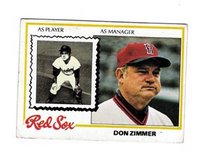 Getting a personal manager would be just like being a child again. Don’t want to go to work? Get Zim to call in sick for you. Need to practice spitting? I just saw LaRussa amble by; I’m sure he’s free. Couldn’t secure a clown for your kid’s birthday party? There’s nothing like an afternoon with Frank Robinson. Don’t know where your motivation’s gone? There’s a whole stable of inspiring pep talkers just a phone call away.
 What is life’s greatest puzzle? Of course it’s one of those things that depends on who you ask. A teenage boy may tell you it’s removing a bra with one hand. Wesley Snipes may tell you it’s figuring out who found out he wasn’t paying taxes. But if you wanted to make a general list—and who doesn’t like making lists?—I would bet that the construction of the pyramids, the hanging gardens of Babylon and the Celtics’ lack of draft-day prowess in 1993 when they took Eric Montross over Eddie Jones would be on there. If the list was more extensive, you could even find a place for Warren Brusstar’s sloppy chest hair shave on his card from '78, the unexplained flameouts of Kevin Maas, Troy Neel and/or the incredibly brief flash that was Vaughn Eshelman. But I would guess that figuring out an average Topps checklist for an entire decade would probably not make the list, though it is definitely deserving (it’s a lot harder than it looks).
 haircut (look at his headshot and squint, you’ll see what I mean about those tufts skirting out from under his cap). I know, I know, I’m an idiot. Hey, do you think that maybe he moved to the wilds of Puerto Rico after retiring and let his hair grow out, then groomed it out to look more like two well-proportioned bear ears off his head, let the hair grow over his real ears and down past his shoulders and even beyond, down past his elbows, grew his fingernails real, real long and plastered his hair to look like fur, then filed down his incisors, gained a lot of weight and lived off the land? Maybe, if he had kids, they could sell tickets to drunk spring-breakers to watch him kill a fish with his hands and teeth while he waded through a brook. And then, after a late lunch of raw fish, Guillermo could try to teach the guava spider and the coqui frog to intimidate the other animals with a good brushback pitch.
  File Under: Muppet
 of a drunken, on-air rant. Or better yet, this card should be kept on file at every network news department, just in case McCarver ever gets busted for something, like if he were in town for a Dodger game and got caught on a security camera committing petty shoplifting on Rodeo Drive. If that ever were to happen and someone printed t-shirts coming to his support, I may be forced to buy one (but only as long as the graphic artist agrees to use the headshot from this hideous card).
 Hair, Glorious Hair!
 Canseco’s latest jump to pitcher wasn’t the first time he made a dumb move on the mound. He's made others, like the one captured here, from 1993. Also, Pete Vuckovich grips his bat like a little girl. Or perhaps, like a bendy toy (you know, one of those rubber toys with the really long arms and legs). It’s like Red Schoendienst told him it would be really good for him to get in the groove by sleeping with his bat the night before and all his muscles were still asleep when they took this photo. How much you want to bet that the respective Score and Donruss photographers got some kind of slap on the back from their bosses while their bosses grinned with their top teeth exposed and shook their heads in disbelief? I think there’s a pretty good chance.
 was never made. Wills was one of the very few players that Topps didn’t sign to a contract, because they didn’t think he’d make it to the majors. How messed up is that? Today they give nearly every draft pick a card. But not that Maury Wills; I just don’t think he’ll make it to the majors.
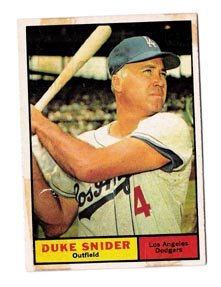 Last week, as I lazily moved from one destination to the next around Northern Vermont, I got to thinking: did Topps create Mickey Mantle, or did The Mick create Topps? (In the public consciousness, I mean). And if the former is true, couldn’t it also be said that Topps either created to help to mold the popularity (and possibly career) swings of every other baseball player since 1951? These questions got me (in a roundabout way) to the idea of the Topps checklist, the meritocracy theory behind each set’s checklist, and whether or not it would be possible—based on a few studious hours with an old Beckett and Microsoft Excel—for me to create a checklist for an ‘average’ Topps set.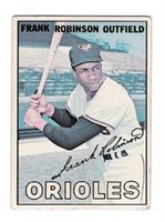
 Spahn and Koufax are interesting, because if you study the checklists from the Topps Sixties, it seems as though Koufax was Spahn’s heir to the Pitcher Hero Number—not Bob Gibson, who was just as deserving. Spahn and Koufax both had three years as a Hero Number, with Koufax ending his career as #100 in the 1966 set (Spahn ended his as #205, a 3rd Tier, in 1965). I gave Koufax #200 because it seems like Topps was positioning him to be the next full-set hero (to take over for the bad-kneed Mantle). Instead, Koufax retired and Topps elevated Gibson and Frank Robinson to take The Mick’s place. Spahn I gave #450.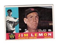
 Other Things to keep in mind:
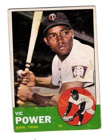 If anyone has an idea for what the design of this average Topps 1960s set would look like, send it to me by email and I’ll post the best three. I’d like to see fronts and backs, as well as League Leaders and All-Star card designs.