
 This set was an entirely foreign concept to me when I started collecting. Even after ten years of collecting I had maybe two or three cards from the set. I think this has to do with the Canseco Rated Rookie (where he’s sporting a ridiculous mustache…of course he was doing steroids! Thinking his dead-rat facial hair was a good idea is a dead giveaway…), which I couldn’t afford at the time as a single card and therefore couldn’t afford the packs. Also, just starting out in ’86, it blew my tiny mind that there was more than one card company. I mean, I was really only interested in Topps (I couldn’t afford the other two), but still--three different kinds; that’s pretty fucking sweet when you think about it. Anyway, I never had any cards from this set.
Being a gigantic Fred McGriff fan, I remember at a show I finally forked over the $12 for his rookie (another Donruss rookie score…a full year ahead of the other companies), only to watch its value sink and sink like a leaf falling in the autumn breeze. Seriously, what does a man have to do to get some value in his rookie card? He’s nearly in the 500 home run club, he played forever and was consistently good (if not great), he’s got a mind-bogglingly inane, yet Triumph of the Will-esque long format infomercial for a Little League professional hitting school video, he had a fantastic if somewhat nonsensical nickname “The Crime Dog”, (a riff on McGruff, but what the hell does it have to do with him? I don’t think he was a notorious bastard, had a penchant for late night gambling or frequenting clubs where gunfire broke out more than occasionally) and he was a winner. Seriously, if he had his career in the Sixties or Seventies, his rookie would be at least $40. McGriff should make the Hall of Fame before his fourth ballot year, and he certainly got help when Rafael Palmeiro slinked away into oblivion. The two had similar careers (McGriff had about 70 less homers than Palmeiro, but without the steroid help), played during the same era, and both are what Beckett would call ‘Semistars’.

Back to the set, it certainly can’t be called a goldmine set, but it does have the Canseco, just about the Mona Lisa of baseball cards during the late 1980s. The downside is that packs were just too expensive for the average kid collector (because of the Canseco possibility). I remember thinking that the blue stripe design looked expensive, and therefore ended up psyching myself out before even attempting to buy a pack. In terms of design, the set featured some pretty decent action shots. Too bad all the photos seemed to get crowded out of the frame by the blue stripe border. Man, that blue stripe border is intense. It makes me wanna watch Max Headroom—or have a seizure (and I’m not entirely sure which one would be more fulfilling).
29. 1984 Topps Traded
 There are certain things that sometimes-great-mostly-mediocre players can do to make themselves remembered after they retire. For Dave Roberts, that meant stealing second in Game 4 of the 2004 ALCS. For Billy Hatcher, it meant tearing the A’s a new one in the 1990 World Series. And then there are the lucky players to be traded or called up in 1984, enshrined in the 1984 installments of Topps Traded and Fleer Update.
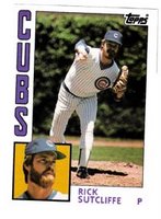
Seriously, the 3 guys pictured (Oliver, Sutcliffe and Nettles) all had pretty good, if not great careers, but nothing helped them more (in terms of their legacy) than being dumped by their former teams during the 1984 season. Think about it, if any one of them was traded in 1983 or 1985, they would earn a resounding ‘Who Gives A Shit, It’s Fuckin’ (insert name here)’, but because it’s the ’84 set, each gets a ’Holy Shit, It’s Fuckin’ (insert name here)! Man, This Set’s Got Everybody!’
Admittedly, this set pales in comparison to the Fleer rendition in terms of value (thanks to Topps not having the foresight to includes Clemens or Puckett), but think about this for a minute: when this set came out, who were you more interested in—Clemens or Dwight Gooden? My money’s on Gooden. So while 1984 was the end of the Big Brother reign of Topps over Donruss and Fleer, they still knew what was up with the hobby.
 You know, actually, as I read these last few sentences back to myself, Topps’ guessing wrong on Clemens and Puckett was a major blunder. If you look at the 1984 Topps set, which I will do in a minute, Mattingly was a big deal. But he was a big deal in every regular issue set that year. You could look at the 1984 Fleer Update set as the seminal set of the 1980s: at its essence it reaffirmed the shift in the balance of power that the regular issue Donruss and Fleer sets of 1984 started. After the Update set, Topps had to kick it into high gear to even stay relevant. They accomplished this with the Olympic team subset in the 1985 set, but by then the embarrassment that was 1984 Traded was reality, not some wild, doomsday scenario thought up at the bar after a long day at Topps HQ.
28. 1983 Fleer
 1983 Fleer deserves more credit than it has received. While it takes a lot for a man to pull himself together after hitting rock bottom (just ask J.R. Richard), I would argue it takes even more for a card company to regain its respectability (or just plain gain respectability) after it turns out a heaping pile of shit like 1982 Fleer. Seriously, how did they rebound with such a strong set?
 I guess the rookie trio of Boggs, Gwynn and Sandberg helped, but they helped all three sets that year (really, there are few sets in the decade that had a leg up from an ‘impact’ rookie: 1985 Topps had McGwire, 1984 Donruss had Joe Carter, 1987 Donruss had Maddux, 1989 Topps had Jim Abbott and Steve Avery). The card design is decidedly bland, but bland in a good way: light, airy, it doesn’t get in the way of the photo or crowd the design. If anything, the non-design is more effective than if they tried to go over the top. It set the tone for the rest of the Fleer decade (and I know I’ve touched on this point before): 1980s Donruss design was beset with a fascination of the line: 1981, 1984, 1985, 1986, 1987, 1988 (and even 1989, just a little bit)—every year the card front was a line-obsessed extravaganza, not so much a baseball card as a two-dimensional, baseball-themed homage to technology; very mannish, very technical, very tough. So if Donruss thought variations on a straight line would teach little boys that baseball was very left-brain, Topps was decidedly right-brain. Topps relied on a new design every year, and every year was distinctly different from the year before. None of that 1982-83 Donruss we’ve-run-out-of-ideas-let’s-just-make-them-look-the-same bullshit. Topps was original every year, which was both positive (1980) and negative (1982).

Fleer was in the middle, with left-brain tendencies. Not completely left-brain, mind you, but their designs were all vaguely similar and somewhat predictable. They stayed away from the dark colors (Donruss territory), preferring to go with white (1981, 82, 84 & 88), blue-white (1987), grey-white (1983, 89) and grey (1985). The lone standout year, in terms of its predecessors, was 1986, but even then (while blue) the front was very circular. That’s really the Fleer design hallmark: the curve. Even in the later years (1987-89), when line became a more important element in the design, with the light colors Fleer cards breathed in curves. You could argue that this was apparent from card #1 of the 1981 set, but I would argue that it’s not really important until 1983. It wasn’t really important until after the company suffered through the 1982 fiasco. This set does deserve more credit, but for now it’s #28.
27. 1984 Topps
 1984 Topps is one of my all-time favorite card designs. I think it has to do with the headshot. I was never really a fan of the 1983 design, which to a lot of collectors is the Holy Grail design of the 1980s. In my opinion, 1983 was too technical: the card front was partitioned into five sections (action shot, head shot, name/position text, team name in colored bar and outer white border). There was no chemistry between the elements; the action and headshots were cordoned off from each other (they didn’t really even touch). Sure, it was a marked improvement from 1982, hands down the most boring Topps card front design of the decade, but it seemed overtly technical and not nearly emotional enough.
Enter 1984, where Topps took all the individual great things from the 1983 set and pushed them together. Gone is that unnecessary border keeping everything from touching. Bigger action shots, bigger, eye-popping headshots on Pop Art color backgrounds (an homage to 1948 Leaf? Probably not, but it’s great anyway), just one white outer border on which player name, position and Topps logo rest, and last but not least, the fantastic team name. Really, it all comes down to the team name; it embodies the emotion lost from the 1983 design. It’s very Elvis Presley, very London Calling; with a simple twist of the hips, a simple smash of guitar the staid, technical design wrapped around the 1983 set dissolves, leaving bigger graphics, bigger action, bigger headshots. Just a kick-ass design.
Design aside, 1984 Topps had one of the weakest rookie classes this side of 1988 Topps. Let’s see: Mattingly, the regular-issue Strawberry and that’s about it. Gooden, Bret Saberhagen and the other rookies didn’t make it until the Traded set, but really 1984 Topps survives sans strong rookie class. Sure the Mattingly helps in the way Canseco helps 1986 Fleer, but again, Mattingly helped all three sets in 1984. 1984 Topps is a great set because of everything else it offers: a strong class of All-Stars, good player assortment on the Season Highlights that begins the set, Active Career Leaders and Team Leaders.
This is also a great set to build on your own if you’re just starting out and don’t have a lot of money. The money cards are all under $10 (with the exception of the Mattingly), the design is first-rate and the player assortment is excellent. It’s the first older set that I put together, and I’m a better man for it. If I let nostalgia cloud my judgment, I would’ve put this set higher (say around 15 or 16), but in reality this set has no rookies and was the first year where Topps came in a resounding third behind Donruss and Fleer in terms of desirability within the hobby. 1984 was really the beginning of the end for Topps.
Well, we’ve made it halfway through the Countdown of the Best Sets of the 1980s. Here’s a wrap-up so far:
53. 1989 Bowman
52. 1988 Donruss
51. 1982 Fleer
50. 1985 Fleer Update
49. 1989 Score
48. 1988 Donruss Rookies
47. 1985 Topps Traded
46. 1989 Donruss Rookies
45. 1981 Donruss
44. 1989 Score Rookie/Traded
43. 1989 Fleer Update
42. 1989 Donruss
41. 1983 Topps Traded
40. 1988 Score
39. 1981 Topps Traded
38. 1988 Fleer Update
37. 1987 Donruss Rookies
36. 1988 Fleer
35. 1987 Topps Traded
34. 1989 Fleer
33. 1986 Fleer
32. 1989 Topps Traded
31. 1981 Topps
30. 1986 Donruss
29. 1984 Topps Traded
28. 1983 Fleer
27. 1984 Topps
Fantastic Card of the Day
 This card of Remdog is one of three things: unfailing proof that steroids were rampant in baseball in the early Eighties, an optical illusion, or the photo was taken minutes after Remy was taken off the rack. Seriously, did he enjoy standing next to nuclear waste? In his playing days, Jerry Remy was fit, but not physically intimidating. Neither was he tall. In fact, on the back of the card it lists him at 5'9", but he could in fact be shorter than that. I'm talking Tom Cruise-short, maybe like 4'10". But his head is scraping the roof of the dugout!?! What gives? (If you need more proof that his mind couldn't take the torturous physical regimen he or someone in the Red Sox trainer's room was putting him through, check out his headshot on the back of the card. Gotta love Remdog: smiling in the face of even the most bizarre, if not arduous predicaments. Self-inflicted gigantism is nothing to be ashamed of, Jerry. Even little guys are allowed to dream big.)
Coming Soon: #26 – 24
11 comments:
Billy Hatcher may have had a fine World Series in 1990, but I'm guessing that he'll be remembered a little more frequently for his home run in the bottom of the 14th to extend the greatest game ever played... at least that's what I remember him for...
I agree on the '86 Donruss, it is a beautiful set, but it was almost impossible to find and when you did you couldn't afford it. For some reason every drug store carried '86 Fleer and Topps, but you had to go to an actual baseball card store to find Donruss. That was the third year of beautiful, impossible to find Donruss.
General question for the group...
These sets were from years where I was heavily collecting autographs on baseball cards. Therefore I find myslef thinking more about it today.
How do you all feel about getting an autograph on a baseball card? Do you think it technically damages the card or doe it make it more attractive and valuable?
I actually got that Canseco rookie from 86 donruss autographed in person at a show thinking it would raise the value tremendously. I managed to trade it for something pretty valuable if I remember correctly. How do you all feel about it?
Great post. I've really enjoyed your countdown and can't wait for the rest. However, I can't agree with your calling The Crime Dog nickname nonsensical. The dude bears a frightening resemblence to the cartoon crime fighter McGruff, not to mention a very similar last name.
84 Topps = London Calling! I'm still in tears from laughing. I love that set too.
Steve, for the record- I believe autographs tend to de-value cards. I don't know why though.
I always thought a ball point pen autographed card was cheesey, but a sharpie made it look great, i think it always helped the card.
Fred McGriff may have been the player most hurt by the strike of 1994. He was at his peak then and would've easily got the home runs he needed that year to get over 500 for a career.
Harold Baines is another one and may have had over 3000 hits if it wasn't for the strikes of 1981 and 1994.
At some point, an analysis of the Boulibaiseball Card subset of the ALF cards by Topps... completely dryly, completely tongue-in-cheek... would be interesting.
Now we're getting there. The '84 Topps was a sweet set, just had a great feel to it.
Still wondering where my fav (1983 Topps) will rank! Keep it up!
the thing i remember most about the 84 topps traded set is the pete rose card. pretty sure they used a picture of tony perez at bat and airbrushed it. the stance is all wrong for pete.
Post a Comment