
49. 1989 Score
 As I’ve noted before, this was a crappy sophomore effort. I mean, c’mon, polybagging packs was so 1988. The one good thing about this set was the card back: large headshot, comprehensive stats, color team logo, room for a few lines of copy. Just overall nice. What was that Fleer set in the mid-1990s? 1995? You know, the one where the fronts were made to look ‘hip’ and ‘now’ and ‘with-it’ when really they looked like the graphic designer had an epiphany after vomiting on a kaleidoscope. Anyway, I think that set was a roundabout homage to the back of the 1989 Score set.
Too bad Score was so obsessed with the subtle geometric baseball motif. I personally thought it worked in ’88. But coupled with the futuristic type on the front, not to mention the lame ‘Score’ name logo, it was just a bad combination. Also, let’s talk about color for a second. Now, I’m no color theory scholar, but when I see the Brett from this set, I’m not really drawn to it; it doesn’t make me want to buy more (unlike the Kirby Puckett from the 1987 Fleer set; one of the best cards of the decade). And you can’t tell me that the Score execs didn’t have hundreds of focus groups about card design. I’m sure by 1989 Topps, Fleer and Donruss were basically farming out the creative design part of the process to junior colleges around the country, but Score, it really looks like a lot of thought went into it and because so much time and energy went in the end product just sort of, well, sucked.
48. 1988 Donruss Rookies
I would like to see a show of hands of who bought this set. Keep your hands raised if you thought you’d be able to sell it later on and be able to put your kids through college. Now keep’em raised if you can tell me the point of including a rookie in the regular issue set and the traded/rookies/update set of the same year. It was totally awesome that Wally Joyner was in the 1986 Topps Traded set and a rookie in the 1987 regular set. But it’s totally lame to have Roberto Alomar as a Rated Rookie in the regular set and included in the end of year Rookies set. He was a goddamned Rated Rookie, the upper echelon of rookiedom. Alomar, Grace, Leiter; they were all RR’s. They had no place in the Rookies set. Also, 1988 Rookies sucked because of the variation on a theme design, there was never any value associated with it and the basic fact that it wasn’t 1987 anymore (no matter how hard the card companies tried to get us to believe). Also, explain this one: how did Score, of all companies, make such a killer 1988 Rookie/Traded set? Topps succeeded that year because it convinced USA Baseball to let it make cards again (a la 1985) of future stars Ty Griffin and Joe Slusarski (who was also immortalized on a three-photo Upper Deck card (I forget which year). This is also a subject I want to get into more, because it really was awesome; for all the shit Upper Deck has laid on the hobby over the years, the three-photo card remains totally awesome). Donruss and Fleer? Stuck with Rookies and Update. Man, here’s the real reason this set is ranked #48: this was the first year that if you got the Rookies set for your birthday or for Christmas or something you actually felt a little disappointed, and a little embarrassed for your parents or friends who got it for you, because you just knew that there was a moment right after they left the card shop where they bought it, where they thought they’d score major points for being hip to buying you baseball cards because that was your thing and that the term ‘rookie’ equates awesomeness within collectors’ circles, thus elevating other collectors view of you (when really all it did was make you look like either a complete card novice or a completist, and who the hell knew what a ‘completist’ was when you were 9 years old).
47. 1985 Topps Traded
The only reason that this set ranks higher than the 1985 Fleer Update is because it uses the fantastic 1985 regular issue design. Not that the ’85 Fleer Update set didn’t look like the regular issue Fleer set, but it’s just something about that ’85 Topps set that makes me feel warm inside.
46. 1989 Donruss Rookies
Wow. Another useless Rookies set from Donruss. Seriously, Donruss should have just stopped making sets after 1987. They would’ve looked pretty stupid at the time, but they wouldn’t have churned out so much crap, personally saving me hundreds of dollars, money that could be put to good use purchasing those ridiculous Comic Ball series that Upper Deck put out with Looney Tunes characters and few major leaguers as well. Was that Jim Abbott I remember in that set? Man, that’s fucked up…but I did like the hologram cards they included in that set. There were only two true rookies from the 1989 Rookies set: ‘Neon’ Deion Sanders and Joe Girardi. Did you know that Sanders apparently hated that nickname? I think that’s hilarious. Someone should prank call Greg Gumbel and tell him that Deion just loves being called ‘Neon’. Then it might actually be fun to watch a CBS pregame show. Also, and more importantly, who cares if you hate your nickname? It’s not you who decides what it is. Do you think Mordecai Brown liked being called ‘Three Finger’?
Briefly, in defense of this Rookies set, 1989 was a banner year: Griffey, Sheffield, Randy Johnson, John Smoltz, Gregg Jeffries, Ricky Jordan…I practically know the whole list by heart. But again: why make a set of rookies if most of the rookies appeared in the regular issue set? The only one that Donruss could’ve legitimately put in this set would’ve been Albert Belle, but they didn’t even think to include him. It’s like their crack team of researchers weren’t allowed to go to games if they didn’t finish their homework.
45. 1981 Donruss
Here’s where the torture cycle starts: 1981 Donruss. Did you know it’s cheaper to buy packs of this set today than many suggested retail prices on packs from this year? It’s true. But then again, why the hell would you want to buy packs of 1981 Donruss? It was printed from scraps from the Dixie Cup factory, right? Ugly, ugly cards. The backs even say ‘First Edition Collector Series’ across the top, like they’re trying to save their own asses ’cause they know the set’s crap. Take this Phil
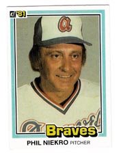 Niekro card: it almost looks like they decided against using their own photographer and instead waited until the Braves’ press secretary went out to the dumpster to throw away the bad takes from the PR photo shoot from that year. Niekro looks borderline psychotic in this photo, like he was the model for the crotchety old man who ran the amusement park and was always trying to murder Scooby Doo. Seriously, what would’ve happened if that guy ever caught Velma and the gang? I bet he would have carried them over his shoulder to his lair in the back of the funhouse and cooked them dinner and maybe taught them how to throw a knuckleball. There are serious issues here that have not been addressed.
Another bad thing about the ’81 Donruss set: besides flimsy stock and bad photos, the colors are all messed up. Did some unlucky printer’s intern leave the still-wet cards out to dry in the sun too long? Also, who chose the typeface for the team name on the front? Was it the only one the printer had left? Or was it the only one that Mr. Donruss had programmed on his Commodore 64?
And now, briefly, in its defense, the Rickey Henderson is one of the best cards from the set, or any set pre-1985. That green and yellow uniform, with the red border (if I remember it correctly); it makes for a nice front. Much better than the front of his ’81 Topps card, where I believe he has his eyes closed.
Coming Soon: Sets 44 – 40
12 comments:
I would wear a Dickie Thon 21 jersey from the Phillies. I love the idea.
I'm going to get the "READY 23" removed from my jersey tomorrow and have it replaced by Thon.
Dude - your blog friggin' rules. I love reading it. Keep up the amazing trip down memory lane.
One minor request - more pics of the cards you're talking about? I know, greedy. But that's just me.
Anyhow, thanks for a truly entertaining, engaging blog.
More great insights, as usual. Keep up the good work...
And say what you will about those '81 Donruss cards, but I'll always have a soft spot in my heart for them (along with the '81 Topps and Fleer sets) because that was the year I first started collecting. The funky Donruss fonts, that cap in the lower corner of the Topps, and that ball on the corner of the Fleers.... Good times, man, good times...
"Niekro looks borderline psychotic in this photo, like he was the model for the crotchety old man who ran the amusement park and was always trying to murder Scooby Doo."
Brilliant!!
Yeah, this was the set that had TONS of errors. I remember the Buck Martinez error card that showed a mirror image of his picture. So he looked like a left-handed batter in one version and a right-handed batter in the other version.
http://www.baseball-cards.com/vintage/1981-donruss.htm
Anyway, I love the site. Keep it up!
Love the site, but have to disagree with the assessment of 89 score. The photo-quality was the best of any major set that year, and every player had an action shot. Plus, the photos on the back were cool and Score always got bonus points with me for the detailed biograhies on the back. And it's not like the borders were an eyesore, like most late 80's Donruss sets.
I agree that '89 Score was a hugely disappointing sophomore edition. It's like they took the best parts of the '88 design -- bold, rich blocks of color combined with slick action shots -- and threw them out the window. I admired Score '88, but the '89 set blocked any momentum that the brand had gained up to that point. Although my local Woolworth's sold Score at dirt-cheap prices, I usually bought Topps or Donruss instead.
I still remember a pack from the '89 Score set that I got as a party favor. It was probably the worst pack I ever opened -- virtually all worthless commons like Keith Atherton, with nothing in it worth over a dime.
You are generous in pointing out that the card backs were decent. But praising card backs is like saying a girl looks pretty from behind -- such a comment quickly becomes irrelevant. It's the front, not the back, that you remember.
Still, I wonder if '81 Donruss wasn't worse. I didn't collect back then, so I can't really say.
the thing i liked about score was that they produced cards for veterans who had retired the previous year. for example, they made a 1988 steve garvey card, even though he retired early in the 1987 season. ditto for don sutton in the 1989 set. as a result, these were the only cards (at that time) to include their entire career statistics.
The guy that said that the 89 Score had the best photos obviously forgot about 89 Upper Deck. Those photos were by far the best.
Love the site, and I loved the Scooby Doo reference.
Hey this is a fantastic site.
I linked you to my site, www.americanlegends.blogspot.com .
I work for a store that sells sports cards and so I am deep into the business. This site is just right for the business!
Would you be able to link me to your site as I did for you?
Take care,
Mark
"Joe Slusarski (who was also immortalized on a three-photo Upper Deck card"
#777 1991 Upper Deck
this was the first year I collected cards so I also have a soft spot for it even though its hysterically bad...like a Rambo movie trying so hard to be serious but you still bust out laughing. You nailed all the points but a few other things that make me laugh looking back on these cards now in my collection
Keith Hernandez - perhaps the worst still posed photography ever on a baseball card. It was like the photographer stood 20 feet back in a windstorm with the camera out of focus!!! At first I thought I just got a misprinted card until I had 4 out of focus cards after going through a box.
The "Deuce" of Jim Palmer - We all know they printer multiples of Hall bound players like Yaz, Pete Rose, Bench, etc. At least on those they had the common decentcy to use a NEW bad picture. Palmer's "second card" was simply a cropped down verson of the SAME DAMN PICTURE!!! talk about cheap!
Post a Comment