
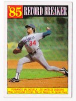
 If I let my romantic tendencies get the best of me, this set would be in the top twenty. The limited vocabulary newspaper headlines on the back, the unbelievably bad airbrushing on the front, plus the original torn-from-the-headlines look on the front of the card—it all combines for a breathtaking card, a venerable feat of design that accurately captures an era of gap-toothed ballplayers with big glasses, bad unis and even worse hair.
But this is a straight-laced countdown, one where I’m not about to allow a deep-seated love of bad airbrushing let this little set slip by unnoticed. It’s a loser, but only because Topps, still new to the whole ‘traded series’ game, made it so.
Let’s put all design issues temporarily aside and focus instead on checklist because it’s here where I think Topps really screwed up (plus I’m a fan of the overall 1976 design, and think it was on the strong side of the 1970s). Topps’ policy, if I have this correctly, was to include only those players who were traded during a brief span of the 1975 off-season, as it was assumed that the company wouldn’t have time to get a new card of the player into the regular 1976 set. But even this idea is problematic, as it kept Topps at least a step behind actual, real-time baseball personnel moves.
The classic example is Reggie Jackson. Jackson’s 1975 card has him on the A’s (correct), 1976 also has him on the A’s (incorrect), for some reason he’s not the main attraction of the 1976 Traded series, and then in 1977 he’s on the Yankees. So what happened to his year with Baltimore?
 It was brief, but it did happen, and Topps had not one but two opportunities to show him in an Orioles uniform. Instead, there’s a ridiculous gap. What Topps should have been doing was extending production time until late June, keeping the presses out in Pennsylvania open at least a little while in the summer, and then releasing a true Traded series in late September. That way they would have players in the series who’d been traded anywhere from just before the season began to up to two months into the season. Sure, it’s a tall order to fill, but they owned their own press, so even if you factor in all the other jobs over the course of the year, from the other sports to non-sports to regionals to other small sets, I’m sure there was a couple days when they could’ve found the time.
Anyway, with all that backstory, here’s a list of players traded that would’ve made the 1976 Traded series a helluva lot more collectible. Those that are bolded were included in the real Traded series [team on actual Traded card]:
Willie McCovey, A’s
Nate Colbert, A’s
Don Baylor, A’s
Mike Torrez, A’s
Reggie Jackson, Orioles
Ken Holtzman, Orioles
Tommy Harper, Orioles
Rick Dempsey, Orioles
Rudy May, Orioles
Scott McGregor, Orioles
Tippy Martinez, Orioles
Darrell Evans, Giants
Gary Sutherland, Brewers
Bernie Carbo, Brewers
Bobby Darwin, Red Sox
Don Kessinger, Cardinals
Steve Renko, Cubs
Larry Biittner, Cubs
Larry Gura, Royals
Bill Sudakis, Royals
Tommy Davis, Royals
Fritz Peterson, Rangers
Bert Blyleven, Rangers
Terry Humphrey, Angels
Mike Easler, Angels*
Reggie Smith, Dodgers
Lee Lacy, Dodgers [Braves]
Andy Messersmith, Braves
Mike Marshall, Braves
Jim Dwyer, Mets
Andre Thornton, Expos
Del Unser, Expos
Cardell Camper, Indians
Rudy Meoli, Reds
Diego Segui, Padres
Pedro Garcia, Tigers
Roy Smalley, Twins
Blue Moon Odom, White Sox
Cleon Jones, White Sox
Ken Brett, White Sox [Yankees]
Carlos May, Yankees
Doyle Alexander, Yankees
Cesar Tovar, Yankees
*Easler’s first Topps card was in the 1978 set, featuring him on the Pirates. This would’ve been his rookie card.
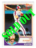
Now, let’s get back to the design. I touched briefly on the idea of airbrushing, or more appropriately, bad airbrushing, and I don’t think I can stress this enough. There were sets put out at various times over Topps’ long and distinguished record with examples of bad airbrushing. Jose Cardenal comes to mind more than once. I think Eddie Mathews’ ear got lopped off on a managerial card. But this Traded series takes bad airbrushing to another level.

Let me put it this way: if you got into a drunken argument at a bachelor party where you were for some reason forced to equate baseball cards with their rightful mythological legend counterparts, you could win easily by saying that any twelve cards and Oscar Gamble would be the equivalent of King Arthur and the Knights of the Round Table, simply on bad airbrushing alone. That’s not a claim—it’s a fact. There is simply no set that features more—and a higher degree of—badly airbrushed cards. Even those cards featuring players without hats are bad: Ken Brett’s pinstripes have been painted on.
I got an email from a reader that I reprinted on the blog not too long ago stating that because the 1982 Fleer was so bad, it was therefore great. It seems that the case could be made for this set as well, so to pre-empt this idea, I think that in this instance checklist and formulation of checklist greatly outweighs the unintentional comedy of the design and photography (and the fact that the Topps’ poor sap headline writer managed a minor victory by working ‘Le Grande Orange’ onto the Rusty Staub card). Especially for a 44-card set.
Why was it released at all? To scare the bejesus out of SSPC (or was it TCMA by now?)? The reasons behind releasing the set (besides selling more cards of a by-now stale set) are missing, and the cards included boil down to nothing more than Willie Randolph, Ferguson Jenkins, Rusty Staub, 41 others who could pass for commons and an unnumbered checklist.
I like this set as much as the next guy, but you could find more searching through Oscar Gamble’s hair.
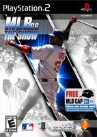 I don’t know what it is about MLB 2006: The Show, but I’m beyond addicted to it. And while almost every other part of my life has suffered because of it, one facet hasn’t.


 In a brilliant move, Leaf sold these—in the same wrapper—with marbles. It’s a miracle any of these cards survived even the first trip from the factory to the drugstore. Packaging aside, this is a neat little set, with overly candid black and white photos probably taken by a high school yearbook photographer on his lunchbreak. I’m serious—if one of the players included in this set ever ended up on the lam, post offices around the country could just tack that player’s card from this set to their wall. This set is an open textbook on the art of proper mug shot photography.
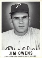

 The collectors who insist on 1969 and before have it right because it’s pretty easy to walk into a hobby store and ask for and receive boatloads of commons and star cards from the Seventies through the present. It’s much harder to walk into the same hobby store and ask to see 1953 Bowman Color and be presented with more than two or three examples. Of course that’s just an example, and I would venture to say that if you make the rounds of the major paper and ephemera shows (like Allentown, Hartford, etc.), you’d have a better shot of finding older cards than new. They also have it right because not only is it harder to find specimen (if you don’t where to look), it’s harder still to find specimen in decent condition. So this argument has a double dose of scarcity: actual, physical scarcity in terms of number of cards, and scarcity pertaining to those in decent condition within that universe.
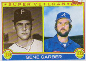 I don’t know. And I don’t think anyone will really know for sure for another ten or fifteen years. By that time I’ll be up in my tree house, yelling down to anyone who’ll listen that you shoulda got that 1983 Topps set back when it was $75—the last set with rookies of three bona fide Hall of Famers, two retiring legends and a Super Veterans card of Gene Garber. Now that’s a real investment.
 David, I know what you mean—if only punk rock post-modern hipsters had figured out a way to break into Fleer HQ in the summer of 1981 (22 years before the publication of The Hipster Handbook), got high and masqueraded as the Fleer executives in charge of the 1982 strategy. That’s the only way this set could’ve been more unintentionally funny. But the same could be said about many sets from this time period, like 1981 Donruss, 1979 Topps and 1982 Topps.
 Unfortunately, both sets don’t really have high monetary value. The 1991 Studio set, though, while we’re on the subject of unintentional comedy, is rife with it. It really makes me happy that you have this set in a binder. I bought this set a few years back for about $12 (around its current value) and immediately put it in a binder. The charcoal gray canvas background, the feathered hair on the white guys and the flat tops on the black and latino guys—the photography is just really funny.
 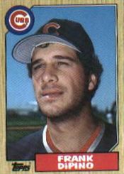 Drew, very astute of you on the Ron Cey citation. When people ask me how the hell I chose 1987 Topps over other, more respectable sets from the decade, it always comes back to Frank DiPino’s lips. It’s something that Topps capitalized on that the other card companies never understood: the art of the airbrush, or more specifically, the art of bad airbrushing. It’s a characteristic that instead of alienating in fact made the set more likable, because it was like we as collectors were in on the joke. You know?
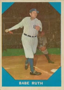 If you're not familiar with this set, Fleer put out a flurry of small competitor sets to Topps in the late 1950s and early 1960s in baseball, football and basketball (actually, basketball is a special case, as sets from this time period are few and far between: Bowman put out a set in 1948, Topps put out a set for the 1957-58 season, and then Fleer came out with a set for 1961-62. So to call them competitors in this particular sport is not exactly accurate. But Topps and Fleer were competitors in baseball, so let's not discuss basketball, if that's okay).
