 Today’s note of appreciation is less about the card than it is about the player. Dave Stewart was one of those pitchers who toiled for a few teams and more than a few years before finding his groove and showing his stuff as one of the game’s most dominant pitchers. He won 20 or more games four years in a row. Today it’s a big deal if a guy wins 17 games. He was recognized as the most dominant starting pitcher on a staff that included a guy who won 27 games that year (1990 A’s). His cards are cheaper than cheap, which is unbelievable, seeing as how cards of Johan Santana, this generation’s version of the dominant pitcher, are well realized price-wise. You could make a case that the game is not likely to see another pitcher on the caliber of Stewart, based on complete games alone. He had 55 in his career (not that great), with 41 of those coming in his four dominant years. The active leader in complete games is Roger Clemens with 118, and if you take his four most dominant years (1986, 1987, 1988, 2001), his complete game total is similar (42). I’m not saying Stewart is going to make the Hall of Fame, I’m just saying that when he was at the top of his game, he was at the top of the game. And for that he deserves more attention.

September 30, 2006
Appreciation: 1990 Fleer #21: Dave Stewart
Today’s note of appreciation is less about the card than it is about the player. Dave Stewart was one of those pitchers who toiled for a few teams and more than a few years before finding his groove and showing his stuff as one of the game’s most dominant pitchers. He won 20 or more games four years in a row. Today it’s a big deal if a guy wins 17 games. He was recognized as the most dominant starting pitcher on a staff that included a guy who won 27 games that year (1990 A’s). His cards are cheaper than cheap, which is unbelievable, seeing as how cards of Johan Santana, this generation’s version of the dominant pitcher, are well realized price-wise. You could make a case that the game is not likely to see another pitcher on the caliber of Stewart, based on complete games alone. He had 55 in his career (not that great), with 41 of those coming in his four dominant years. The active leader in complete games is Roger Clemens with 118, and if you take his four most dominant years (1986, 1987, 1988, 2001), his complete game total is similar (42). I’m not saying Stewart is going to make the Hall of Fame, I’m just saying that when he was at the top of his game, he was at the top of the game. And for that he deserves more attention.
September 29, 2006
Appreciation: 1976 Topps #590:
’76 Rookie Outfielders
It’s no secret I’m a Lemonhead. How can you not be? Chet’s a badass; why the White Sox gave up on him is a mystery. So his rookie is a big deal to me. It’s not worth very much, which makes it all the more desirable (and attainable). Collecting Chet Lemon is a lot like collecting Fred Lynn or Jack Clark or Dale Murphy (to a certain extent): you can get their cards, including their rookie cards, for under $20 and their other regular cards (for the most part) for under a dollar. They were also popular enough that companies today include them in their vintage-themed sets…
I was just reading the back of this card and it says the White Sox acquired Lemon from the A’s. That means, had Oakland held onto him, their early 1980s starting outfield would’ve been Dwayne Murphy, Rickey Henderson and Lemon. Not bad at all. Granted, the A’s had Tony Armas, but they’d move him to Boston soon enough anyway. Anyway, every team has a guy like Lemon (someone who is with the team long enough to establish tenure and then sort of becomes the team). Lemon’s situation with Detroit was singular because so many guys were around forever: Morris, Parrish, Whitaker, Trammell, Gibby and Lemon were there all through the 1980s. In Boston there was Dwight Evans. Really that’s the only guy I can think of right now, but you could find examples on almost every team.

I was just reading the back of this card and it says the White Sox acquired Lemon from the A’s. That means, had Oakland held onto him, their early 1980s starting outfield would’ve been Dwayne Murphy, Rickey Henderson and Lemon. Not bad at all. Granted, the A’s had Tony Armas, but they’d move him to Boston soon enough anyway. Anyway, every team has a guy like Lemon (someone who is with the team long enough to establish tenure and then sort of becomes the team). Lemon’s situation with Detroit was singular because so many guys were around forever: Morris, Parrish, Whitaker, Trammell, Gibby and Lemon were there all through the 1980s. In Boston there was Dwight Evans. Really that’s the only guy I can think of right now, but you could find examples on almost every team.
September 28, 2006
Appreciation: 1978 Topps #233: Dick Pole
 Sure it’s fun to make fun of guys with unfortunate names, but what makes this even better is that he’s on the Mariners. You could make a case that the only contributions the Mariners made to Major League Baseball before Mark Langston broke in were that they made the American League basement one team deeper and that they had some of the most consistently ugly uniforms. Even by ultra-hip retro fashions, the upside down trident looks like a misplaced afro pick. Just really bad stuff. Pole’s uni looks like it’s made out of polyester. Bad name, bad team, bad uniform: this card is worth framing, or laminating and making into a bookmark, or something that figures prominently into your everyday life so you’re reminded how good you’ve really got it.
September 27, 2006
Appreciation: 1977 Topps #523: Rollie Fingers and his Finely Waxed Mustache
And to think, it all started with Charlie O. paying Fingers a $500 bonus for growing what would become his signature (I think this is true, but I guess for now we’ll have to call it an unsubstantiated rumor). Another great thing about this card is that because he signed with the Padres after 1976, Topps had to pull his Padres uniform out of their collective asses. Or maybe not? I’m looking at it more closely, and if it’s a fake job, it’s a pretty damn good one, one of their better airbrushings.
As a side note, can you imagine if the A’s and Red Sox really had gone through with their mega-trade in the mid-1970s and the Sox got Fingers and Rudi like they were suppose to? For chrissakes, that would’ve been one of the best teams ever put together. Read Gammons’ Beyond the Sixth Game for more great writing (the stuff of a whole generation of Red Sox fans’ wet dreams).

As a side note, can you imagine if the A’s and Red Sox really had gone through with their mega-trade in the mid-1970s and the Sox got Fingers and Rudi like they were suppose to? For chrissakes, that would’ve been one of the best teams ever put together. Read Gammons’ Beyond the Sixth Game for more great writing (the stuff of a whole generation of Red Sox fans’ wet dreams).
September 26, 2006
Appreciation: 1982 Topps #203: Toronto Blue Jays Future Stars
 It’s amazing how quickly people forget about players. It’s no wonder that players like Rickey Henderson and Julio Franco keep playing; they know that fans won’t remember them unless they’re in the public eye. Case in point: Jesse Barfield. Have the Blue Jays ever had a better outfield arm? Really, if you were on third and someone hit a long fly out to Barfield with less than two outs, do you trust your legs enough to get you to home before the throw? I don’t know if I’d run (then again, I get shin splints if I run more than forty feet at a time, so I know I wouldn’t make it). Barfield was part of the Blue Jay All-Star outfield of the 1980s with George Bell and Lloyd Moseby. Can you imagine if a team cultivated that kind of outfield talent today? One of two things would happen: if they were on the Red Sox, Theo Epstein would go down to the Store 24 in Kenmore Square for a cup of coffee and in his brief absence the interim co-GMs would trade the young outfielders to the Marlins for Mike Lowell, or in their third years they’d all ask for max contracts and end their days in towns with no chance of winning (like Texas).
 Another thing to appreciate about this card: it’s the rookie of first baseman Boomer Wells. Has there ever been another sports franchise in the history of sport that’s had two players with the exact same name? I’m guessing Boomer’s real first name is not ‘Boomer’. So then, did the pitcher David Wells (who cut his teeth with the Blue Jays in the late 1980s) get his nickname from the first baseman, or did it arrive naturally on its own?
September 25, 2006
Appreciation: 1991 Score #773: Bo Breaker
In 1990 Score did a favor to young boys everywhere (that none of them consciously asked for): it gave them a fixation for their latent, unrealized homosexual desire. I’m speaking of course about the Bo Jackson black and white photo card of him with no shirt on, but holding a baseball bat and wearing football shoulder pads. If I remember correctly, Beckett had it instantly valued at $5, which was a very big deal, and collating was poor enough by Score to guarantee that you’d never get it in a pack. Despite Score’s best efforts, the sports-star-without-a-shirt-on fad was really a one-card wonder. As was the Bo Jackson special card, because as you can see here, it’s much harder to make anger aesthetically pleasing than raw power.
Not that this card doesn’t have its merits. It was fairly obvious that Jackson was a ‘good guy’; he seemed nice and a good role model for children (if you ask people my age who followed baseball in the late Eighties/early Nineties, Jackson is consistently one of their favorite players). He was also incredibly strong, so the idea that he could smash his bat in two while smashing a home run was no stretch of the imagination. It was also kind of cool (in a very safe way) that someone could be strong enough to snap a bat in half if he got frustrated enough at striking out. This idea would prove quaint by the mid-Nineties when Albert Belle became baseball’s dominating personality and the idea of snapping a bat was more about anger than it was about a blip in personal discipline.

Not that this card doesn’t have its merits. It was fairly obvious that Jackson was a ‘good guy’; he seemed nice and a good role model for children (if you ask people my age who followed baseball in the late Eighties/early Nineties, Jackson is consistently one of their favorite players). He was also incredibly strong, so the idea that he could smash his bat in two while smashing a home run was no stretch of the imagination. It was also kind of cool (in a very safe way) that someone could be strong enough to snap a bat in half if he got frustrated enough at striking out. This idea would prove quaint by the mid-Nineties when Albert Belle became baseball’s dominating personality and the idea of snapping a bat was more about anger than it was about a blip in personal discipline.
September 24, 2006
A Note of Appreciation
Yesterday I did the unthinkable: I gave away some of my cards. My Dad had been through town last weekend and took a few boxes of cards with him back up to Boston. I found more cards I no longer wanted to be reminded of as soon as he left, but instead of keep them in the closet, I put them in a big ziplock bag, wrote FREE! on the side in sharpie and put them down in my apartment building’s mailroom. When I went back down there this morning the bag was gone, so it’s good to know that although that bag was full of Kevin Duckworth doubles and 1980 commons, there’s someone out there who appreciates the hunt.
That said, my experience has put me in a sharing mood. That’s why I’ve decided to share one thing I love about collecting, baseball or baseball cards every day until I run out of things to talk about. I’m starting today with
Appreciation: Joe Morgan’s 1981 Topps Traded card #807
 There are a few reasons I love this card: 1) it’s cheap, 2) it’s his first card in a West Coast uniform and 3), he’s obviously not as spry as he once was (but he’s trying very hard to look it). It’s Morgan’s face fat (and gut fat) that give it away, but he’s not helped by the pose. If anything, they should’ve had him at the plate, or barring that, sitting in the dugout or something that doesn’t call
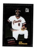 attention to the fact that he was nearly 40 years old when they took this photo. Also, another reason I love this card is because Topps thought it was worthy enough to be included in one of its Chrome sets. It’s like preserving Fat Elvis over Skinny Elvis.
September 20, 2006
A Few of My Favorite All Stars
One of the kicks of any set is seeing how all-stars are represented. Also, the all-star design is a pretty good way of determining if the set design is going to be stellar or if it’s going to suck. Take 1990 Topps for example. 1990 was the Year of the Square (it happens every eight years or so on the Chinese calendar, between the Year of the Swirly Line and Year of the Team Name Pennant). Squares were abundant in the Topps design, and while on paper that could’ve been cool if, say, Frank Lloyd Wright had designed them, the design sucked.
The all-star cards were no exception, and in fact were perhaps one of the lowest lowlights of the set design-wise. Let’s look at the Will Clark card. It’s got big block letters screaming ‘All Star’ in a way reminiscent of the old Star Market logo from the Boston-area supermarket chain of the same name, in a way that calls to mind both Easy Rider and drug party super vans with airbrushed murals on the sides of sunsets and White Fang wolves and Native American feathers and other shit that just reminds me of Phoenix, Arizona, in a real depressing way. Then we have the really poorly chosen Lichtenstein-on-a-bad-day pixilated border in a host of puke oranges that was the cornerstone of the 1990 Topps design. To round out the front they used thin block capital letters to spell out the player’s name and a weirdly saturated photograph. So if we think about the design as a product of the early 1990s, when Photoshop and PageMaker and Quark were in their earlier days, this design was supposed to look futuristic. All it ended up looking like was futuristic in a Tomorrowland kind of way: with a distinct 1970s feel. And I didn’t even mention the hideous 1930s Art Deco-esque font used for the headlines on the back. Barely legible, ugly, ugly stuff.
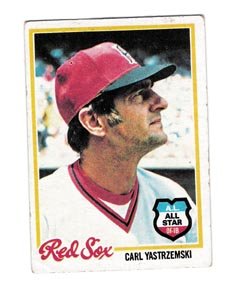 Despite the putrid design, 1990 was smack in the middle of an unprecedented run of eleven years where Topps gave the all-stars their own subset. From 1977 to 1981 a badge or a banner was placed on a player’s regular card. This had two effects: 1) there were more checklist numbers available for more players (more rookies, more role players, more bench warmers, other subsets, etc.) and 2) it created something we could call ‘All Stars Without Borders’ in that you’d have all-stars all across the checklist of the set. While I’d personally vote for an All-Star subset over banners on players’ regular cards in the ASWB tradition, the idea of spreading them over the course of the checklist is a neat idea. Of the ASWB years, 1978 is a personal favorite. The all-star badge is a perfect complement to the scripty border design, like a gas station logo complements the scripted thread nickname on the left breast of a gas station attendant’s jumpsuit. They just go together well. Plus, by looking at this one card of Carl Yastzremski, you can tell that the whole set lays out well. It’s one of the most aesthetically-pleasing sets of both the 1970s and the ASWB sets.
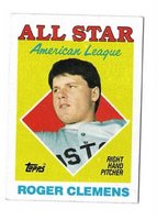
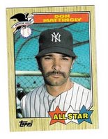 Going back to the All-Star subset run from 1982 to 1992, and not counting 1993, when all-stars went back to how they were in 1973 and 1974 (by position, with both leagues on one card), there are a few years I’d like to mention. First, besides 1990, there are only two years that don’t follow the design of the regular cards. Both work, but to varying degrees. The first is 1987. The regular ’87 card featured the name in a colored box along the bottom of the card. On the all-star card, the name is smeared across a banner along the top. The bottom features three stars (red, white and blue) with the bright yellow words ‘All Star’ spread out across. Not unpleasing in the least, and the photos are a mixture of close-ups and medium shots, including the classic ‘Dave Parker in a Warm-Up Jacket’ and ‘Mike Schmidt Leaning on
 a Bat’, not to mention Don Mattingly sporting a pre-NASCAR NASCAR mustache. The second year to deviate between regular and all-star card design was 1988. ’88 differed from ’87 in that 1988 featured headshots only, like this one of Tim Raines. The designers also did a funny thing with the Clemens card: they took a shot of him slouched on the bench and separated him from the background. 1988 and 1989 were the only two years during the 1980s when Topps put the all-stars on an abstract background. Every other year they were rooted in the context of their own photograph. 1988 is an especially good year for all-star design (in my opinion).
 Although Topps abandoned The Sporting News and/or Sport Magazine sponsorships of the all-stars nearly twenty years earlier, for 1988 they harked back even further and created a step-brother design to the hallmark 1958 all-star design. In this example, Eddie Mathews’ massive head takes up most of the card, but behind him is an abstract blue background (American League all-stars had a red background) with little yellow stars. “’58 All Star Selection” is across the top in very cool, calm 1950s modern design (Topps was always a mirror of the forefront of design), and the player’s name and position is across the bottom. In 1988, there
 really wasn’t any major, respectable design movement to speak of (from what I remember, anyway), so Topps had to look from within to find card design harmony. They found it by stealing from 1958. They got rid of the stars (which they’d bring back, to a certain degree, in 1989), but they kept the color scheme of red, yellow and blue. These elements make for a welcome return to the abstract, and certainly a great complement to the stellar, thin-bordered photography of the regular player cards in the set. One of the best all-star designs of the decade.
 Quickly, a few other favorites. 1993’s Topps Finest was a set that I only have two cards from because they were just so goddamned cool and thus, so goddamned expensive. That said, the all-star subset is great. The great thing about this first Finest set is that the cards look like they were made by pressing beer cans into a mold and then coloring them with dyes. This Eckersley is one of my favorite cards of the decade. (Which reminds me of a list I’d like to put together one of these days…)
Donruss was always clueless about the very idea of the all-star and how to showcase it. There were those lame ‘all-star only’ sets that they put out in the late 1980s, then they worked all-stars into the 1990 set, but really Donruss didn’t have all-stars. They had Diamond Kings.
Fleer, on the other hand, did have all-stars, and they knew what to do with them: as an insert set, which was kind of cool to get when no other company was really doing that. The Fleer all-star design was always real simple and usually quite abstract (and not in the All-American Topps kind of way, but in the stark white formica countertop kind of way, which definitely fit the Fleer aesthetic of the late 1980s).
 The Topps rack pack glossy all-star was always one of my favorite card subsets and really the only reason to spend the extra fifty cents for the rack pack (besides the extra cards). Just imagine my delight upon opening my 1986 Topps rack pack and scoring this Carlton Fisk glossy all-star, complete with him jawing out no one in particular. I still feel chills on my arm just looking at it. No wait, somebody left the window open.
Finally, the only all-star design related elements I think Topps should bring back are the gigantic puzzle (formed when you put all the all-stars together) and the cartoon back. Or how about this: when you put all the all-stars together, they form a gigantic cartoon. Maybe a 12-panel comic strip of Dave Parker complaining that he's cold and making a young Barry Larkin go find him his warm-up jacket for his big all-star photo. You know, just for old times sake.

The all-star cards were no exception, and in fact were perhaps one of the lowest lowlights of the set design-wise. Let’s look at the Will Clark card. It’s got big block letters screaming ‘All Star’ in a way reminiscent of the old Star Market logo from the Boston-area supermarket chain of the same name, in a way that calls to mind both Easy Rider and drug party super vans with airbrushed murals on the sides of sunsets and White Fang wolves and Native American feathers and other shit that just reminds me of Phoenix, Arizona, in a real depressing way. Then we have the really poorly chosen Lichtenstein-on-a-bad-day pixilated border in a host of puke oranges that was the cornerstone of the 1990 Topps design. To round out the front they used thin block capital letters to spell out the player’s name and a weirdly saturated photograph. So if we think about the design as a product of the early 1990s, when Photoshop and PageMaker and Quark were in their earlier days, this design was supposed to look futuristic. All it ended up looking like was futuristic in a Tomorrowland kind of way: with a distinct 1970s feel. And I didn’t even mention the hideous 1930s Art Deco-esque font used for the headlines on the back. Barely legible, ugly, ugly stuff.
 Despite the putrid design, 1990 was smack in the middle of an unprecedented run of eleven years where Topps gave the all-stars their own subset. From 1977 to 1981 a badge or a banner was placed on a player’s regular card. This had two effects: 1) there were more checklist numbers available for more players (more rookies, more role players, more bench warmers, other subsets, etc.) and 2) it created something we could call ‘All Stars Without Borders’ in that you’d have all-stars all across the checklist of the set. While I’d personally vote for an All-Star subset over banners on players’ regular cards in the ASWB tradition, the idea of spreading them over the course of the checklist is a neat idea. Of the ASWB years, 1978 is a personal favorite. The all-star badge is a perfect complement to the scripty border design, like a gas station logo complements the scripted thread nickname on the left breast of a gas station attendant’s jumpsuit. They just go together well. Plus, by looking at this one card of Carl Yastzremski, you can tell that the whole set lays out well. It’s one of the most aesthetically-pleasing sets of both the 1970s and the ASWB sets.
 Going back to the All-Star subset run from 1982 to 1992, and not counting 1993, when all-stars went back to how they were in 1973 and 1974 (by position, with both leagues on one card), there are a few years I’d like to mention. First, besides 1990, there are only two years that don’t follow the design of the regular cards. Both work, but to varying degrees. The first is 1987. The regular ’87 card featured the name in a colored box along the bottom of the card. On the all-star card, the name is smeared across a banner along the top. The bottom features three stars (red, white and blue) with the bright yellow words ‘All Star’ spread out across. Not unpleasing in the least, and the photos are a mixture of close-ups and medium shots, including the classic ‘Dave Parker in a Warm-Up Jacket’ and ‘Mike Schmidt Leaning on
 a Bat’, not to mention Don Mattingly sporting a pre-NASCAR NASCAR mustache. The second year to deviate between regular and all-star card design was 1988. ’88 differed from ’87 in that 1988 featured headshots only, like this one of Tim Raines. The designers also did a funny thing with the Clemens card: they took a shot of him slouched on the bench and separated him from the background. 1988 and 1989 were the only two years during the 1980s when Topps put the all-stars on an abstract background. Every other year they were rooted in the context of their own photograph. 1988 is an especially good year for all-star design (in my opinion).
  Although Topps abandoned The Sporting News and/or Sport Magazine sponsorships of the all-stars nearly twenty years earlier, for 1988 they harked back even further and created a step-brother design to the hallmark 1958 all-star design. In this example, Eddie Mathews’ massive head takes up most of the card, but behind him is an abstract blue background (American League all-stars had a red background) with little yellow stars. “’58 All Star Selection” is across the top in very cool, calm 1950s modern design (Topps was always a mirror of the forefront of design), and the player’s name and position is across the bottom. In 1988, there
 really wasn’t any major, respectable design movement to speak of (from what I remember, anyway), so Topps had to look from within to find card design harmony. They found it by stealing from 1958. They got rid of the stars (which they’d bring back, to a certain degree, in 1989), but they kept the color scheme of red, yellow and blue. These elements make for a welcome return to the abstract, and certainly a great complement to the stellar, thin-bordered photography of the regular player cards in the set. One of the best all-star designs of the decade.
 Quickly, a few other favorites. 1993’s Topps Finest was a set that I only have two cards from because they were just so goddamned cool and thus, so goddamned expensive. That said, the all-star subset is great. The great thing about this first Finest set is that the cards look like they were made by pressing beer cans into a mold and then coloring them with dyes. This Eckersley is one of my favorite cards of the decade. (Which reminds me of a list I’d like to put together one of these days…)
 Donruss was always clueless about the very idea of the all-star and how to showcase it. There were those lame ‘all-star only’ sets that they put out in the late 1980s, then they worked all-stars into the 1990 set, but really Donruss didn’t have all-stars. They had Diamond Kings.

Fleer, on the other hand, did have all-stars, and they knew what to do with them: as an insert set, which was kind of cool to get when no other company was really doing that. The Fleer all-star design was always real simple and usually quite abstract (and not in the All-American Topps kind of way, but in the stark white formica countertop kind of way, which definitely fit the Fleer aesthetic of the late 1980s).
 The Topps rack pack glossy all-star was always one of my favorite card subsets and really the only reason to spend the extra fifty cents for the rack pack (besides the extra cards). Just imagine my delight upon opening my 1986 Topps rack pack and scoring this Carlton Fisk glossy all-star, complete with him jawing out no one in particular. I still feel chills on my arm just looking at it. No wait, somebody left the window open.
Finally, the only all-star design related elements I think Topps should bring back are the gigantic puzzle (formed when you put all the all-stars together) and the cartoon back. Or how about this: when you put all the all-stars together, they form a gigantic cartoon. Maybe a 12-panel comic strip of Dave Parker complaining that he's cold and making a young Barry Larkin go find him his warm-up jacket for his big all-star photo. You know, just for old times sake.
September 13, 2006
The Set That Never Was (But Very Well Could've Been)
 When I first started this exercise, I asked that anyone interested send me their take on what the average Topps set would look like. I honestly thought that I wouldn't get any response, thinking that even though baseball card design has influenced design and art since the inception of the form, not too many people had the time (or the desire, really) to try their hand at it. Thankfully, I was wrong.
 May I present to you...the only submitted design and therefore the winner...Dave from Vermont. And now, in the artist's own words: "This one is inspired by the 67s (big space for the photo), the 61s (small box at bottom for name/team/position) and the 60s (team logo in bottom left, tho only two Topps 60s sets had team logos, but what the hell, right?). One other thing: I made a point to use sans-serif fonts; seems Topps liked those plain (but bold and readable) names." And this design would've won no matter what anyway, as Dave made a point to mention that he accomplished his design on work time. So here's to you Dave, way to go. My only critique would be that I'll be damned if Yaz is gonna represent in Yankee Stadium. I mean, I know he's from Long Island, but c'mon. Let's rouse a sleeping Topps photographer in Boston, for chrissakes, and get a good one of Carl throwing his glove at a ball completely out of reach.
Also, I totally screwed up the checklist, as I forgot to include #'s 49 (Ed Brinkman, Senators) and 50 (Tony Oliva, Twins). Here's the new version.
September 12, 2006
For Your Consideration...the Average 1960s Topps Checklist
Okay, so it took a little longer than I imagined. I left out some guys that I probably should've left in (like Johnny Klippstein, Clay Carroll and Pete Ward) and part of me really wanted to give Gil Hodges a player card and a managerial card. And I also probably shouldn't have put Diego Segui on the Pilots. Oh well. Here it is.
September 02, 2006
Caring for Your Collection
You know, I never thought I’d leave this much of a gap between posts, but this whole numbering thing has moved way past ‘exercise’ and is now much more of a full-on ‘task’. I am just a little over half-way done; I’ve determined each team’s roster, its manager, the All-Stars, who the rookies are, who the League Leaders are and whether or not the ‘average’ set would include a ‘special subset’ or not. Of these cards, I’ve numbered 361 of them, leaving 237 to go. Just to give you an idea of how I do this (identifying and numbering each card), here’s the brief version of my project:
I wanted to determine if an ‘average’ set could be constructed for a given decade (I chose the 1960s), which would reflect the merit and popularity-based system of numbering that Topps employed in those ten sets (1960 to 1969). I’ve determined the rosters (roughly 22 to 26 players each) of the 20 main teams and included 5-man mini-rosters for the 4 expansion teams (Pilots, Royals, Expos, Padres), based on each player’s service and tenure with that team. I used a minimum of 3 years on any team, and if the player was on more than one team for over 3 years, then I identified him with the team of his longest tenure in the decade (special exceptions were made for the expansion players, like Diego Segui). For example, Orlando Cepeda played on the Giants (1960-66), the Cardinals (1966-68) and the Braves (1969). Though he played nearly 3 full seasons on the Cardinals and helped them win the World Series in 1967 (and won the NL MVP), I have him on the Giants, because that’s the team he was with the longest and therefore is the team he identifies with the most. I think the one major drawback of my ‘tenure-based’ system is that my set does not include any journeymen players (ie those who may have had a 6 or 7 year career in the decade, but played for 4 or more teams).
As for the checklisting for my set, I’ve consulted the checklists for each set from 1960 to 1969, culled and analyzed the numbers of each player, and determined their ‘average’ checklist number for the decade. Some numbers are more exact than others. Anyway, tonight I still have 157 guys on tap to number, so hopefully I can wind this project up soon. I’m going to try to make the full, completed checklist available as a pdf or .xls download.
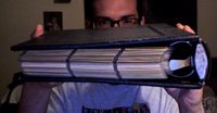
But that’s not what I wanted to talk about. I’ve been thinking a lot about how I should display my collection: boxes in my closet, in random stacks around my apartment, or in pages in a binder? Displaying and caring for cards is one of the biggest topics in the hobby, with Ultra Pro just about cornering the market in mostly-transparent plastic sheets with holograms on them. Admit it, it’s the hologram that gets you first, then it’s the dust-free plastic, and then, late at night just before you decide to load that old 1990 Topps Brewers team set into pages, it’s the smooth, smooth plastic caress against your stubbly cheeks that convinces you Ultra Pro is good enough for your precious cardboard. I’ve been down that road many times and it’s all good: I recommend Ultra Pro. In fact, if you’re serious about showcasing your cards in a binder or you want to teach a kid how to appreciate the high art of baseball cards, I recommend buying Ultra Pro pages by the box. I don’t know how much it costs for a box of 100 pages, but the last time I did it (about 10 years ago) it was around $20 to $25. Paginating a set and running out of pages when you’re knee-deep into it sucks. Don’t be that guy. Buy pages by the box.
For those of you who’ve never bought pages or paginated a set, the standard size (modern) baseball card fits into upright 9-pocket pages. Larger-sized cards, like those from the Topps sets 1952 to 1956, fit into horizontal 6-pocket pages. Of course, I’m sure that Ultra Pro makes about a billion different pocket configurations, so you should look at their web site (www.ultrapro.com) or visit your local hobby shop to determine what’s best for your cards.
 If you don’t want to buy a 3-ring binder and some pages, then you’re a cheapskate and your loved ones probably don’t expect much from you on their birthdays or around the holidays. That said, boxes in a closet aren’t all bad. There are specially-designed cardboard boxes that can store 300, 600, 800 or more cards like a vending box. They don’t cost very much, and they’re good for stacking (especially for those of us with collections that populate well over 150,000). Of course, if you don’t want to splurge on the 2 bucks it costs for a sportscard box, there’s always the prospect of a shoebox, or if you don’t have the cash for kicks, there’s the recipe box standby. Here’s how that works: see where your mother/wife/girlfriend/boyfriend/friend/coworker/neighbor keeps their little flip-open box of recipes. I bet it’s somewhere in the kitchen. Now, when they’re not looking, steal the box, dump out all the recipes and keep your prized cards in there. I would recommend slipping a rubber band around the stack of recipes (perhaps even the very same rubber band that kept all your cards together) and hiding the recipe box somewhere in your room. Then, methodically swipe hard, uncooked macaroni elbows from the kitchen (and a bottle of glue), and garishly adorn the recipe box with said items. When it’s completely covered (and unrecognizable…see where I’m going with this?), take it out of its secret hiding spot and use it to proudly showcase your cards. When your friends ask why you’re showing them your baseball cards in a ridiculous macaroni-covered recipe box, tell them you made it at summer camp when you were a kid. And try not to make eye contact with your mother/wife/girlfriend/boyfriend/friend/coworker/
neighbor when you say this. He/She can usually tell when you’re lying—you’re a horrible liar. My advice would be to spend the goddamned $1.95 on a stupid 800-count cardboard box.
 Pages, boxes, what am I forgetting? Toploaders! Right. Toploaders give the impression that your cards are valuable (when they are, in fact, most likely not). They are the prerequisite for dealers at card shows, so don’t be fooled: just because that Topps Archive Gaylord Perry’s in a toploader does not mean it’s valuable. It still costs less than doing a load of laundry. But toploaders are great for cards, because if you have all your cards loose in a shoebox (like me), they prevent the corners from nicking. A toploader is really two pieces of hard plastic with just enough space for a card to slip inside. It’s lightweight, good for transporting your priceless/worthless possessions to card shows and begging dealers to buy them, and it’s also great for stacking. Here’s what it’s not:
1) A toploader is not the same thing as a screwdown case. Card storage products are generally named for how a card relates to them. To use a toploader, you load a card in at the top. To use a screwdown case, you put the card between the two pieces of hard plastic and, with a screwdriver, screw the two pieces together, trapping the card between. See the screwdown case example pictured.
2) A toploader is not recommended for the transport of cards to a card grading service. Professional graders generally ask for the card to arrive in a flimsier hard plastic sleeve. I’m not entirely sure why this is.
3) A toploader is not a good surface to affix Scotch tape.
4) The plastic used in cheaper quality toploaders is prone to discoloration if left in the sun.
5) They bend if under a lot of weight. The frame withstands weight but the two ‘window’ pieces of plastic do not.
6) The plastic used is not always smooth, requiring the use of a soft sleeve for the card, and lots of banging to get the card down in there.
7) And then, when you inevitably want to get the card out of there, well, it’s a hassle.
8) A toploader is not good for those who want their cards to survive with perfect corners. Corners will most likely be damaged.
9) I now understand why professional graders do not like toploaders.
Top loaders and soft sleeves are good for beginners and seasoned collectors alike. As long as you know what you’re in for and what to expect, everything should be good.
Collecting can be fun. Hell, it is fun. If it’s something you enjoy but you don’t know how to justify your obsession to those you care about, displaying your cards—either in binders, boxes or a stack of toploaders—is a great way to start.
I wanted to determine if an ‘average’ set could be constructed for a given decade (I chose the 1960s), which would reflect the merit and popularity-based system of numbering that Topps employed in those ten sets (1960 to 1969). I’ve determined the rosters (roughly 22 to 26 players each) of the 20 main teams and included 5-man mini-rosters for the 4 expansion teams (Pilots, Royals, Expos, Padres), based on each player’s service and tenure with that team. I used a minimum of 3 years on any team, and if the player was on more than one team for over 3 years, then I identified him with the team of his longest tenure in the decade (special exceptions were made for the expansion players, like Diego Segui). For example, Orlando Cepeda played on the Giants (1960-66), the Cardinals (1966-68) and the Braves (1969). Though he played nearly 3 full seasons on the Cardinals and helped them win the World Series in 1967 (and won the NL MVP), I have him on the Giants, because that’s the team he was with the longest and therefore is the team he identifies with the most. I think the one major drawback of my ‘tenure-based’ system is that my set does not include any journeymen players (ie those who may have had a 6 or 7 year career in the decade, but played for 4 or more teams).
As for the checklisting for my set, I’ve consulted the checklists for each set from 1960 to 1969, culled and analyzed the numbers of each player, and determined their ‘average’ checklist number for the decade. Some numbers are more exact than others. Anyway, tonight I still have 157 guys on tap to number, so hopefully I can wind this project up soon. I’m going to try to make the full, completed checklist available as a pdf or .xls download.

But that’s not what I wanted to talk about. I’ve been thinking a lot about how I should display my collection: boxes in my closet, in random stacks around my apartment, or in pages in a binder? Displaying and caring for cards is one of the biggest topics in the hobby, with Ultra Pro just about cornering the market in mostly-transparent plastic sheets with holograms on them. Admit it, it’s the hologram that gets you first, then it’s the dust-free plastic, and then, late at night just before you decide to load that old 1990 Topps Brewers team set into pages, it’s the smooth, smooth plastic caress against your stubbly cheeks that convinces you Ultra Pro is good enough for your precious cardboard. I’ve been down that road many times and it’s all good: I recommend Ultra Pro. In fact, if you’re serious about showcasing your cards in a binder or you want to teach a kid how to appreciate the high art of baseball cards, I recommend buying Ultra Pro pages by the box. I don’t know how much it costs for a box of 100 pages, but the last time I did it (about 10 years ago) it was around $20 to $25. Paginating a set and running out of pages when you’re knee-deep into it sucks. Don’t be that guy. Buy pages by the box.
For those of you who’ve never bought pages or paginated a set, the standard size (modern) baseball card fits into upright 9-pocket pages. Larger-sized cards, like those from the Topps sets 1952 to 1956, fit into horizontal 6-pocket pages. Of course, I’m sure that Ultra Pro makes about a billion different pocket configurations, so you should look at their web site (www.ultrapro.com) or visit your local hobby shop to determine what’s best for your cards.
 If you don’t want to buy a 3-ring binder and some pages, then you’re a cheapskate and your loved ones probably don’t expect much from you on their birthdays or around the holidays. That said, boxes in a closet aren’t all bad. There are specially-designed cardboard boxes that can store 300, 600, 800 or more cards like a vending box. They don’t cost very much, and they’re good for stacking (especially for those of us with collections that populate well over 150,000). Of course, if you don’t want to splurge on the 2 bucks it costs for a sportscard box, there’s always the prospect of a shoebox, or if you don’t have the cash for kicks, there’s the recipe box standby. Here’s how that works: see where your mother/wife/girlfriend/boyfriend/friend/coworker/neighbor keeps their little flip-open box of recipes. I bet it’s somewhere in the kitchen. Now, when they’re not looking, steal the box, dump out all the recipes and keep your prized cards in there. I would recommend slipping a rubber band around the stack of recipes (perhaps even the very same rubber band that kept all your cards together) and hiding the recipe box somewhere in your room. Then, methodically swipe hard, uncooked macaroni elbows from the kitchen (and a bottle of glue), and garishly adorn the recipe box with said items. When it’s completely covered (and unrecognizable…see where I’m going with this?), take it out of its secret hiding spot and use it to proudly showcase your cards. When your friends ask why you’re showing them your baseball cards in a ridiculous macaroni-covered recipe box, tell them you made it at summer camp when you were a kid. And try not to make eye contact with your mother/wife/girlfriend/boyfriend/friend/coworker/
neighbor when you say this. He/She can usually tell when you’re lying—you’re a horrible liar. My advice would be to spend the goddamned $1.95 on a stupid 800-count cardboard box.
 Pages, boxes, what am I forgetting? Toploaders! Right. Toploaders give the impression that your cards are valuable (when they are, in fact, most likely not). They are the prerequisite for dealers at card shows, so don’t be fooled: just because that Topps Archive Gaylord Perry’s in a toploader does not mean it’s valuable. It still costs less than doing a load of laundry. But toploaders are great for cards, because if you have all your cards loose in a shoebox (like me), they prevent the corners from nicking. A toploader is really two pieces of hard plastic with just enough space for a card to slip inside. It’s lightweight, good for transporting your priceless/worthless possessions to card shows and begging dealers to buy them, and it’s also great for stacking. Here’s what it’s not:
 1) A toploader is not the same thing as a screwdown case. Card storage products are generally named for how a card relates to them. To use a toploader, you load a card in at the top. To use a screwdown case, you put the card between the two pieces of hard plastic and, with a screwdriver, screw the two pieces together, trapping the card between. See the screwdown case example pictured.

2) A toploader is not recommended for the transport of cards to a card grading service. Professional graders generally ask for the card to arrive in a flimsier hard plastic sleeve. I’m not entirely sure why this is.
3) A toploader is not a good surface to affix Scotch tape.
4) The plastic used in cheaper quality toploaders is prone to discoloration if left in the sun.
5) They bend if under a lot of weight. The frame withstands weight but the two ‘window’ pieces of plastic do not.
6) The plastic used is not always smooth, requiring the use of a soft sleeve for the card, and lots of banging to get the card down in there.
7) And then, when you inevitably want to get the card out of there, well, it’s a hassle.
8) A toploader is not good for those who want their cards to survive with perfect corners. Corners will most likely be damaged.
9) I now understand why professional graders do not like toploaders.
Top loaders and soft sleeves are good for beginners and seasoned collectors alike. As long as you know what you’re in for and what to expect, everything should be good.
Collecting can be fun. Hell, it is fun. If it’s something you enjoy but you don’t know how to justify your obsession to those you care about, displaying your cards—either in binders, boxes or a stack of toploaders—is a great way to start.
Subscribe to:
Posts (Atom)