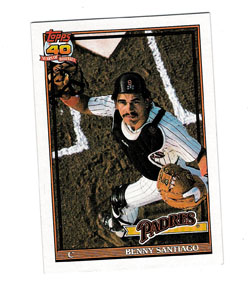
 But for all this doom and gloom the changed atmosphere (one of increased competition for share of voice and for collector dollar) did wonders for the individual quality of the cards. Topps, not known for stellar photography, busted out some definitely cinematic poses for the 1991 base set. Take this one of Benny Santiago (and by the way, when did he go from ‘Benito’ to ‘Benny’?): not only is the lighting just right, but the photographer is definitely using a crane for the shot, in an effort to dramatize Santiago going after a pop foul, from the pov of the ball. Kind of weird, when you think about it, but definitely more dramatic than another shot of Santiago in the dugout picking his nose.
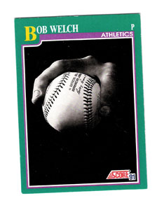
Score, unlike Topps, did not have to include grand, sweeping photography in its base set in order to do battle with the company’s newly launched premium brand (that would come in 1992 with the stellar Pinnacle set): they had to do it to stay in the running against the ten or so competing sets. Also unlike Topps, Score’s 1990 set featured great, show-stopping photography on a few choice cards, set pieces if you will. Of course I’m talking about the Bo Jackson in pads card, but there was also the Bo Jackson All-Star Game card as well as the Highlights cards of Ryan and Boggs. Then there were the artist’s-rendition-from-a-photo Dream Team cards that were very much like Diamond Kings only way cooler, seeing as how there were less of them. Anyway, I’m rambling here, but the point is that Score had more to draw from than Topps in terms of how to do a show-stopping set piece card. Topps knew only to rely on sweeping photography; Score knew that there would have to be a gimmick attached as well. That’s why the Bob Welch card from the 1991 set works. Sure, Welch won 27 games and wasn’t considered the top starter that year on the team (Dave Stewart was), and sure, his win-total outburst was more career aberration than anything else, but the guy did win the Cy Young, his team did make the World Series and he did have a pretty great season, statistics-wise. So how does Score celebrate his achievement? With a card that graphically summarizes his season: a simple black-and-white photograph of his signature pitch, the split-finger fastball. In a word, it’s classy. More so than, say, the Bo Breaker card, which was derivative of the 1990 Jackson set piece, and which I’ve written about before.
 As a third example, take a look at the Fernando Valenzuela card from the 1991 Upper Deck set (#175). It’s trademark Upper Deck, in that it features an awesome three-picture photo of the dynamic Valenzuela wind-up. The three-photo card was an original UD idea that was as much a brand signifier as it was a gimmick, and just by looking at it you knew what Upper Deck stood for as a card company: great quality, irreverent presentation. In essence, a premium brand that cared fuck-all about the other companies, because once collectors got a taste of the Upper Deck product, there wouldn’t be any more competition. It took the hobby a little while to come to this conclusion, but here we are. Industry insiders and historians will tell you that the success of Upper Deck can be laid on the shoulders of many decisions, from including autographed cards as inserts to leading off with the Griffey rookie as card #1 in 1989, but they’d be amiss if they didn’t mention that by using cinematic photography on nearly every card, and especially the three-photo card, customers moved past ‘collectors’ to ‘loyal following’ the moment they opened a pack.

No comments:
Post a Comment