 This was a gorgeous set. Sure, some of the inserts were ugly (MVPs, Long Ball Leaders, Spirit of the Game, Elite, Award Winners), but others were fantastic (Decade Dominators, anyone?) and the base set was probably the nicest-looking Donruss design since… well, at least since the black’n’red of 1985.
 But what really made this set unbelievable was that just three years earlier Donruss still held tight to their nerdy line motif. And yet, despite 1992 being one of the worst designs of the early decade, without it and the 1993 set, there’s a good chance that 1994 would look very different (this kind of design transition was nothing new to the hobby: in 1969 Topps released a minimalist set, then in 1970 did gray borders, setting up a short-lived design renaissance consisting of 1971’s black borders and 1972’s psychedelia). Let’s take a step back for a moment to note how 1994 Donruss came to pass (from a design sense).
1991 was the last ‘traditional’ Donruss issue, with thick patterned borders that completely surrounded the photograph on the front and came in two colors (green and blue), dependent on the series, not the team. ’91 also marked the last year of the pictureless, statistic-heavy two-color back (black for text and a border in the same green or blue of the front). 1992, while hideous in design, moved the set onto a better, more durable stock, with a four-color front and back, replete with a headshot. Because they added color (and thus photography) to the card backs, Donruss took a step away from showcasing row after row of statistics. 1993 saw more of the same: the borders on the front got thinner, the photography got more adventurous on both the front and back, and while they provided roughly 40% of the back for stats, gone was the always-entertaining ‘Career Highlights’ section (usually devoted to recounting a player’s freak injuries). For more on 1991, 1992, and 1993 Donruss, see earlier Nineties Countdown posts.
So then it made sense that 1994 would feature borderless photography on the front (it was next logical step). What was truly amazing was that Donruss made the backs borderless photos as well (with overlaid graphics); biographical information and statistics seemed as mere afterthoughts on these cards. And while I’m usually a proponent of full career statistics, the sparse use of typography (in any form) works well in this design.

Coupled with the more refined design was a refined checklist. 1994 saw the return to 660 cards, and the checklist had a ‘classic Donruss’ feel (despite there being no Diamond Kings in the base set, or, for the first time in 11 years, any Rated Rookies). And the set was not even really hurt by the fact that there weren’t Rated Rookies (though it would’ve been nice to have a 1994 Alex Rodriguez Rated Rookie, right?) or really any other, unmarked rookies to speak of. 1994 was all about veterans, doing veteran things, including a subset of cards celebrating various veterans’ accomplishments spread out over the checklist (many of them checklists themselves). There was even an insert of 1984 reprints.
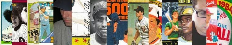
I was 15 years old in 1994. And with greasy, matted hair, embarrassingly thick glasses, and a face full of pimples and a mouth full of braces, I was old enough to appreciate a thing of beauty.
These scans are from TwinsCards. Visit their great site if you get a chance.
No comments:
Post a Comment