 How many more years can Topps do the Heritage line? You have to think they’ll do it as long as it makes them money, right? Or is it more of a question of design? I’d like to think it’s the latter, that at a certain point they’d stop (after the well of classic design runs dry). So how many more years? Well, they’re set for now, because this set is almost flawless, a huge improvement from last year’s Heritage ’57 (and I’ve always been a much bigger fan of the 1957 design than 1958). Topps had stellar design years in 1959, 1960 (to a certain degree), 1963, 1965, 1967, 1968, 1971, 1972, 1977, 1978…but Upper Deck compromised more than a few of those years with their own rip-off Vintage line, and do we really need or want Heritage ’78?
  This set—one of the strongest Heritage sets in years—represents Topps at the top of their design arc of the 1950s-1960s. Gone are the unneeded (and historically inaccurate) action poses. Instead: lots of close-ups and medium close-ups. Now I know beyond a doubt that not only does Jeff Weaver look exactly like Zach from Gilmore Girls, but he will probably fight you if you tell him. Gone is the washed-out photography that seriously marred last year’s Heritage ’57 set. Taking their places are strong colors: from the better-quality photography to the iconic solid color background; even the backs feel stronger than last year’s. The deep red may be a little hard to read in low light, but for some reason when I read them I get the strongest urge to learn how to chew tobacco. This is also odd, because I’ve always considered 1958’s design to be the most elemental Topps ever produced, almost to the flash-card degree. Like all great art, it’s all things to all people: elegant, abstract, simple, international, clean, crisp, modern, and yet I find it very pre-school (I think it would be fascinating to track down some of the old Topps designers and have them explain how they went from the almost no-design design of 1958 to the ultra modern, beatnik, jazz-record-and-advertising design of 1959. The two years couldn’t be more different. I almost expect the explanation to be that there was a change in art department leadership). Because today’s Topps designers didn’t muck around with the base card design (or any aspect thereof), it works.
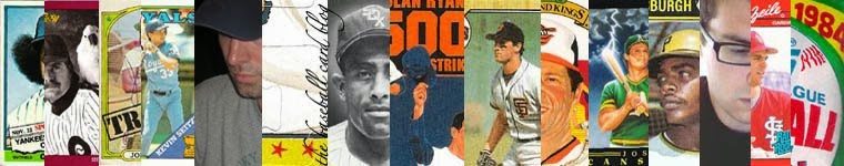
As I said before, I’ve always been a bigger fan of the years around 1958 than 1958 itself. Maybe that’s because I’ve always found the design so basic, maybe because my first 1958 cards were rain-soaked commons purchased in an album at an antique store for $10 (I was really more concerned with the non-rain-soaked 1965 Frank Robinson in the same album), so I never appreciated them much. Only in the past year have I really started to discover the beauty of this set. Starting with the stellar All-Star subset (Topps has never done better), re-created beautifully in Heritage ’58—even on the obligatory non-superstar American League second baseman card of Sweet Loretta. The only thing missing was Topps getting the rights from the now-defunct Sport Magazine to use their name on the card, like in the original, because I think everybody remembers the sham that was Topps Magazine.

The card that really made me appreciate the 1958 set was the black-backgrounded Pete Whisenant (one of only six black backgrounds). He’s just a common from the Reds, but that black background kicks ass. Anyway, when I caved and bought a box of this year’s set, I got this card of Aaron Rowand in one of my first packs. All I could think of was, Yeah! Black background! Other nice little things:
• White borders on the special cards I haven’t seen that thick a border since Eddie Murray’s 1988 Record Breaker.
• Then & Now insert set This is one insert set where Topps rarely fails. They have nice pairings, decent design, and it almost feels like it could be a subset rather than an insert set.

• Tasteful airbrushing I can’t believe I just used that phrase, but it’s true. I’m not entirely sure if J.D. Drew really ever made it on to the Red Sox, but his card is pretty good. That’s not to say that all the airbrushing is great; that would be too good to be true. Ronnie Belliard’s hat is made out of frosting, and I’m not sure if those braids are his, either.
Of course, Topps makes a few blunders with this set (this wouldn’t be a Topps set without a few glaring bad decisions), but lucky for them most of those bad decisions are limited to the insert sets. Starting with the Flashbacks set.
 They should really do a design overhaul on this one, and while they’re at it, they should re-evaluate where they’re getting their images. This one of Kaline is obviously taken off his 1967 card. Not even the right decade! How dumb do they think we are?
 Also, when are they going to put the Chrome and Refractor insert parallel sets to bed? These sets feel over-the-hill to me. Am I the only one who’s not thrilled to get one of these in his pack? I feel like I’m just getting one less card. I’m also less than thrilled with the Home Run cards of Mantle and Rodriguez.
 At least in the Mantle set’s defense, it commemorates his 1958 home run title and it’s printed on the same stock as the set, so it sort of fits. But the Rodriguez cards have nothing to do with anything, plus they are printed on thin glossy stock. They feel out of place in Heritage packs, like Topps got the target audience wrong. They’re as bad and feel as worthless as the Hobby Masters from last year’s Series 2 hobby packs.
 Rounding out the insert sets (that you have a decent shot in finding in a box) is the New Age Performers set. In years past, this insert set has boasted consistently good design. Unfortunately, that streak ends with this set. The starburst, the weak color palette, the squeezed serif type across the top—it all makes for a bad front. The backs are nice, but no one is going to put these in nine-pocket pages with backs facing out. Too bad.
It’s been a long, cold winter in New York, and I’m a pretty pessimistic guy, but we just got an extra hour of sunlight today, Spring is right around the corner, and for the all crap that Topps has unloaded on us in the past week or so, this year’s Heritage set is pretty great. Truthfully, I’m in the mood for collecting a set, but there’s only
 one thing holding me back from going for the master set (I’m 11 cards shy of the master Heritage ’54 set), and it’s this: in 1958, card #273 featured Hal Smith of the Cardinals. Smith, possibly to stem the tide of questions about who was who between the two Hal Smith’s, possibly because he was just having fun or was out of his mind, had his photo taken with his mask on. It’s one of the greatest cards ever. He’s even giving a sign, which to a little boy might look like he’s gesturing inappropriately. I don’t know, but I’m pretty sure he’s smiling, and it sure as hell is creepy. That’s why I’m crossing my fingers that there’s a card of Joe Mauer or Jason Varitek with their mask and pads on, hopefully giving an equally inappropriate-looking sign. Then I’ll know it’s okay to dive in head-first.
1 comment:
I recently discovered that the local Shopko still has quite a few 2007 Topps Heritage packs left. After being thoroughly disappointed with 2007 Topps Series 2, I decided to buy a few packs. I'll admit it -- I'm hooked now. Sure, the gum sucks and the wrappers are more imitation wax than real wax, but these cards are really a sight to behold. Thanks in large part to EBay, this may be the first set I ever make a serious attempt to complete (though I think I have just about all of '89 Topps by accident).
Oh, Topps should get rid of all the stupid Mantle / A-Rod / Chrome / Shit insert sets in these Heritage lines. I got one of those Mantle home run cards and wanted to trade it right away. I'd rather have less inserts and more cards per pack.
Post a Comment