 A while back I encouraged every- and anyone to send in their take on an 'average' 1960s Topps design to go with my checklist for the 'average' set. You may remember that our friend Dave from Vermont sent in a design a few weeks back; it was posted with the final, downloadable pdf checklist.
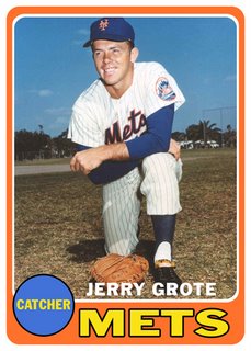
 This morning I received another design, this one from something (or someone) known as The Triborough Organisation. Note the heavy influence of 1968, the dropped out player name a la 1967 and the team name color scheme similar to 1960, 1965 and 1966. Its photo-to-border ratio suggests late decade design, as for some reason I associate bigger pictures with post-1965 design (and yes, I'm lumping 1968 into the 'bigger picture' category, though it had the most non-photographic front-of-card elements since '65). Anyway, for your viewing pleasure.
No comments:
Post a Comment