
The all-star cards were no exception, and in fact were perhaps one of the lowest lowlights of the set design-wise. Let’s look at the Will Clark card. It’s got big block letters screaming ‘All Star’ in a way reminiscent of the old Star Market logo from the Boston-area supermarket chain of the same name, in a way that calls to mind both Easy Rider and drug party super vans with airbrushed murals on the sides of sunsets and White Fang wolves and Native American feathers and other shit that just reminds me of Phoenix, Arizona, in a real depressing way. Then we have the really poorly chosen Lichtenstein-on-a-bad-day pixilated border in a host of puke oranges that was the cornerstone of the 1990 Topps design. To round out the front they used thin block capital letters to spell out the player’s name and a weirdly saturated photograph. So if we think about the design as a product of the early 1990s, when Photoshop and PageMaker and Quark were in their earlier days, this design was supposed to look futuristic. All it ended up looking like was futuristic in a Tomorrowland kind of way: with a distinct 1970s feel. And I didn’t even mention the hideous 1930s Art Deco-esque font used for the headlines on the back. Barely legible, ugly, ugly stuff.
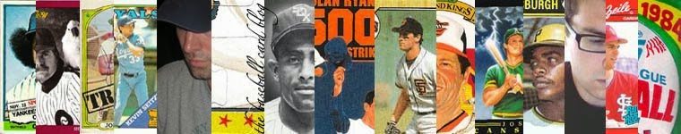
 Despite the putrid design, 1990 was smack in the middle of an unprecedented run of eleven years where Topps gave the all-stars their own subset. From 1977 to 1981 a badge or a banner was placed on a player’s regular card. This had two effects: 1) there were more checklist numbers available for more players (more rookies, more role players, more bench warmers, other subsets, etc.) and 2) it created something we could call ‘All Stars Without Borders’ in that you’d have all-stars all across the checklist of the set. While I’d personally vote for an All-Star subset over banners on players’ regular cards in the ASWB tradition, the idea of spreading them over the course of the checklist is a neat idea. Of the ASWB years, 1978 is a personal favorite. The all-star badge is a perfect complement to the scripty border design, like a gas station logo complements the scripted thread nickname on the left breast of a gas station attendant’s jumpsuit. They just go together well. Plus, by looking at this one card of Carl Yastzremski, you can tell that the whole set lays out well. It’s one of the most aesthetically-pleasing sets of both the 1970s and the ASWB sets.
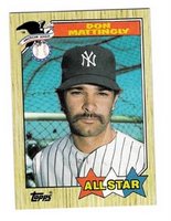 Going back to the All-Star subset run from 1982 to 1992, and not counting 1993, when all-stars went back to how they were in 1973 and 1974 (by position, with both leagues on one card), there are a few years I’d like to mention. First, besides 1990, there are only two years that don’t follow the design of the regular cards. Both work, but to varying degrees. The first is 1987. The regular ’87 card featured the name in a colored box along the bottom of the card. On the all-star card, the name is smeared across a banner along the top. The bottom features three stars (red, white and blue) with the bright yellow words ‘All Star’ spread out across. Not unpleasing in the least, and the photos are a mixture of close-ups and medium shots, including the classic ‘Dave Parker in a Warm-Up Jacket’ and ‘Mike Schmidt Leaning on
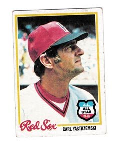
 a Bat’, not to mention Don Mattingly sporting a pre-NASCAR NASCAR mustache. The second year to deviate between regular and all-star card design was 1988. ’88 differed from ’87 in that 1988 featured headshots only, like this one of Tim Raines. The designers also did a funny thing with the Clemens card: they took a shot of him slouched on the bench and separated him from the background. 1988 and 1989 were the only two years during the 1980s when Topps put the all-stars on an abstract background. Every other year they were rooted in the context of their own photograph. 1988 is an especially good year for all-star design (in my opinion).
  Although Topps abandoned The Sporting News and/or Sport Magazine sponsorships of the all-stars nearly twenty years earlier, for 1988 they harked back even further and created a step-brother design to the hallmark 1958 all-star design. In this example, Eddie Mathews’ massive head takes up most of the card, but behind him is an abstract blue background (American League all-stars had a red background) with little yellow stars. “’58 All Star Selection” is across the top in very cool, calm 1950s modern design (Topps was always a mirror of the forefront of design), and the player’s name and position is across the bottom. In 1988, there
 really wasn’t any major, respectable design movement to speak of (from what I remember, anyway), so Topps had to look from within to find card design harmony. They found it by stealing from 1958. They got rid of the stars (which they’d bring back, to a certain degree, in 1989), but they kept the color scheme of red, yellow and blue. These elements make for a welcome return to the abstract, and certainly a great complement to the stellar, thin-bordered photography of the regular player cards in the set. One of the best all-star designs of the decade.
 Quickly, a few other favorites. 1993’s Topps Finest was a set that I only have two cards from because they were just so goddamned cool and thus, so goddamned expensive. That said, the all-star subset is great. The great thing about this first Finest set is that the cards look like they were made by pressing beer cans into a mold and then coloring them with dyes. This Eckersley is one of my favorite cards of the decade. (Which reminds me of a list I’d like to put together one of these days…)
 Donruss was always clueless about the very idea of the all-star and how to showcase it. There were those lame ‘all-star only’ sets that they put out in the late 1980s, then they worked all-stars into the 1990 set, but really Donruss didn’t have all-stars. They had Diamond Kings.

Fleer, on the other hand, did have all-stars, and they knew what to do with them: as an insert set, which was kind of cool to get when no other company was really doing that. The Fleer all-star design was always real simple and usually quite abstract (and not in the All-American Topps kind of way, but in the stark white formica countertop kind of way, which definitely fit the Fleer aesthetic of the late 1980s).
 The Topps rack pack glossy all-star was always one of my favorite card subsets and really the only reason to spend the extra fifty cents for the rack pack (besides the extra cards). Just imagine my delight upon opening my 1986 Topps rack pack and scoring this Carlton Fisk glossy all-star, complete with him jawing out no one in particular. I still feel chills on my arm just looking at it. No wait, somebody left the window open.
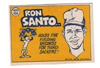
Finally, the only all-star design related elements I think Topps should bring back are the gigantic puzzle (formed when you put all the all-stars together) and the cartoon back. Or how about this: when you put all the all-stars together, they form a gigantic cartoon. Maybe a 12-panel comic strip of Dave Parker complaining that he's cold and making a young Barry Larkin go find him his warm-up jacket for his big all-star photo. You know, just for old times sake.
1 comment:
I also loved the 1978 all-star cards. They were the best ones I've seen.
Post a Comment